Tony Zhou
-
Watch: Tony Zhou on Drive and “The Quadrant System”

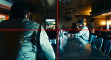
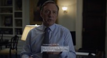
This quick Tony Zhou video starts by breaking down a shot from Nicolas Winding Refn’s Drive in which Carey Milligan and Ryan Gosling walk to their respective doors in a hallway, pointing out how the left and right sides give us two separate stories in one composition. Then Zhou moves on, repeatedly slicing the film’s frames in half vertically and horizontally. A model of textbook visual analysis, Zhou gets to the essence of what thoughtful shot composition looks like. Heed Zhou’s wise parting words: “You don’t need Steadicams or cranes or drones, or the latest 4K whatever. You need top, […]
by Vadim Rizov on Feb 2, 2015 -
Watch: Kurosawa and The Geometry of a Scene

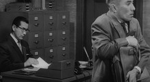
In his latest “Every Frame a Painting” series, Tony Zhou takes generic, ensemble coverage to task. Pitting rigid Hollywood biopic fare against the geometric blocking of Akira Kurosawa’s The Bad Sleep Well, Zhou considers why dynamism comes through movement and not necessarily edits. As the characters shift about the room, tracing lines of triangles and squares, Kurosawa uses full-bodied actors — not close-ups — to draw your attention to a given object.
by Sarah Salovaara on Jan 30, 2015 -
Watch: What Makes a Video Essay Great?

As our attention spans grow increasingly shorter in the age of information, there appears to be a growing audience for a form of film criticism beyond the written word. More precisely, for the video essay. Kevin B. Lee, the video essayist at Fandor, provides a nice inquiry into the state of the video essay today in his year-end recap, spotlighting the efforts of Tony Zhou and ::kogonada, while musing on what viewers respond to in their works: decisive analysis, politics, or the occasional cinephile fetishism. Further, Lee considers how even a narration-less supercut can adhere to its maker’s perspective based […]
by Sarah Salovaara on Dec 29, 2014 -
Watch: Jackie Chan’s Brand of Action Comedy

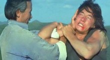
The latest edition of Tony Zhou’s “Every Frame a Painting” series takes a look at the king of action comedy, Jackie Chan. Consistently putting himself at a disadvantage like the silent film stars Keaton and Chaplin, or defamiliarizing the familiar as weaponry, Chan’s perfectionism and attention to detail have set him above the rest for decades running. In the video, Zhou also closely analyzes the difference in Chan’s Chinese and American work, particularly the director’s editing, which can compound or dismantle the effects of Chan’s stunt work.
by Sarah Salovaara on Dec 12, 2014 -
Watch: Visualizing Character Choice in Snowpiercer

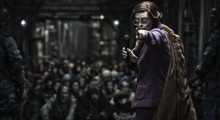
“How do you show character choice,” wonders Tony Zhou in this abridged version of his popular “Every Frame a Painting” essay series. Void of melodramatic “there’s no turning back” declarations, Zhou points towards Snowpiercer as a film that is constantly conveying its protagonists’ decision making process through right and left camera looks. Just as effective, if not a touch more subtle than its vocalized counterpart. Be forewarned: massive spoilers ahead.
by Sarah Salovaara on Oct 29, 2014 -
How Do You Show a Text Message in a Film?

Not too long ago I was asked to read a script, and when I finished I had one question: what year was this script set in? I wondered because the whole script revolved around people in different cities being completely unable to communicate with each other, to know what was going on in each other’s lives. Yep, this present-day film took place in a world where mobile phones had not been invented. You’d be surprised at how often screenwriters ignore today’s modern means of communication. And not just phones — in order to be truly contemporary, filmmakers must incorporate text […]
by Scott Macaulay on Aug 15, 2014 -
Watch: “Satoshi Kon – Editing Space & Time”

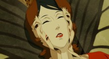
We recently spotlighted Tony Zhou’s video essay on Michael Bay’s editing techniques, and now he’s come up with another fascinating editorial analysis. “Satoshi Kon — Editing Space & Time” examines the work of the late anime legend (Paprika, Perfect Blue) purely from an editor’s perspective, finding analogical techniques in Wes Anderson’s work while unpacking the director’s use of graphic matches, imaginative wipes and other transitions that underlined his concerns with the slippage between dreams and reality. It concludes with Kon’s final work, the one-minute short Ohayo (Good Morning). This is well worth a look, both for anime buffs and editors […]
by Vadim Rizov on Jul 25, 2014 -
“What is Bayhem?” The Secret of Michael Bay’s Shots

In the latest in his Every Frame a Painting series, film essayist Tony Zhou breaks down the visual language of the visually dynamic, sometimes-maligned (although not by Filmmaker!) Michael Bay, showing why his shots still pack more punch than your average multiplex-crasher. Using commentary from Werner Herzog, references to West Side Story (one of Bay’s favorite films) and A/B comparisons of imitators interesting and not, Zhou explains Bay’s use of parallax, off-screen space, compression and speed. If you’re planning to see Transformers 4 — or even if you’re not — just check this out.
by Scott Macaulay on Jul 3, 2014
