FIRST THINGS FIRST
David Geffner on the Art of Film Titles.
I remember jumping in on a rowdy, late-night screening of Casino last year in the heart of L.A.'s commercial (and not very indie-friendly) movie beast, Universal City Walk. There were only a few, at best, hardcore Scorsese fans mixed in with a crowd consisting of tattooed homeys sneaking beers. The audience was loud, drunk and primed for serious ultra-violence -- until the title sequence came up. Then everyone went quiet, riveted by Saul Bass' neon-flamed graphics; the room calmly eased into heavy anticipation of what was to be a morally complex -- and very expensive -- documentary on Vegas racketeers.
Granted Casino, and the scores of amazing main title sequences before or since -- Anatomy of a Murder, Vertigo, Seven, Portrait of a Lady, Blue Velvet to name just a few standouts -- had a lot more dollars to play with than most indie post budgets can swing. But in the world of main title design, even for micro-budgeted indie projects, money don't always make the man, as the saying goes, and a little creative brainstorming can go a long way.
"You can definitely do interesting things for under $10,000," Bob Freemon of New York-based REI remarks of a typical low-end indie title budget. "You can experiment with font and text design, delay fades and dissolves of type, cut to multi-color background plates. What's important from our standpoint is for the filmmakers to learn the language of typography and opticals, so they can have a plan going in."
Freemon, whose recent work includes, Chasing Amy, Blackout, Walking and Talking, and Woody Allen's upcoming Deconstructing Harry, cites the upper range of an indie title budget as somewhere between $30,000 and $40,000 � enough to buy a smattering of digital animation, although nothing like the flashy graphics which grace studio main titles. But Freemon continues, "Tone is the most important thing in a main title sequence. My art director and at least one of our partners sit down and ask the director what the movie is about. Sometimes it becomes an education process; encouraging [the director] to start thinking title design early on, so they're not forced to go with white lettering on black when the money's all run out."
Cost and equipment aside, the ultimate questions when designing a main title sequence are, much like any other aspect of a film, centered on theme, content and the viewer's desired emotional response. Other than trailers and marketing elements seen prior to a movie's release, titles are the very first images the audience absorb after the lights go out. They form a kind of contract, outlining the filmmaker's intentions and, for better or worse, setting up expectations that the audience, almost subliminally, will demand be met.
"The conceptual question of what a title sequence should or should not do is a very interesting one," observes Randy Balsmeyer, whose N.Y.-based Balsmeyer & Everett is renowned for their elegant and clever title treatments (Fargo, Dead Man, Kama Sutra, Naked Lunch). "I would liken good titles to a well-played overture. They set you up emotionally for what's to follow, but also create a deep undercurrent of emotion that will color everything which comes after, just like in a symphony. Certainly from the title designer's standpoint, it's always nice to have a flashy showpiece on your reel. But if the sequence overwhelms the film, or strays from the director's true theme, then the right choices weren't made, no matter how great [the titles] look."
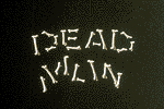 | 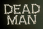 |
| Balsmeyer and Everett's titles for Jim Jarmusch's Dead Man.
| |
Kyle Cooper, formerly with R. Greenberg & Associates and now heading up his own L.A.-based firm, Imaginary Forces, has over 70 films on his resume and insists that the main title sequence is not just a stand-alone animal but a key part of the movie.
"Donnie Brasco is an example where the director wanted us to reveal the nature of his main character in the title sequence," Cooper says. "By manipulating surveillance photos that had been used for the film, we were able to tap into the character's obsessions. In a real sense the film is about his predatory nature, and the main titles clue you in, just like another character would do. They set up hints which the director can pay off later in the film."
Issues of theme, content, and character revelation are certainly not new to the world of main titles. In fact, designers like Peter Himmelstein, whose New York-based firm has designed titles for each of Ed Burns' movies as well as docs like A Perfect Candidate, urges indies to look at "every title sequence Saul Bass ever did" to educate themselves to the medium's history. "The crudeness of Bass' work was so inventive," Himmelstein marvels. "Sequences like Vertigo and Anatomy of a Murder or newer ones like Age of Innocence and Goodfellas are complete little films unto themselves. Bass had this integrity of design from project to project, regardless of theme or content."
Balsmeyer advocates that filmmakers approach their title designer when the film is still in script form. "Chinese Box (Wayne Wang's next film) is a project where the movie's themes -- the handover of Hong Kong -- were communicated to us early on. I had worked with Wayne on Smoke and Blue in the Face, and we talked about creating an actual Chinese box on screen to connote this world of ever-deepening puzzles which spiral into one ambiguous space after another. The result was a modest, digitally animated sequence which accurately reflects the mood and tone of the film. From my experience, it's the people who come to us very late in the process, who have already cut most of their movie and established a pace for the opening, that lock us into a certain approach."
Examples of a close director-designer relationship resulting in innovative main title solutions can be found in much of Balsmeyer's work with Spike Lee, most notably last year's Get on the Bus, which, according to Balsmeyer, was pretty unique despite the tight budget. "We did insert shoots designed around themes of human bondage and chains on a stage," says the designer. "Then we intercut those visuals with graphics (titles) that had been created on a Mac and output straight to film. Basically, the main costs were stage time, props, and actor salaries. But the actual graphics were incredibly cheap."
Office Killer, a debut indie feature by the award-winning fine art photographer, Cindy Sherman, is a best-case scenario of creative invention overcoming an extremely limited budget (less than $7,000). Designed by New York's Bureau, a company which does print and advertising work as well as film effects, the sequence is a tense, quasi film-noir riff featuring lurid, multi-colored type rippling across symbols of office America -- computer keyboards, water coolers, ashtrays stuffed with cigarette butts; it's as if the titles themselves were on the hunt for yuppie prey.
 |  |  |
 |  |  |
| Designed by New York's Bureau, this title montage from Cindy Sherman's Office Killer (shown here in photos scanned from a video monitor) cost under $7,000. Drawing upon themes from the film, the sequence plays the film's title cards as the projections of an office xerox machine. | ||
As Marlene McCarty, Bureau's co-founder, describes: "Office Killer was a real set piece for us. It was very ambitious on a low budget. And it came together because the director is a fine artist herself and was totally open to our ideas. We got involved very early in the process, showed Cindy some sketches we had mocked up on video, and she basically let us run with it." Known for innovative use of moving type in the title sequences of films like I Shot Andy Warhol, Swoon, Safe, and Ratchet, McCarty is reluctant to divulge Bureau's cost-saving tricks on Office Killer, confiding that "only a minimal amount of computer manipulation was used. Since the indie films that come to us typically don't have huge budgets for digital playtime, we try to get creative with the typography."
In the ranks of current title design, particularly since the recent death of the medium's acknowledged master, Saul Bass, there's one designer (and one key film), who has garnered the lion's share of attention, and deservedly so. Kyle Cooper's nerve-jangling, distinctly post-modern take on a serial killer's fussy preparations for David Fincher's Seven was a masterstroke of thematic and graphic ingenuity. Along with Bureau on the East Coast, Cooper is one of the few designers attempting to apply trends in print, advertising and record industry graphics to a lagging and conservative film industry.
Owing a debt to youth culture mags like Raygun and Bikini, where article headings and text are often cryptic, Cooper's sequence for Seven was astounding to look at, yet it never lost sight of the designer's goal. "David Fincher wanted to set up the film's relationship with evil in a very direct and uncomfortable way," Cooper notes. "I think we accomplished that. But in Seven there's also a structural concern going on. You don't see the killer until nearly 40 minutes in, so the titles need to bridge that gap. You're inside his head straight off, making the tension that much more intense when he does finally show up."
Cooper's work after Seven, most notably The Island of Dr. Moreau and the upcoming Mimic, is intricate, densely layered and relies heavily on computer-manipulated imagery -- an approach that's cost-prohibitive in the world of indie filmmaking. Nonetheless, Cooper urges independents to approach design firms known for studio work: "It's all about finding creative solutions to new problems. A tight budget, in the service of a really great script, may not make us any money. In fact, we might not even break even. But just to be associated with a thought-provoking indie film, and a director that's open to experimentation, is, ultimately, good for our business."
While Imaginary Forces' digital budgets are typically very generous, its founder feels the world of computer graphics is not entirely closed out to indies simply because of cost. "What becomes pricey a lot of the time is scanning live-action footage and multiple film opticals," Cooper explains. "In theory, indies could create whole title sequences on an Avid, lay out their typography on a Mac with Adobe AfterEffects, go into an on-line room and dissolve back and forth at digital resolution, then transfer to film. For Mimic we did a temp sequence where we took a bunch of photographs, integrated them with graphics on a Mac-based Photoshop program, then dissolved back and forth and filmed it out. Granted this was only a test, but the results were pretty nice."
Cooper's urgings notwithstanding, probably no other element of the indie post process has expanded -- some would say overwhelmed -- the filmmaker's title palate more than the computer. Its ability to create snappy graphics and effects at digital resolution, like time stretching or compression not based on even frames, cannot be duplicated in a film optical environment. Because systems like the Avid or Lightworks have allowed indies to manipulate graphics, photos, even production footage, and get results beyond the range of most optical printers, some designers feel the computer is a mixed blessing.
"There are still problems fine-tuning moves on the AVID, and also in carrying the type over to film," observes Himmelstein. "I tend to use the computer for static layouts of fonts and backgrounds and for experimenting with the design and placement of text," Himmelstein continues. "In the end, we still lay out the design and placement of text," Himmelstein continues. "In the end, we still lay out the sequence mechanically and shoot to film. It's very close, as far as the digital possibilities, but cost-wise it's not quite there." Himmelstein, like Cooper, champions software such as Adobe AfterEffects for previewing typography on his laptop, as well as utilizing the Avid to try out thematic ideas. "But," he cautions, "unless you're prepared to go all the way in a full digital environment, or can settle for a film transfer off a kinescope, the computer can be a bit more seductive, graphically, than money and time really warrant."
In a perfect world, where independents could check out as many designers as possible before signing one on, what would be the best piece of advice a designer could give to make sure indies get the most creative bang for their buck?
"Call us four months before production begins," Bureau's McCarty chuckles, only half-kiddingly. "I can't stress enough how important it is, from the designer's standpoint, to get in sync early on so time and money don't run out. Also, trust the designers to do their job. I studied typography with these old master guys in Switzerland and come from a very classical training. So when someone wants us to break the rules and come up with fresh stuff, we have a lot of knowledge to draw on."
For filmmakers looking to cut costs, Balsmeyer offers this advice: "I would tell filmmakers not to be too enamored of supering titles over live-action footage, because [the process] can run into heavy optical costs. Alternate solutions which are vastly cheaper include cutting between art cards and typography, and building titles right into a live stage shoot." Two examples that Balsmeyer is quick to cite of the former technique, done nearly 30 years apart, but notably similar in their approach are Bass' titles for West Side Story, where the text was painted on the set of the New York neighborhood's walls. And for a debut feature by Spike Lee's former film editor, Barry Brown, called Lonely In America, Balsmeyer says, "We mocked up this newsstand on a stage and built the titles right into the props, in that case the magazine covers. Ultra-cheap, inventive, and very much in the spirit of the movie; Barry cut his dailies and his title sequence was done."
But suppose there is absolutely no money to be squeezed from an already strapped production? Should filmmakers cross the line and design the titles themselves? In the case of one recent indie director, Stephen Kay, who designed his own, Beat-influenced titles for The Last Time I Committed Suicide, hiring a designer was simply not a option due to budget constraints. "The film's producer, Ed Bates, and I sat down at a coffee shop one afternoon," Kay describes, "and literally did every single title card on a different napkin! We spent some time looking at the Blue Note Catalog (a jazz record label prominent in the 50s) and came up with variations that were specific to each person's credit. Then we took the napkins in to CFI, where we doing the lab work, and said here's what we want. And they laid them out on their computer!"
Although necessity dictated so on The Last Time I Committed Suicide, Kay, who has no formal training in graphic design, was very clear about his intent. "I wanted to shake people up right away," the director relates. "Not to let them sink back and relax but create some tension in each card. My advice to other first-timers is to know your limitations and expand upon them. We knew we could not do titles over picture, or use multi-color schemes, or dynamic moves of the type. So we came up with something simple yet still consistent with the tone of the film. Being unable to hire a designer does not mean your titles have to be dull or ordinary. If you know your film really well, you can come up with something pretty unique all by yourself."
Also see the special sidebar article on The Art of Kyle Cooper
VOD CALENDAR


 See the VOD Calendar →