caspar newbolt
-
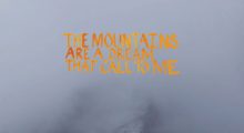
Lookbook Case Study: The Mountains Are a Dream that Call to Me

Writer/director Cedric Cheung-Lau says the initial version of the script for his in-development debut feature, The Mountains Are a Dream that Call to Me, consisted solely of 44 images. Then came the words. For the lookbook, Cheung-Lau took sentences from the finished script and married them to images of his location, the Annapurna section of the Himalayas. The script tells the story of a grieving older woman and a young Nepalese man who meet in the mountains and go on a journey together, and Cheung-Lau stresses the importance of the setting to the story. “The landscape surrounding them is real,” […]
by Scott Macaulay on Mar 14, 2019 -
On Decks: The Art (and Necessity) of the Independent Film Lookbook

Lookbooks are an increasingly vital part of the filmmaking process. A good lookbook can make a pitch, just as a bad one can dissuade an investor, producer or financier from a project. Yet the creation of lookbooks is rarely discussed. The topic is missing from the many labs and tutorial programs set up to help first-time filmmakers—even though a good lookbook is perhaps the quickest way for a project to stand out. Simply put, refined visual knowledge and the skillful conveying of that knowledge is power for a director. When we interviewed Reed Morano last year about her work on […]
by Meredith Alloway on Mar 14, 2019 -
CASPAR NEWBOLT SHARES HIS THREE RULES FOR WATCHING MOVIES
Over at IFP’s blog, Version Industries co-founder Caspar Newbolt has a provocative new opinion piece in which he shares his three rules for watching movies. Arguing against the near-automated saturation of opinions that the internet has spawned, Newbolt reasons that its best to simply go into a movie cold. As he writes: “I once got into an argument with someone at a party about a film, which I was insisting was good and he was arguing wasn’t. In the end it turned out he’d not actually seen the film but was basing his opinion on what he’d read on Rotten Tomatoes, […]
by Jane Schoenbrun on Jan 19, 2012 -
TIM SUTTON’S “PAVILION” GETS A GORGEOUS NEW WEBSITE

Tim Sutton’s upcoming Pavilion is a beautiful debut, a collage of subdued, hypnotic moments that combine to capture the aching aimlessness of youth. And now the film has a similarly stunning website. Designed by Caspar Newbolt of Version Industries, the site overlays images and GIFs on each page to bring many of the film’s visually striking moments to life. This lovely GIF, for instance, loops on the homepage: Over at the IFP website , Newbolt blogs about developing the Pavilion website, as well as the film’s posters. He discusses how watching the film inspired and informed his designs: “For the […]
by Jane Schoenbrun on Oct 17, 2011
