 Back to selection
Lady Vengeance
by Farihah Zaman
Lady Vengeance: Poster? I Don’t Even Know Her

In an impressive show of state pride and clever programming, the Alamo Drafthouse, the much-lauded Austin-based movie theater chain run by the same folks behind nerd art and t-shirt purveyor Mondo and annual genre film festival Fantastic Fest, is doing a roving summer screening series called The Rolling Road Show. Each of its ten lovely Texas cult classic films, from The Searchers to Bonnie and Clyde to Blood Simple, will be shown outdoors in a town related to the film. To promote the series, the Drafthouse worked with artist Jason Munn to create new, graphically minimalist posters for these films, such as the beautiful update on The Texas Chainsaw Massacre, below.
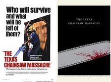
Poster remakes have become popular among rising young illustrators in the last couple of years, so the Rolling Road Show’s tactic, while not entirely novel, is timely in capitalizing on a bit of a phenomenon. The fixation on personalizing such posters makes sense given that promotional materials and supplementary artwork have traditionally been an important part of genre filmmaking and distribution. With smaller budgets, venues, and audiences, killer artwork has often been key in creating a distinctive style to excite, inspire, and even titillate potential viewers into the theater. Who can hear the name Foxy Brown without imagining those pulpy, drippingly saturated images from the 1970s, or hear the name Ed Wood without thinking of his flatly lurid sci-fi posters from the 1950s? This lean towards the extreme continued even into later decades like the 1980s and 1990s.
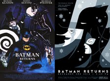
In our era, of course, sampling, appropriation, and referential artwork has taken hold across disciplines. So, it isn’t the focus on materials that is new to genre, but rather the reimagining of them. How fitting that in a time when the Hollywood genre market has become flooded with remakes and reboots of old favorites that the remake of the poster has become widespread as well. Etsy, Flickr, and Tumblr abound with burgeoning and established artists alike redoing posters for classic cult and genre films, usually incorporating a clean, modern aesthetic that contrasts sharply with the excesses of previous generations. Artist Tom Whalen, for example, references art-deco in chillingly pared-down designs that look like layered paper cut outs. His take on Batman Returns has just as many elements as the original, but it collapses them into a series of simple lines.
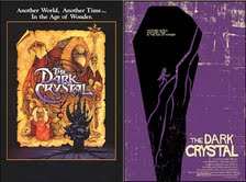
The unnamed couple behind Swesler on Etsy take the trippy, busy illustration of the original Dark Crystal poster and shreds it down into a practically monochromatic print.
Other artists take the minimalist trend to the extreme, to the point where the poster is a single still or object, such as the typographic work of Patrik Svensson.
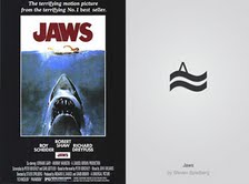
There are also these bizarre line drawings that were used for a Chilean DirecTV ad (appropriately for the discussion at hand, the tagline translates to “Keep better memories of your movies”).
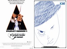
In these cases the artist is winking at a generation of moviegoers for whom these films have become a part of the collective unconscious, wittily using just one evocative item as a shorthand that draws on and opens the door for all of our movie memories. The film itself becomes the final word in the last round of a game of Celebrity Password..
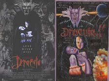
Of course, the Chilean work is a reminder that other countries have been putting their own spin on American imports long before the practice became popular within the U.S. itself. Foreign versions of our favorite movie posters, usually hailing from France, Eastern Europe and Japan, have long been considered prized collectibles. The African continent, often unduly overlooked by both film and art fans, has produced a series of highly covetable posters hand painted for bootlegged screenings of American films in Ghana, a sort of illegal rolling road show of their own. If the American artists’ work reflects Western culture’s modern fascination with minimalism, these Ghanaian artists’ work shows a luscious excess that harks back to historical genre promotion in a way still completely indebted to its country of origin. The depiction of Gerard Butler in 300, rendered as some kind of demented Ishtar with bulging eye and swarthy skin, is a particular favorite. Bram Stoker’s Dracula is another gem; the poster clearly uses the gothically attired stars and occultish images from the original poster but twists them into various purple half-beasts far more viscerally animalistic, referencing a mythology more mysterious than slightly clunky 19th century literature.
While many original posters are inspiring and iconic works of art, and have actually changed the way we perceive genre, they were still developed primarily as tools to sell the films. While the same may be said of some of these remakes, such as the prints for the Road Show and the bootleg screenings in Ghana, many are simply a graphic artist’s way of visually processing what is a visual medium. These posters are there to sell only themselves.
FARIHAH ZAMAN began working in film as a Programmer for Film South Asia documentary film festival before moving to New York in 2005, where she was the Acquisitions Manager at independent film distribution company Magnolia Pictures. In 2008 she coordinated Independent Feature Production’s No Borders program, the only international co-production market in the US, before becoming Program Manager of The Flaherty Seminar until 2010. Farihah currently writes for The Huffington Post, as well as online film journal Reverse Shot, among others.
