 Back to selection
THE iPAD, FILMMAKER AND RETHINKING MAGAZINES
 We just went to press on the new issue of Filmmaker very late last night and as we were doing so we had some informal conversations on a possible iPad version of the magazine. (Check out the blog hopefully later today or tomorrow for my review of the device.) So far not many magazines have published iPad specific editions due to two reasons: iPads weren’t available for testing; and publishers, designers and editors are still in the process of rethinking their products for the iPad platform. Conde Nast is apparently going to be experimenting with several different approaches across all their publications throughout the summer before making a final judgement and I think that’s smart. Among the things to consider:
How much should the print publication be a base in terms of design and content?
How dynamic (or not) should a publication be, i.e., how much updating and continual reworking of content?
How much should a publication pull in from social, if at all?
Should pricing be single issue, subscription, or a free-standing app? Should issues be each discrete apps or else a single app that archives all the issues?
How should advertising be rethought for the platform? Should advertising, if it’s included, intrude on content (i.e., in the same frame) or be separated from it?
For small publications without large staffs and robust development teams, is it worth moving to iPad without the resources for major rethinks?
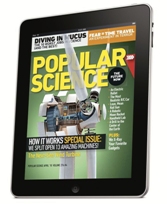
Brad Colbow has a good video demo’ing three publications on the iPad: Popular Science, GQ and Time. Already it’s interesting to see how publishers are grappling with the possible new conventions of the iPad. (I agree with Brad — I don’t like the design changing so much when the iPad revolves from portrait to landscape mode.) Colbow likes Popular Science, which was designed by Bonnier, whose demo iPad video I posted on the blog a couple of months ago. From their own blog, they lay out six design ideas related to their digital philosophy:
– SILENT MODE. Magazines are a luxury that readers can lose themselves in. Mag + has fewer distractions than the Web. It allows readers to lean back, away from the browser, and just focus on the bold images and rich storytelling. Reduced complexity increases a reader’s immersion.
– FLUID MOTION. Magazines are easy to browse, and Mag+ replicates that with a story-to-story navigation that’s more like a panning camera than a flipping page. As we say, “Flow is the new flip.”
– DESIGNED PAGES. Magazines are defined by their carefully conceived layouts that give readers an immediate understanding of the content and why it matters to them, a quality that got lost on magazine Web sites. Mag+ brings design back to digital publishing.
– DEFINED BEGINNING AND END. Unlike the Web, magazines have a defined storyline and flow from front to back. Mag + returns to the notion that something can be, and wants to be, completed. It’s the end of endlessness.
– ISSUE-BASED DELIVERY. One of the great joys of magazines is that feeling of anticipation when a new one arrives. Mag+ maintains that by delivering full issues at once with all the same content as the print edition, and on the same schedule.
– ADVERTISING AS CONTENT. Relevant, attractive advertising is as much a part of the magazine experience as the editorial content, and Bonnier wants Mag+ advertising to include both pin-ups and applications readers can appreciate.
Further discussion is at the Inventing Interactive blog. There, David Young concludes:
It’s great to see so much interest by publishers in iPad apps. But they should be more willing to make radical changes and reinvent themselves. They need to design new and innovative ways of communicating. They need to give readers the power to navigate and explore stories in any depth they wish. If the iPad really is going to be the rebirth of publishing, then publishers need to do something new.
We already have a bunch of ideas, but I’d love to hear from you. What would you like to see in an iPad edition of Filmmaker? What added functionalities and what specific-to-the-medium design ideas? Please comment below if you have some thoughts.
iPad Magazine Art Direction from Brad Colbow on Vimeo.
