“We Mostly Didn’t Shoot Traditional Coverage Because We Knew the Edit Points”: DP Drew Daniels on Quarter Life Poetry
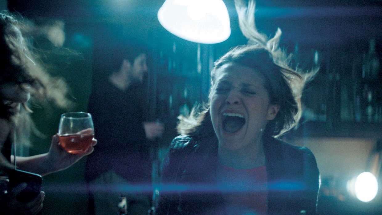 Samantha Jayne in Quarter Life Poetry (photo by Drew Daniels)
 Samantha Jayne’s Quarter Life Poetry began life as a Tumblr and Instagram, transforming her millennial 20something experiences into doodles and poems. Now it’s an ambitious series set to premiere on FX Networks later this year, brought to life with director Arturo Perez Jr. helming all ten episodes. Via email, cinematographer Drew Daniels addressed the challenges of crafting their own visual language and using a jib for a shot it wasn’t intended for.
Filmmaker: How and why did you wind up being the cinematographer of your film? What were the factors and attributes that led to your being hired for this job?
Daniels: I’ve known Art and Sam for many years and I’ve done several short films with them, so naturally Quarter Life Poetry was the next step for our collaboration and friendship.
Filmmaker: What were your artistic goals on this film, and how did you realize them? How did you want your cinematography to enhance the film’s storytelling and treatment of its characters?
Daniels: With QLP, we really wanted to mix up formats and play with emotional lighting cues and long, coordinated camera movements, which felt like a good next step in our work together up to this point. We’d just done a one-take short film before QLP, and wanted to take what we learned and push it further. We wanted to use a mix of camera and lenses and aspect ratios to tell Sam’s story on a purely emotional level. Every choice we made was in service of the feeling of the scene. This was one thing that Arturo was very adamant about and I took this as a personal challenge to execute. With that in mind, we thought, what does shooting anamorphic widescreen make you feel? How does it distort reality and how can we use that to tell Sam’s story? What does shooting 1.33:1 spherical do to the perception of space? What do zooms or voyeuristic angles make us feel? How do wide lenses and 1.85:1 aspect ratio change how we feel about the character’s state of mind? We asked these questions for each episode and used all of these tools to derive an evolving camera language for the show. The lighting was meant to evoke certain genres and feelings that we also felt added to the emotional journey of the character. For example, in “Friday Nights,” when Sam sinks into self-doubt and panic, the lights dim and begin to change from warm to cold and it gets really dark and moody and the lights flicker in a surreal way….then we snap out of it and we’re on to the next scene. Overall, we wanted this episode to feel like a horror film, motivated by the character’s fear and anxiety. We approached the lighting of each episode this way.
Filmmaker: Were there any specific influences on your cinematography, whether they be other films, or visual art, of photography, or something else?
Daniels: Our biggest influences were not necessarily specific to individual pieces of art or cinema, but rather, we took overall ideas of horror films, ’70s cinema, New Wave, and even corporate videos, and applied what we thought was the right flavor into QLP.
Filmmaker: What were the biggest challenges posed by production to those goals?
Daniels: As usual, our biggest challenge was our short shooting schedule. We had to have a good plan to be able to shoot exactly what we wanted in the time allotted. We mostly didn’t shoot traditional coverage because we knew the edit points and only shot what was needed.
Filmmaker: What camera did you film on? Why did you choose the camera that you did? What lenses did you use?
Daniels: We shot on an Alexa Mini with Kowa Prominar spherical lenses, Todd AO anamorphic lenses, and a Cooke Varatol zoom lens. The Alexa is a go-to because of its dependability in delivering great images no matter what. I shoot just about everything with it. We also pushed our ISOs as part of our visual language. Some episodes were shot at 1600 ISO and some were shot at 400 ISO. I wanted to use changing aspect ratios, lenses and ISOs as tools for a diverse visual language for this show. But the thing that ties it all together is the point of view and subjectivity of the camera with the lead actress (and show co-creator) Samantha. The camera stuck with her point of view and erred on the side of subjective reality.
Filmmaker: Describe your approach to lighting.
Daniels: The approach to lighting was based on emotionality and feeling for each episode. What does the color, the movement, the quality say about the character and what they’re going through?
Filmmaker: What was the most difficult scene to realize and why? And how did you do it?
Daniels: “Treating Yourself” was difficult, because we originally had a different shot idea that involved a huge jib arm behind the counter doing a long camera move. We scrapped this and simplified it but this meant we had to still shoot it on the long jib arm! It wasn’t the right tool for the job but it still worked. It was also difficult because it’s almost entirely VO and I wasn’t sure it would be interesting or bold enough. But we held on Sam’s face the whole time and then cut to Teddy’s CU (1st AC for QLP!!!) and it somehow works.
Filmmaker: Finally, describe the finishing of the film. How much of your look was “baked in” versus realized in the DI?<
Daniels: I certainly baked in a lot of the look with various LUTs that me and my colorist Bossi Baker designed. It was a combination of the lighting, costume design and art direction along with the various ISOs and lighting styles that give the show its particular patina.
Title: Quarter Life Poetry
Camera: Arri Mini
Lenses: Kowa Prominars
Todd AO anamorphic
Cooke Varatol Zoom lens
Lighting: emotional
Processing: digital
Color Grading: DaVinci Resolve