 Back to selection
How To Survive Your First Color Grade
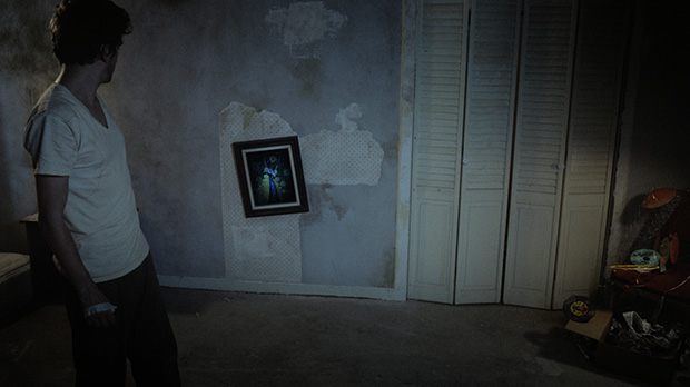
For any film, color grading is an essential part of the process. For some it’s simply a way to get the shots within a scene to match cohesively, despite adjusted lights or a change of sun position. For others it can help tell the story. Either way, If you’ve never sat in on a coloring session before, the whole thing can seem quite daunting.
Jalal Jemison has colored five features and has an extensive background in VFX and compositing. He has been a VFX supervisor, a director, a lead compositor and has had his own small VFX studio. For the last four years he has been a full time colorist. In addition to being Filmmaker‘s webmaster, Michael Medaglia is an award-winning director of several short-format films including fiction, documentaries and music videos. Deep Dark is his first feature-length film.
Below, they cover topics like how to prepare for your session, how to communicate with your colorist and how you can use color-grading to better tell your story.
Note: all before/after images in this article can be clicked for a high-resolution version.
Preparing For Your Color Session
Michael: Coloring a feature can be more expensive than college tuition, so before you start you’ll want to prepare. Do some preliminary work and you’ll save both time and money. The best way to prep for your session is to know what looks you want so you spend less time on costly hemming and hawing.
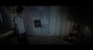
1. Use stills of your film: Pull stills from your cut for each scene and play with them in your favorite photo-editing software (i.e. Photoshop). You can try different variations until you settle on a look you’re happy with.
2. Find stills from other films: If you’ve seen a look you like in another film (or even a photo), grab some screenshots to show to your colorist. It’s a great way to immediately convey what you want. Keep in mind, if you didn’t light for it, you may not get the look you want. Colorists can work magic, but they are not wizards.
3. Talk to your DP: Chances are any good DP worth his/her salt had a very specific lighting they were going for when shooting a scene. If you’re the kind of director who’d just rather focus on the performance and not worry as much about lighting, contrast and shadows, do yourself a favor and have a chat with your DP before heading into the coloring room.
What we did on Deep Dark
During pre-production I had already started creating a look-book for the film. These images became invaluable when talking to my DP and production designer. So, by the time it came to color I already had an idea for the look of most of the scenes. After we locked picture, I took stills from the film into Photoshop to refine the look. Compared to whatever I did, I knew our colorist would be able to do so much more, but wanted to at least have a jumping-off point.
If you can, try to arrange for your DP to sit in on your color sessions. This wasn’t possible on Deep Dark but I still sent stills back to Francisco Bulgarelli to get his valued opinion.
Jalal: As a colorist, organization and communication are paramount to getting a director what he/she wants. First-time filmmakers commonly expect a colorist to have all the answers to the coloring of the film. Colorists do have all the answers but the director has to be asking the right question. A good colorist will always approach a film from two angles: technical and creative. Being able to balance both of these sides for the film will always have the best final results. As a director, first approach the technical problems of a film: acquisition format, color space, codecs. Then approach re-times, pan-&-scans and repositions. From there you can get into the real creative part: the online of the color.
Speaking in colors: how to communicate with your colorist
Michael: Like any artistic collaboration, communication is key. Communicate well with your colorist and you’ll get the look you want. Communicate poorly and it will be a disaster. How to do you speak to a colorist? It helps to at least know a little bit of color theory. You can use terms like “highlights,” “shadows,” “crushing blacks,” etc. If you’re looking for a good crash-course on color theory, here’s a place to start.
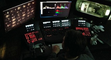
Even if you don’t have a grasp on the vocabulary, you can tell the colorist how you want to scene to feel: cool vs. warm, colorful vs muted, lighter vs. darker, happy vs. depressing. Keep in mind, these terms are very subjective. When in doubt, it’s always better to have an example to show.
Jalal: Obviously, communication is important, and there are proper terms for communicating elements within a scene. “Warm” is orange/red, “cool” is blue. “Crushing” is bringing mid-low level greys to black. The best approach is to always have the most specific examples and use the simplest terms. This will be the best way to get what you want. All words and ideas to translate color are subjective. Be simple and explicit in describing what you want.
Another important thing is to understand the technical limitations of your image. There are lots and lots of different acquisition formats and not all have the same technical capabilities. I would say it goes from the Prosumer DSLR to Red/Epic. Both can create an amazing image but only Red and Epic level imagery will be able to get you a proper image when stuff is not photographed exactly how you intended for final delivery. I am still surprised when people don’t know the latitude, dynamic rage and general technical limitations between the consumer prosumer formats compared to the more digital cinema formats like Red and Alexa. The Blackmagic Cinema Camera has an amazing format, close in latitude to the RED or Alexa formats. These new prosumer formats will replace all other prosumer cameras. It really is a giant leap.
Also, as a colorist, you are at the mercy of your organic makeup to perceive the proper colors of a scene. Mood, for example, can determine one’s perception of color to a great degree. There is no way to correct this because this perception of color is relative to what the colorist sees. If a colorist is in a somber mood they might naturally color to a more flat, grey tone, where if they are happy, they might color with higher contrast and more color. There’s no “right” mood to color in, but it’s always important to keep the mood of the person, project and environment in perspective. (Read more: How mood alters color-perception.)
Breaking it down: how to approach coloring a film
Jalal: The average film can have anywhere from 80-160 scenes. When it comes to coloring them, where do you begin? Typically it’s best to work on the technical aspects first. Once you’ve gotten them out of the way, you can focus on the fun part: the creative side.
The first thing we do is ingest the media and make sure all the online media in Resolve matches the exported reference clip from editorial. I make sure all the retimes, and repositions and any pan & scans are done to correctly match the offline clip. From there I always tackle brightness/contrast first, doing any overall primary color matches, then I get more in depth with particular looks to a scene or overall story arcs that require color or a look to tell the story.
Once all the technical details associated with coloring a film are hashed out, I usually break down the movie into hero scenes. A hero scene for the entire movie, then a hero for each scene. I usually get a good look that the director and I like for these heroes, then work my way backwards to fill the gaps in the scenes.
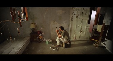
What we did on Deep Dark
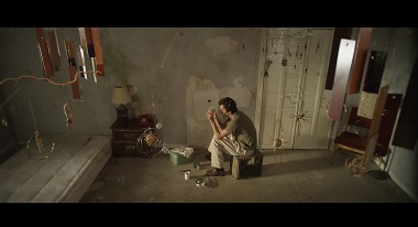
Michael: About half of the film takes place in an apartment, where the protagonist interacts with a talking hole in the wall. These scenes become the main arc of the story, which the other scenes support. For this reason we decided to focus on the apartment scenes first and then work our way out. Once we established the apartment look, every other scene was colored in reference to that.
Telling the Story
While color-grading is about making your film look professional and giving it a great “look,” don’t forget it can also help tell the story. There are thousands of ways to do this. Here are a few to get you thinking:
Create a world for your story. This technique is commonly used in fantasy, sci-fi and period pieces. It makes the most sense if your film doesn’t take place in “reality.” Every story has a setting and your color helps create that setting. Obvious examples are Amelie or The Matrix. On the other hand, if you’re going for a naturalistic drama you might want to just stick with natural colors and make it feel as real as possible. In the end, it’s purely a creative choice.
Convey mood or emotional state. If your protagonist is depressed, colors could be cool or muted. If they’re happy you might want to use warmer colors or increase the saturation. Just like mood affects color, color also affects mood.
Create distinct story lines. If your film has several different storylines, you might want to give them different looks so that the audience can better distinguish one from the other. This is commonly done with flashbacks.
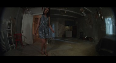
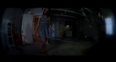
What we did on Deep Dark
In our case, we altered the color of the apartment according to the emotional state of the main character. We didn’t want the effect to be too drastic, so it’s a subtle change. When things are bad, we drained the colors. When things were going well, we brought them back in. We had already done similar things with our lighting and production design so this was a case of several things working in conjunction. Also, we wanted the apartment to feel a little bit more like a fantasy world compared to the non-apartment scenes, so we kept the latter scenes more natural-looking in comparison.
We also used color-grading to help define a character in Deep Dark. In the film, The Hole is just a hole in the wall, voiced by actress Denise Poirier. The Hole becomes a kind of sympathetic creature, so I felt it was important to the story that the audience identify with her. In order to do this, we used a lot of POV shots using an 8mm fisheye lens to give them a distinct look (hat firmly tipped to HAL from 2001). We wanted to do more than that, however. The Hole is not human and would probably not see things in the same way a human would. It might not even see the same spectrum of colors a human would. For inspiration, I researched the way different animals see colors. In the end, the look we settled on is not what a dog, cat or insect would see. It’s more of a heightened version of what a human sees.
Jalal: In Resolve, we have the ability to play with numerous blurs and color effects within the base application. For certain things outside Resolve’s native limitations, I rely heavily on OFX plugins. Since Resolve is a node-based grading system it is really easy to play with effects within a mask or a key. In this particular case we didn’t want the surreal color blurring effect we came up with to fill the entire screen, and we wanted to make sure we keep our attention on the actor, but at the same time still have this surreal feeling of the Hole’s POV. I started with some color correction and blur then used Genarts Sapphire for the final surreal color blurring. Michael was really good at working with me for the desired look. We looked through some different types of animals and played with a few different effects before we landed on the final look.
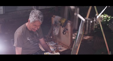
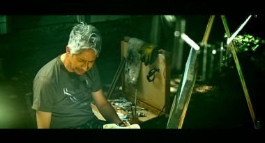
Michael: At one point in Deep Dark, the protagonist is told an allegorical story by a street art-seller. We don’t really know if it’s true or made-up. The story gets referred to several times throughout the film. We wanted to give these scenes a different look from the rest of the film. We wanted it to feel more like a sequence of disjointed memories rather than a typical scene. Again, we created much of this look with cinematography and lighting and our DP, Francisco, did an amazing job. The coloring of the scenes became the icing on the cake. For reference we started with some cross-processed photos. We found one that we liked, particularly the ones where the oranges and greens were affected. From there Jalal worked his magic.
Jalal: As a colorist, I am just the last piece of a long production chain and for me to do my job well I rely on having beautiful imagery from the DP. In this case I was immediately excited seeing the photography. I knew, from the first frame of the movie, Francisco had an amazing eye. He had done some pretty colors and blooms in the photography, to start the cross process look, but the final look was much more affected. As a colorist, to get a desired look I like to create a surreal looks from scratch. I don’t use presets unless I make them myself. I like to know exactly what each node is doing. Michael and I found some really beautiful cross processed images on the internet. I brought those into Resolve then I was able to analyze the images with my scopes and histogram, something the technical side of my brain needs to know. From there I had a base analysis of what makes a beautiful cross process image, then the creative side of my brain was able to dial in a final look that felt cohesive with the rest of the movie.
We hope this article has been helpful for those entering a color session for the first time. Have you used color-grading as a way to help tell your story? If so, please leave a comment and let us know. Also, if you have any questions, drop a comment and we’ll do our best to answer.
Contact the Authors:
Jalal Jemison (Twitter: @jalaljemison)
Michael Medaglia (Twitter: @medaglia)
Deep Dark was colored at Mission Control in Portland, Oregon. It is currently in post-production and will be completed in the fall of 2014.
