 Back to selection
Color Grading The Kings of Summer

Director Jordan Vogt-Roberts’ coming of age comedy The Kings of Summer premiered successfully at Sundance this year, but it took a hectic few weeks of work to grade and produce the final deliverables in time to make the Sundance submission deadline.
The Kings of Summer was graded by Narbeh Tatoussian, senior DI colorist at Blacklist Digital. Tatoussian has worked in the industry for over 16 years. He started in the shipping vault, then moved up through post-production and the QC department before becoming a tape room supervisor, assistant colorist and finally a colorist. During that time he says that’s he’s worked with “every single format” and “every single platform of color correction there is.”
Founded by Tims Johnson, Blacklist Digital is a Hollywood-based camera rental and postproduction facility. Blacklist actually started in Johnson’s house, with editing bays on the top floor and equipment rentals from his garage. Now it’s moved out of his house and offers camera rentals, data management, post production and color correction; a “one invoice” company as he describes it.
In the following interview, Tatoussian and Johnson discuss the grading of the picture The Kings of Summer, and what filmmakers need to do to make life easier in post-production.
Filmmaker: At what point did you get involved with The Kings of Summer?
Tatoussian: We were color correcting a TV show for the director and d.p., and we found out that they were working on this feature. The d.p. wanted to shoot on RED with anamorphic lenses in REDgamma3 correction/color space, which was not yet available, but we knew that it would be available while they were shooting.
Once it became available, we started doing tests. I did a test with REDgamma3 and I told them what corrections we could do.
Filmmaker: How do you go about color grading a movie? How does the discussion start?
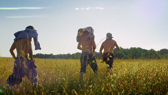
Tatoussian: The first day the d.p. and the director and I sat in a room and the director had a vision of what he wanted the movie to look like. It’s a dark comedy, and he didn’t want to do the traditional comedy look, he wanted to tell a story through the color, and as the story progressed and changed he wanted the color to change with the story.
It’s a story about teenagers that hate their parents. They go into the jungle, they build their own house, and they think they can survive by themselves. As the story starts, it is all happy, beautiful colors, and as it progresses and it goes into the dark, we changed the colors of the forest and jungle. Then, at the end, we came out to be all happy.
There were a lot of power windows, a lot of keying, a lot of controlling different greens and colors. The director is a very big fan of montage and shooting slow-mo, so there was the combination of the RED camera and a Phantom camera for the montage. For the montage they wanted the colors to be vibrant, so luckily we had Resolve. If we didn’t have Resolve there’s no way I could have achieved what we achieved for the look of this movie.
Filmmaker: Why do you grade in Resolve?
Tatoussian: When I started in the industry, there was still film, and the only color correction box out there was the DaVinci. When the industry shifted to software-based color correction, DaVinci was able to do the transition. I’ve tested many different boxes. I was probably one of the first ones who colored on Final Touch, before it became Color.
When Blackmagic Design bought DaVinci they started adding more tools and more capable color correction. To me it is the Ferrari of color correction. The tools, the ability to go in and out, the options, bring able to work with the RAW files and being able to go in and out of different editing applications.
Filmmaker: You started grading the picture when they had picture lock?
Tatoussian: Mostly. There were a handful of shots for VFX so I got together with the d.p. and the director, and we set a look and color corrected the plates for the VFX and we gave the VFX company the 4K plates for them to start coloring. Kings of Summer had a 5K RAW workflow.
Filmmaker: They didn’t want the traditional comedy look. Can you define what that is?
Tatoussian: If you look at the majority of the comedies, it’s all saturated, vibrant, all reds. It’s very alive, bright colors. That’s what they usually go with for the comedy features. But if you look at Kings of Summer, the director and the d.p. wanted a cinematic look but they didn’t want it to be just one tone of colors. They wanted a separation, they wanted the forest to be certain colors, and the greens of the trees were certain colors. At the start there were a lot of yellows and vibrant colors. As the story started going in a different direction and they were just sad, the greens changed in the trees, so it was not a traditional comedy color correction.
Filmmaker: Having the Phantom footage and the Red footage, did that pose any challenges?
Tatoussian: It’s a little bit challenging because with RED you’re in a 5K RAW workflow. Phantom is a different format, but since it was used for the montage and they weren’t cutting it together, it was easier for us to do.
Filmmaker: How long did it take to grade?
Tatoussian: We had a deadline to make for Sundance. The editor locked picture the second week of December and we had to finish before January 9 for the Sundance deadline. We worked through December to get the movie done. We also had to make a bunch of deliverables. We had to finish it, put the titles on, some graphics and VFX and audio, and we had to wrap and create a DCP for Sundance. And since the director and the DP wanted a cinematic look, we had to use a grain pass in order to achieve that cinematic look.
Filmmaker: What’s a grain pass?
Tatoussian: Since we’re in a digital world, there’s no more grain, there’s no more film, but filmmakers still want the film look. There are 35mm scanned grain plates that we were able to bring in to Resolve and marry with the picture and create a cinematic, grainy movie.
Filmmaker: For anyone who’s a new filmmaker, is there any advice you’d give them on things to avoid? What should they do to make your life easier at the grading end of it?
Tatoussian: With file-based workflow’s, what’s happening is that if you don’t have the proper file management, by the time you get to the finishing world it can cost you more money. You can unintentionally cripple the files so badly that when it gets to color correction you can’t achieve the look that you imagined at the beginning.
We highly recommend consulting with a post-production facility; choose the cameras and workflow that’s best for the project. Make sure you have the proper storage, proper cameras, proper lenses and proper workflow.
Johnson: I think you should always start from where you are trying to go, and work backwards. Figure out what your final deliverable is, what color space you’re going to be in, what your aspect ratio is going to be, and then work backwards and have a dialog with your post house on the best way to maintain the quality.
We get a lot of people shooting high-resolution cameras, the trend is towards cameras that acquire in 5K, 4K, very large acquisition formats. And then they are immediately transcoding to lower-res footage and when they finish the process they have no way, or no time, or no budget to get back to the 5K. And then they wonder, “We shot in Red, how come we’re not getting this result?” You have to be able to maintain the link back to that asset so that the ending process takes full advantage of the resolution and dynamic range that’s captured.


