 Back to selection
Shutter Angles
Conversations with DPs, directors and below-the-line crew by Matt Mulcahey
DP Erik Messerschmidt on Shooting Netflix’s Mindhunter with a Custom Red Xenomorph
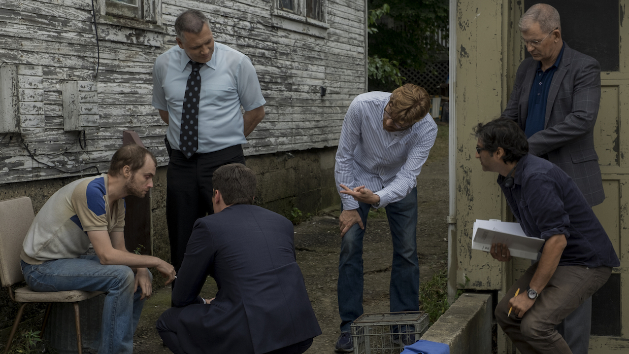
 Erik Messerschmidt (fourth from left in striped blue shirt) on the set of Mindhunter (Photo by Merrick Morton)
 When mere mortals gear up for a job, they are restricted to selecting cameras currently in existence. Not David Fincher.
Fincher has long hated all the gak required to make a digital cinema camera functional: a wireless transmitter to get signal to video village, the add-ons to provide wireless iris and focus control, the assistant camera’s onboard monitor hanging off the side — all the things that turn a small, lightweight camera body into a labyrinth of cables and breakout boxes.
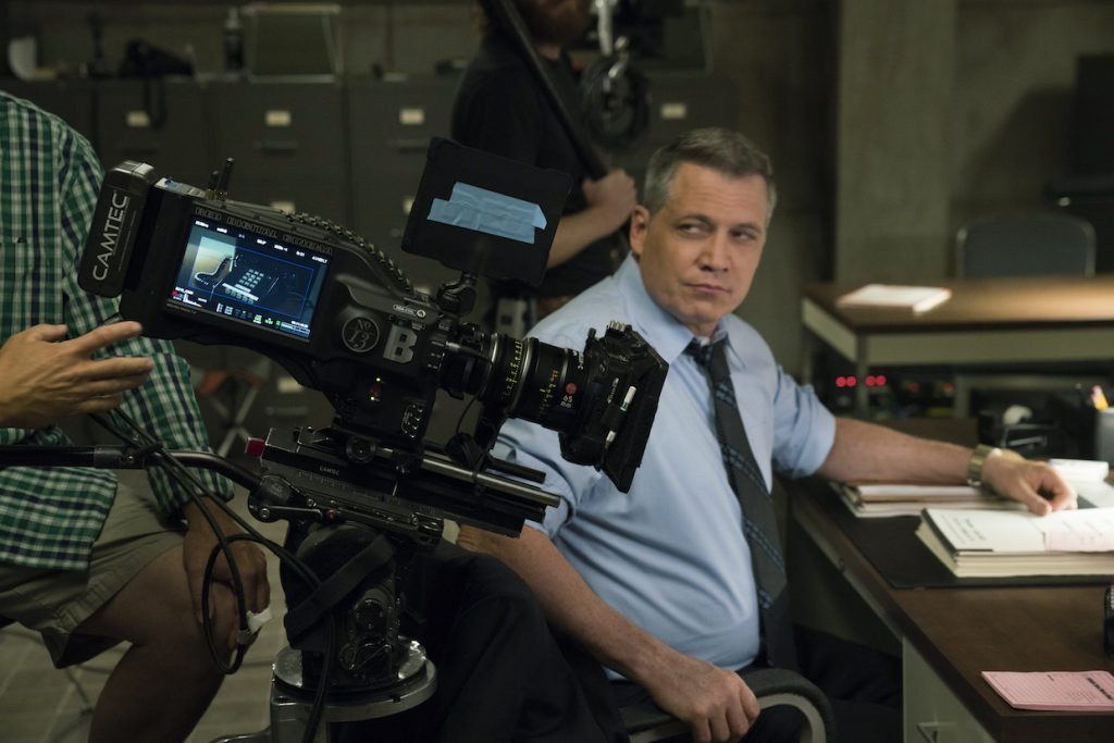
Red Digital Cinema responded by making Fincher his own set of custom Weapon Red Dragons for use on the new Netflix series Mindhunter—each with the features listed above built into an ergonomically friendly camera christened the Xenomorph. Put a lens on the front and a battery on the back and the Xenomorph is ready to rock and roll.
On Mindhunter, cinematographer Erik Messerschmidt reaped the benefits of that smaller camera footprint. Messerschmidt spoke to Filmmaker about his work on the new series, which follows the fictionalized story of the agents (Jonathan Groff’s Holden Ford and Holt McCallany’s Bill Tench) who started the FBI’s psychological profiling program in the 1970s by interviewing incarcerated serial killers.
Filmmaker: While the characters of Holden Ford and Bill Tench are fictionalized, the serial killers in Mindhunter are real people and the interviews are set in the actual locations. What type of research material did you have access to?
Messerschmidt: The art department assembled a tremendous cache of reference material from the period, which was very helpful as we discussed space and set design. I also looked at a lot of still photography and film from the era for inspiration. Stephen Shore’s photography was particularly helpful.

(Above) Red’s custom Xenomorph in action. Messerschmidt paired the camera with Leica Summilux-C lenses, typically set to a T2.5. The 29mm and 40mm were the show’s hero lenses, though the 65mm was also used quite a bit for close-ups. A 180mm Zeiss Ultra Prime and a pair of Fujinon Premiere Zooms (75-400mm and 24-180mm) day-played occasionally for specific scenes. (Photo by Patrick Harbron)
Filmmaker: Which record mode did you use on the Xenomorph? I know Fincher likes to have a little bit of a buffer to reframe and add stabilization in post.
Messerschmidt: We shot 6K 2:1 with a 5K center extraction. This method gave us tremendous freedom in post for stabilization and re-framing when necessary. The editors work with a lot of split screens, so having the extra room to reframe and adjust in the cut is very helpful in that process.
Filmmaker: What is the intended aspect ratio? I read it was 2:1, but when I take a frame grab of the show on Netflix the dimensions are more like 2.2:1.
Messerschmidt: You are very thorough. The aspect ratio for the release is 2.2:1.
Filmmaker: How do you determine exposure for a scene? Red has all of these exposure tools on its LCD monitors – a histogram and then proprietary gauges like their goalposts and stoplights. How much do you use those Red tools?
Messerschmidt: Our joke on set was that the exposure was correct when the shadow goalpost was pinned and the histogram was all the way to the left. (laughs) The toe of the Dragon sensor sees for miles into the shadows, so I didn’t worry too much about the noise floor and shadow detail, although it’s important to keep an eye on it. I didn’t need a lot of protection in the highlights, so I rated the camera at 640 ASA for a little more dynamic range into the shadows. Part of rating the camera at 640 was to protect myself in the event I went too far with underexposure, especially as so much of the lighting style lived in the lower third of the sensor’s dynamic range. I did use the goalposts and stoplights when working outside, but I primarily work with a waveform. I like the waveform because it tells you exactly where your exposure is within the context of the frame. This helps so much with matching lighting shot to shot. It’s like a digital spot meter. Common working practice suggests that one should expose the histogram to the right while protecting highlights, but personally I find it very difficult to work that way. It’s more fun to be on the edge of too thin. For day exteriors, I still use a light meter to check myself. Depending on the scene I usually would play sunlight one to two stops over. Overcast days I would often expose at key or a bit under if the scene called for a some mystery.
Filmmaker: How do you monitor on set? Monitoring in RedColor2 and RedGamma4 are going to give you an image that’s much contrastier and more saturated than the final look of Mindhunter. Did you make adjustments on the Red itself—dialing in saturation levels and tone curves directly into the metadata? Did you have a DIT live-grading?
Messerschmidt: Our monitoring philosophy was to keep it very simple. David hates having extra stuff around, so I didn’t work with a DIT or a separate lighting monitor. We viewed in DragonColor2/RedGamma 3 on two Sony 25” OLED monitors. I calibrated the monitors myself to Rec709. RedGamma 3 is slightly lower contrast than the more ubiquitous RedGamma 4 curve, so it’s a better match to the final grade. I like to get the dailies as close to the intended look as possible through exposure, white balance and lighting alone, knowing we can tweak further in the DI. I don’t like to live grade. I’ve found in the past that it can be a bit of a crutch and I end up chasing my tail and getting lost in terms of contrast and gamma. I think for season two we’ll likely go to a single in-camera LUT based a bit more on the look and gamma curve we settled on in the DI (of season 1).
Filmmaker: I’ve got a couple of frames here from different locations that all have this yellowish hue. How do you get that look?
Messerschmidt: The yellow tone we arrived at for many of the night interiors comes from a combination of lighting, kelvin settings and, of course, color correction. Many of the interiors were shot at 3800 or 4000k with 3200k incandescent balanced light sources. Practicals can end up playing even warmer, especially through lampshades, so it’s very important to keep an eye on them. In some situations where the practicals felt too red I would cool the camera back down toward 3200k and we would adjust further in DI where we had more flexibility.
I love the scene in the bathroom with Debbie and Holden (top row, far right). The entire scene is lit with the mirror fluorescent and a little catchlight for Debbie’s eyes. We changed the tubes to 3200k fluorescents but they still have a bit of green in them, which I liked. I put the camera at 3800k which exaggerated the yellow tone.
For the motel scene where Holden is eavesdropping while Bill Tench is talking to his wife we lit the entire scene through the window (top row, far left). It’s really down there and I was pretty worried I had gone too dark but I think it works for the scene.
Our first meeting with Benjamin (bottom row, far right) in his apartment is mostly lit, or at least motivated, from the practicals in the set. We find out later that Benji has somewhat “set” the scene for them so it’s all very “arranged.” I thought it would be cool if the exterior light hardly penetrated the set at all so there are a couple shots, like the ones of Detective Ocasek, where you get a sense of the outside world but the audience is still very much inside with Benjamin and the agents.
Filmmaker: Seems like almost every car scene I see now in a decently budget film or TV show is done in a studio with plates whooshing by out the car’s window. What are your tips for actually crafting believable car shots in this style?
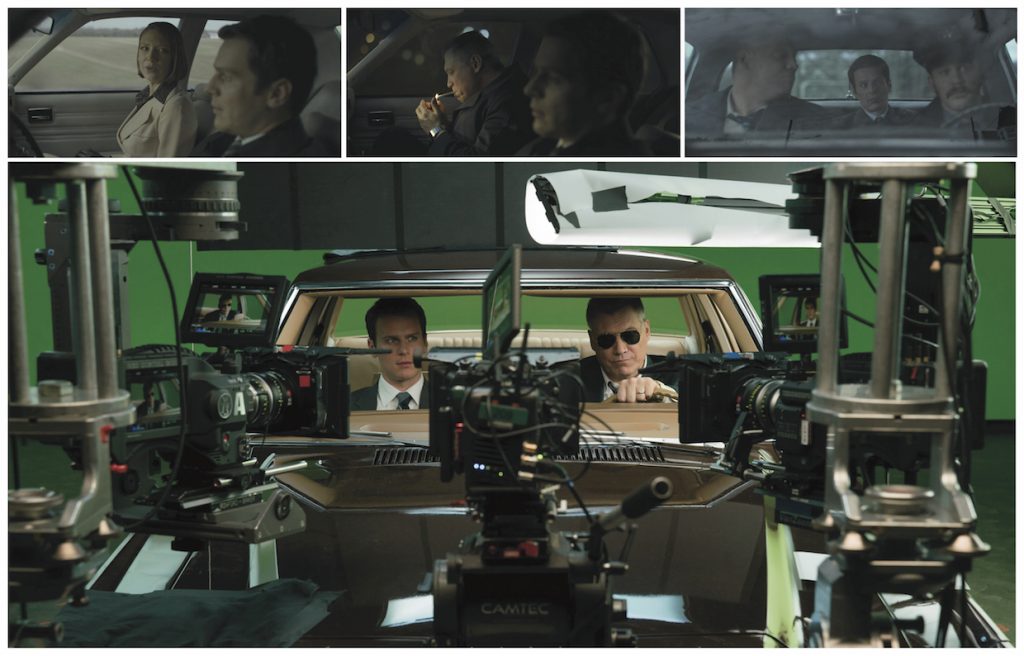
Messerschmidt: Car scenes are often about exposition and information. In our show, the cars are places where the characters reconcile the information they have just collected. The problem with actually shooting in a real moving car is that there are so many variables that are counter to the process of acting and directing. Just moving the camera to a new angle is incredibly time consuming, so it’s very difficult to give the actors and director the space and time to work. It’s for that reason that Fincher chooses to shoot car scenes predominantly on stage with green screen.
I think the giveaway that any process shot is fake is when there are incorrect or completely absent reflections. Cars are full of shiny surfaces (chrome, vinyl, glass etc), so it’s very important that the reflections on those surfaces not only feel real, but also match the plate in the greenscreen comp. For example, if the characters are driving down a country road in the winter, the audience should feel the dormant trees reflecting in the mirrors, windowsills and dashboard of the car. On Mindhunter we do a lot of work with LED video walls to help with this problem. Our technique is to always shoot the plates before we shoot any of the interior elements on stage so the plates are available to use as interactive lighting elements. We feed the plates into the video wall, which in turn serves as the primary lighting source in the car. It’s an interesting and very effective technique.
We discuss the blocking and coverage of the car scenes in advance with each [episode’s] director to make sure the appropriate plates are shot with accurate focal lengths and pan and tilt angles. I think the audience can always tell if a plate has been skewed in post to cheat perspective, so it’s crucial that the plates are as close to the first unit coverage angles as possible.
Filmmaker: One my favorite aspects of Mindhunter is the precision of the frames. There’s something almost mathematical about the way the characters are arranged, like each frame is a geometry problem to be solved.
Messerschmidt: Blocking is one of my favorite parts of the process and the style and approach of Mindhunter is very much about structured staging and camera direction. Typically we would start each scene with a rough blocking rehearsal without the camera. It’s, of course, really important for each scene to have some basis in reality, so the actor’s positions and action are motivated by the story, the set and their character. Often we had pre-discussed specific moments that we wanted to highlight with a cut or a close-up, dolly move etc., so sometimes the blocking revolved around a specific camera choice, but it all depends on the scene and the director.
After we had the rough staging we would bring the camera in and look at the scene through the lens. If adjustments to the blocking were required to work within the frame, we made those next, always with the actors and not the stand-ins. Usually we would start with a master shot, or at least the widest shot of the scene, to commit to continuity and staging. After our screen direction was established we would lay out the coverage as needed to support the master and the cutting sequence.
The style of the show doesn’t allow for much improvisation, at least from a staging standpoint, so the actors commit to their marks and action in the rehearsal. If during shooting we discover that something isn’t working in terms of performance or action we’ll obviously make an adjustment, but any changes are usually made while we shoot the master so that everything is worked out by the time we go in for further coverage. It’s a very classic style of working and I think it leads to a very disciplined looking show.
Filmmaker: I had a preconception that the show was going to be more of a murder mystery or a thriller. But Mindhunter is mainly a character study that unfolds almost entirely in long conversations. What are the challenges to make that interesting? For example, in episode five there are three scenes with three different suspects in the same interrogation room. How do you keep that from feeling redundant?
Messerschmidt: I think it’s paramount that the camera never distract from the story, especially in a dialog driven drama like Mindhunter. So I wasn’t necessarily looking to always “make it interesting” visually. A lot of the drama comes from what is not said or the subtext of the dialogue, so having lots of coverage and options for the editors is really the priority on a show like this. Mindhunter is so much about how and when the characters learn information, so a lot of it is about pace and tone.
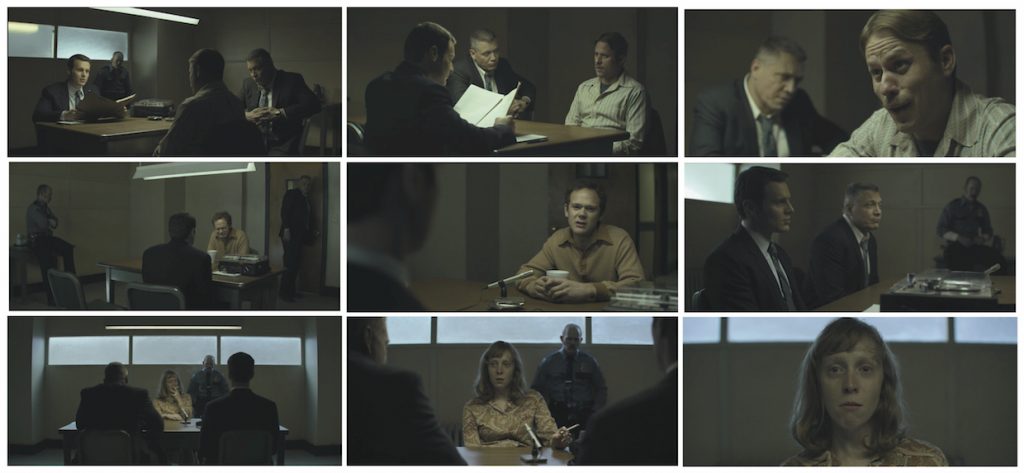
We tried to approach each scene with realism in mind, at least in terms of lighting. So in many cases the set’s practicals lit the actors. In episodes five and six there are multiple interrogations in one set with the three suspects in the Beverly-Jean Shaw murder, and neither the audience nor our heroes are ever quite sure who is responsible. We lit all the scenes with one overhead fluorescent tube. Gaffer Danny Gonzalez and I played a lot with shadow and color to try to make that place feel claustrophobic. When Holden and Tench are interviewing Benji (middle row of frames) the first time we kept the camera away from the action; most of the scene plays in two shots and wider mediums of Benjamin. When we see Benji again after Rose has told her side of the story, we’re much closer and on top of Benjamin with wider lenses, because Holden and Tench are much more aggressive in the second interview.
When we did the blocking rehearsal of the Frank interview (top row of frames), [Jesse Boyd, the actor playing Frank] leaned back out of the top light and into the shadow at the end of his scene. It was one of those happy accidents we didn’t initially orchestrate; it’s just something he did. I love that moment.
That particular interrogation set was very graphic and rectilinear but most of the camera angles in the scenes with Benji and Frank use the perspective of the table for depth and not necessarily the architecture of the room. In the Rose interview (bottom row of frames) we went for a more orthographic presentation of the space. I love the wide shot as she lights her cigarette before going into her story. There was something about presenting that scene in a very square proscenium style that I thought was interesting.
Filmmaker: To finish up, can you break down your approach to each of the four serial killer interviews from Season 1?
Messerschmidt: [Cinematographer] Christopher Probst first set the tone for the Ed Kemper interviews [with the work he did shooting] episodes one and two. When the show went back to shoot more Kemper scenes later in the season I used a similar approach to what Chris had implemented. The Kemper interview room is very institutional, almost banal. The original concept was that the California Medical Facility might not necessarily have had a formal interview or interrogation room, so it’s a bit of an ad-hoc space adjacent to the prison library, like a reading room. I used the overhead fluorescents as the principal light source, with a little bit of daylight creeping in through the windows. Episode three has two Kemper scenes with a time break in between, so we changed the color and quality of the light in the windows to help show the change in time.
For Jerry Brudos’s scenes [production designer] Steve Arnold built an amazing set inside a prison gymnasium – he designed a chain link cage inside the larger room of the gym. Our characters are supposed to be in Oregon to interview Jerry, so I wanted to use very subtle cool northern light in the windows to help establish place. I worked again with the overhead fluorescents as the main source of light. It’s how I imagine that space would look if it really existed in the Pacific Northwest. Those scenes took about a week to shoot, so key grip Paul Goodstein and his team built an enormous tent outside the windows. The interior of the tent was white. Gaffer Danny Gonzalez filled it with three or four 18k fresnels to create a bounced ambient soft source that we knew would stay consistent across the entire schedule. Paul had the idea to gel the windows with “half soft frost,” which is a shower curtain type material, and the set painters aged the glass to further obscure the source. I was really happy with the result. In the DI we took the whole scene towards cyan.
The Monte Rissel interview was a set that Steve Arnold built on stage in Pittsburgh. Again, it’s intended as a bit of an ad hoc private space the prison officials put together so the agents could have some privacy with Rissel. We had already done a lot of warm top light in the show and Monte’s story is so graphic and descriptive I didn’t want there to be any warmth on him at all. The room should feel cold and soulless. We pushed quite a bit of HMI daylight through the windows of the set through multiple layers of diffusion. I think we had a couple of 20×20 muslins with grid cloth in between. The windows acted like little apertures, keeping the light off the walls. Since we had such large sources outside the fall off feels natural and motivated. I love the close-up shot of Monte in the second scene where he’s telling his story and finally opening up to the agents. In the rehearsal he turned toward the window, so we put the camera dead on him for that moment. I love the way the soft front light looks, especially since so much of the scene plays in shadow with sharp backlight. It’s almost a cathartic moment for Rissel and a very formative moment for Holden and Tench.
The exteriors and most of the prison cell scenes for Richard Speck were shot at Moundsville State Penitentiary in West Virginia. Moundsville is a classic Gothic style stone prison built at the end of the 19th century. It’s very striking and imposing. The interview set was a stage build that Steve Arnold designed. Fincher joked that it should look a little like Dracula’s breakfast nook, so we kind of went for that. With that idea in mind, I thought it would be cool if we had a chandelier type fixture over the table and Steve agreed. He designed and built the light bulb fixture that ultimately did most of the lighting for the scene. We used a lot of smoke in that set, because the exposure was so far in the toe so the smoke helped lift the shadows a bit. In DI our colorist Eric Weidt was able to find a really nice yellow tone for the scene. Initially the set looked rather red/brown in dailies because of all the incandescent light and I’m really pleased with how it all turned out. I think it’s one of my favorite scenes in the show.
Matt Mulcahey works as a DIT in the Midwest. He also writes about film on his blog Deep Fried Movies.


