The Clear Identification of Priorities: Ricky D’Ambrose on Being His Own Graphic Designer
 Detail of the poster for Notes on an Appearance
 It was apparent early on that I would design most of the paper props for Notes on an Appearance: The film’s predecessor, a short called Spiral Jetty, relied, in a similar way, on a cache of fictitious newspaper and magazine clippings. Both films were made quickly, with meager ledger books (Spiral Jetty, if memory serves, cost less than $500; Notes on an Appearance was shot, edited, color-corrected and sound-mixed for less than $30,000); and both films were made without much infrastructure, relying on small, resourceful crews. Under these conditions, I became the films’ art director and production designer, learning and perfecting a rather straightforward method for designing, printing and video recording an invented archive of paper documents modeled on existing sources. (Before the shoot, I maintained a file of cutouts from print editions of The New York Times, The Washington Post, The New York Review of Books, New York Post, among others. Selections were scanned and imported to Photoshop; article layouts—composed in 4×3, to match the dimensions of the film frame—were based on these reference clippings, complete with identical typefaces and matching character spacing and leading; the results were printed on newsprint or white inkjet paper, taped to a wall and recorded.)
Learning design was, for me, largely a matter of imitation. As a child, Microsoft Word seemed like a great discovery, a way to play at being a grownup: Suddenly, I could traffic in the official documents of the adult world, turning out dinner menus and letterhead and brochures for the many businesses of my fifth-grade imagination. But I was also learning to experience text visually, as something that could be graphic and image-like—as something to look at as well as to read. (This undoubtedly appealed to my decidedly unliterary 10-year-old self, who devoted most of his time outside school to painting and drawing.) And although I didn’t realize it at the time, it occurs to me now that this somewhat lonesome childhood education in the existence of—and apparent differences between—Arial and Gill Sans coincided with another great early discovery: filmmaking.
Shooting and editing on VHS, as I was, meant thinking about how videotapes could be presented—and thinking about how videotapes could be presented meant paying attention to home-video packaging, especially during my frequent trips to the video section of my neighborhood public library, on Long Island. Later, with the onset of digital video, VHS boxes were replaced by DVD cases, and with these new cases came new ways of thinking about design, abetted by the Criterion Collection and its special commitment, unique at the time, to elegant DVD editions. Among the initial revelations: Lucien S. Y. Yang’s four covers for the box set of Truffaut’s Antoine Doinel films; James Tung’s cover art for The Shop on Main Street; Eric Skillman’s designs for Scenes from a Marriage, Il Posto and The Silence; Christine Ditrio’s work for À nos amours. With a flatbed scanner, I could digitize these designs, enlarge them on my computer monitor—and ultimately learn from them.
Having devoted much time to looking at and thinking about—and ultimately producing—type, it never occurred to me that someone else should design the poster for Notes on an Appearance. I was (and am) very fortunate to work with an extremely sympathetic U.S. distributor that trusts my instincts and that has given me permission to design not only the film’s theatrical release poster but also its DVD packaging and menus. As a rule, though, these materials would avoid mimicking any of the newspapers and magazines shown in the film (i.e., the title wouldn’t appear in the style of a New York Times or New Yorker headline; the names of cast and crew members wouldn’t simulate newspaper article bylines). And vis-à-vis the film’s narrative, all artwork would be relatively neutral, centered on blocks of text and color that give the film a lucid, unfussy visual identity that isn’t merely illustrative. Proceeding in this way meant that the film’s promotional materials wouldn’t be parasitic: There was no need for posters and press kits and postcards to mimic, soak up, assimilate the content of the film. Rather, the design elements would be made to stand somewhat on their own, independent of the film, without direct reference to its characters or plot. (This is one reason why Rockwell, the typeface used for the film’s end credits, never appears anywhere on any of the promotional artwork for Notes on an Appearance. For the latter, I used Akzidenz-Grotesk, an early sans-serif typeface popularized by the twentieth-century graphic designer Josef Müller-Brockmann, whose championing of grid systems and whose flawless posters and advertisements were extremely relevant to my thinking for Notes on an Appearance.)
I like something Müller-Brockmann said in an interview once: “I have always aspired to a distinct arrangement of typographic and pictorial elements, the clear identification of priorities. The formal organization of the surface by means of the grid, a knowledge of the rules that govern legibility (line length, word and letter spacing and so on) and the meaningful use of color are among the tools a designer must master in order to complete his or her task in a rational and economic matter.”
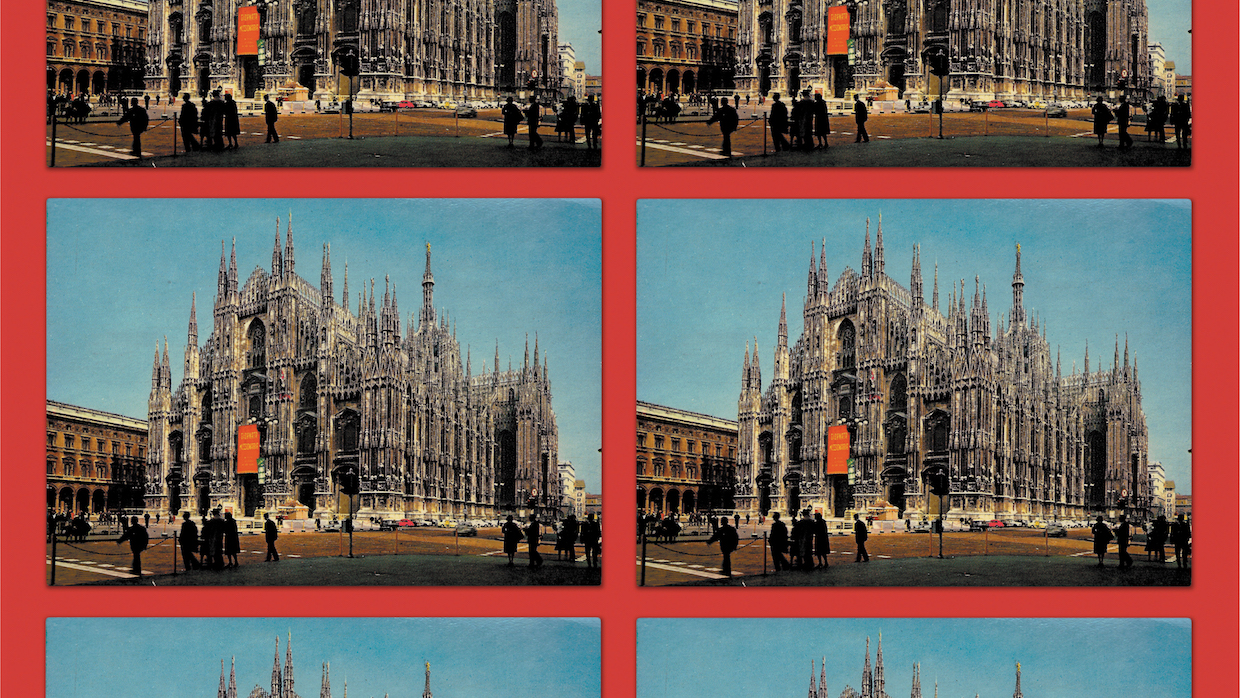
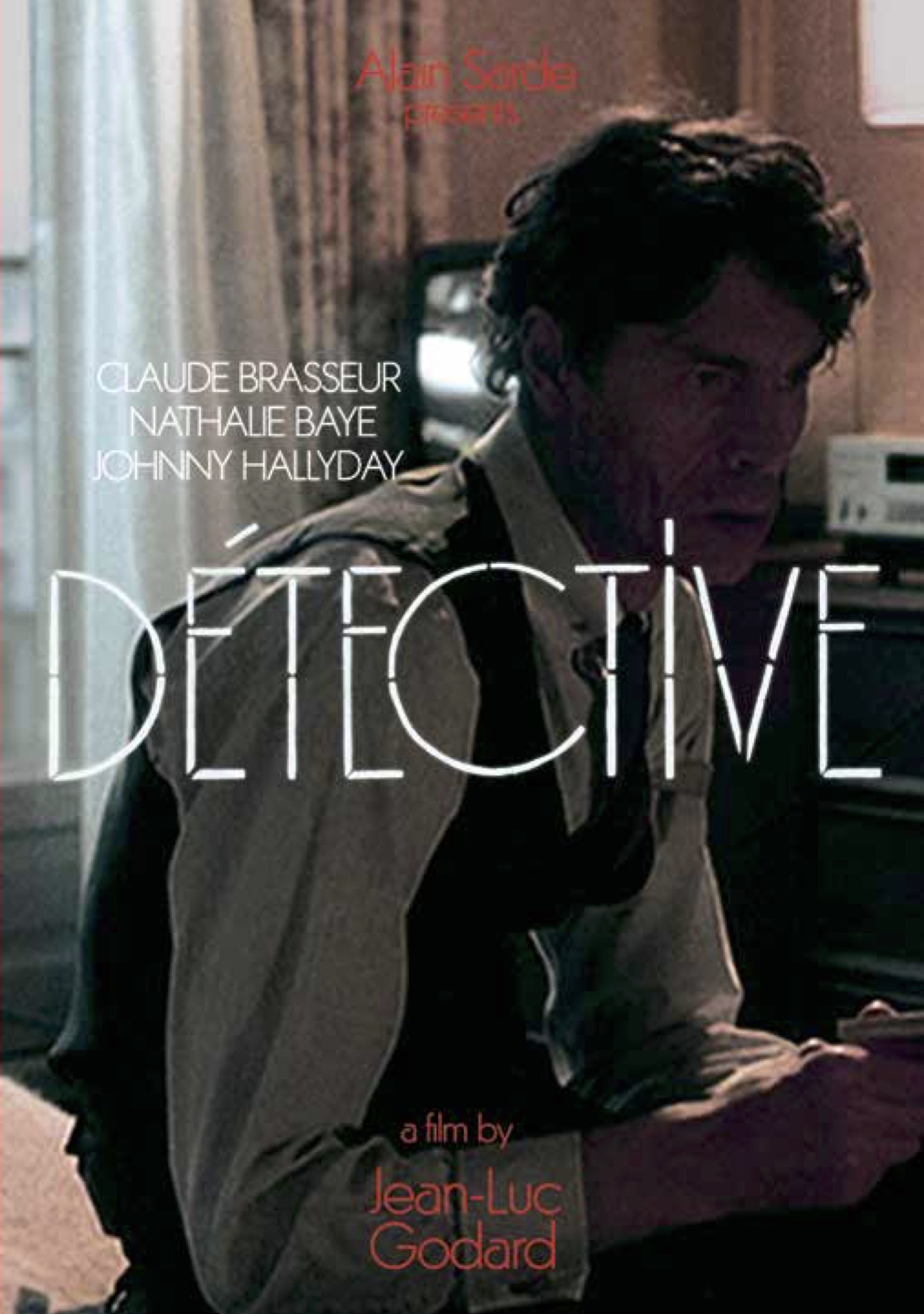
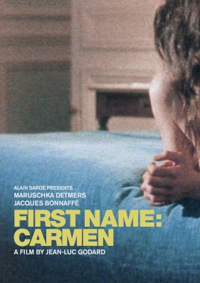
The goals, then: economy, condensation, mystery. And repetition. Maybe this is one area where the film’s graphic design harmonizes in some way with the film’s content because Notes on an Appearance is patterned by an obsessive repetition of events, which more often than not obfuscate, rather than clarify, the motives and circumstances of the film’s characters. Hence, the final poster design, with its grid of postcard views of Milan Cathedral, set against a solid red field. (I didn’t realize it at the time, but the conceit owes something to the serial images of the American artists Ed Ruscha and Douglas Huebler. Ruscha’s book of photographs, Twentysix Gasoline Stations, is an especially useful, if unintended, point of reference here.) These seem less like studied design preferences than intuitive choices, guided by a few questions: Is the design, first and foremost, pleasing to the eye? Are the design elements clear and limited in number, and, if they are, are they balanced in relation to one another? Is the design rhetorical, figurative, a recapitulation of “theme” or “mood” that grossly overstates the film? Does the design have independence and impersonal character? Does it complement the film—or overwhelm it? The design for the packaging of the film’s DVD release was guided by these questions, and, I think, so were my cover designs for the recent U.S. home video releases of Godard’s Detective, Hélas pour moi and First Name: Carmen.