Shutter Angles
Conversations with DPs, directors and below-the-line crew by Matt Mulcahey
Jellyfish Flares, Malick Homages and “Igor, the Possession Lens”: DP Caleb Heymann on the Fear Street trilogy
 Fear Street: 1994
 “A Film Trilogy Event.” That’s how Netflix heralded the arrival earlier this month of Fear Street, a trio of interconnected horror movies based on R.L. Stine’s popular book series that debuted on the streamer in one-week intervals.
That wasn’t exactly the plan when cinematographer Caleb Heymann stepped onto the Georgia set in March of 2019 for the first of 106 days of shooting. As production began, Fear Street was a 20th Century Fox endeavor with a theatrical release planned.
However, Heymann says he wouldn’t have altered the films’ style regardless of the distribution method.
“I don’t think [the viewing platform] has to change your approach,” said Heymann. “With a decent internet connection and a 4K OLED TV, the home viewing experience can give theaters a run for their money, just from a technical standpoint of viewing. Over the lockdown I bought a new OLED TV and streamed all these classic 70s and 80s films remastered in 4K and the detail was gorgeous. You could really see all the film grain and subtle details. It was a cinematic viewing environment.”
As for less-than-cinematic viewing environments, Heymann accepts that inevitability: “You just try to put out of mind that others will be watching it on their phones while riding the subway, but that’s no worse than in the SD days with pan and scan for VHS.”
Set in the neighboring towns of affluent Sunnyvale and downtrodden Shadyside, the first Fear Street film, 1994, harkens back to the end of that VHS era with a Scream-adjascent slasher tale. The second entry, 1978, pays homage to the Friday the 13th epoch, while the final entry, 1666, unfolds the origin story of the witch who haunts all three tales.
With the films now all streaming on Netflix, Heymann talked to Filmmaker about the challenges of differentiating and unifying the look of the Fear Street trilogy.
Filmmaker: When Netflix picked up the movies, were they already completely finished or did you have to do any additional work for them like a High Dynamic Range (HDR) pass?
Heymann: By the time we got into the color grade, Netflix was the distributor, and I was already in Atlanta shooting season four of Stranger Things. I had to give feedback remotely, but we were very fortunate to have an amazing colorist in Skip Kimball. So, we were watching it in HDR, but intentionally not going too crazy with the HDR pass with crazy bright highlights or anything. Skip was able to make sure the [HDR and Standard Dynamic Range] versions lined up nicely.
Filmmaker: Break down the schedule for me. This was a 106-day shoot, which comes out to about seven weeks per movie. Was there a week or two of downtime between the films to do additional prep for the next installment, or did you do preproduction for all three movies before this marathon six-month shoot?
Heymann: It was definitely ambitious to make three films of this scale in that 106-day shooting window and you had to move fast. Originally, [director] Leigh Janiak and I were just going to do Part 1 (1994) and Part 3 (1666). We prepped them together. I think I had about six weeks prep at the beginning, then went straight into shooting the 1994 period. After 46 days of 1994, which included the ending of Part 3, we had to switch gears completely and start a whole new movie in the 1666 village the next morning. We left behind the dollies and Steadicam in that UV-lit mall [from 1994] and went fully handheld, which was a shock to the system but also refreshing and helped us quickly adjust on the fly for 1666. It also helped that Leigh has this incredible ability to keep all these interconnected stories in her head and is really good at quickly making decisions and knowing if she loves or hates something.
Originally Part 2 (1978) was going to be another director and DP, but things changed kind of last minute and Leigh and I were asked to do it. We had two weeks to prep the movie, but the script was changing and we had to do tech scouts before we’d really even gotten into shot listing. So, there was a lot of freestyling going on with that one, but at that point we’d all been working together for many months, so there was very much a groove that I think allowed us to be bold and take chances.
Filmmaker: You shot on Alexa Minis with Panavision T Series anamorphics. The T Series is an interesting choice. You’re doing essentially three period films, but you went with the newest Panavision anamorphics.
Heymann: From the beginning we liked anamorphic lenses because of how they harkened back to the look and texture of ’90s films like Scream and so many films we grew up on. I spoke to Panavision’s Bob Foertsch and Dan Sasaki and we looked at images from my lookbook and how we could translate that optically. Dan showed me his ability to de-tune the T Series to get different looks, so we could have some subtler aspects of vintage optics, like a slight halation or softer edges and different types of flares, while still having the mechanical advantages of the newer lenses that help with focus and reliability and having multiple cameras. Dan could control seven different parameters to help us subtly craft the different looks for each time period, and I just felt super spoiled, honestly.
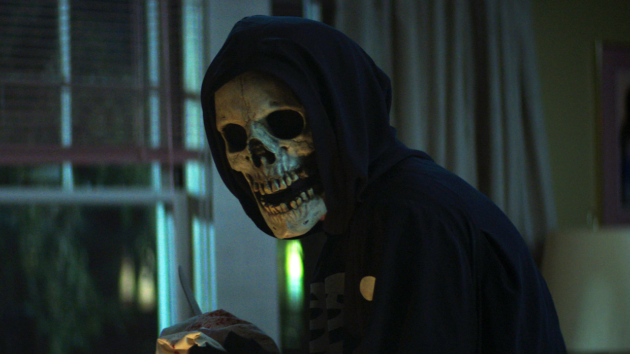
They also made us these awesome custom lenses. We were talking about what Roger Deakins did with portrait lenses on The Assassination of Jesse James by the Coward Robert Ford and how we could do something along those lines. We tried a few things and Dan ended up taking an old Russian Petzval lens and adding anamorphic elements to it. Every time we went into “possession mode” as the witch’s power takes hold, we’d call for either Ivan (the 58mm) or Igor (the 85mm).
For 1978, we pushed the de-tuning so that we had a warmer tone with less contrast, softer corners and these bonkers flares that looked like jellyfish. We also wanted to lean into the zooms and Dan was able to give us a couple zoom lenses that matched well to the de-tuned T Series.
Filmmaker: These are three distinct movies set in different time periods, but they also essentially have one long story arc. How did you approach differentiating the films while all having some unified elements across all of them?
Heymann: From the beginning there was this notion that the camera movement for Part 1 (1994) would make use of more modern technology for an expressive mix of dolly, Steadicam and Technocrane. In the late ’70s, the Steadicam had just been invented and we leaned into it heavily for 1978, which helped with the terrain of the summer camp and our crazy schedule that had us moving fast each day. We had two Steadicam operators throughout the shoot and would at times stage scenes to accommodate these “dueling Steadicams.” Then, going back in time to 1666, we stripped all the technology away and went for a barebones handheld approach that I think gave the scenes an important sense of immediacy and subverted the expected classical approach to that period. Leigh told me and Nick Müller, our amazing A-cam operator for all three films, to watch Soderbergh’s The Knick (for inspiration), which was an incredibly visceral experience of handheld where the camera is allowed to freely roam. Another touchstone was [Terrence Malick’s] The New World.
Another layer of the look had to do with the lighting, contrast and color. When I started prepping the film, Leigh sent me our production designer Scott Kuzio’s lookbook and it turned out we’d both independently pulled several of the same photographers into our references that we’d pitched—Gregory Crewdson, Ryan McGinley, Philip-Lorca diCorcia—and sometimes literally the same photographs. I took that as a good sign that we were on the same page and tried to keep those images and that tonality in mind when lighting Shadyside as we began work on 1994. Shadyside was going to be dark and hazy with deep shadows, potential trouble lurking wherever you go. The way the look evolved was driven largely by lighting, moving from a sort of garish palette of colorful lighting for the ’90s defined by neon and colorful practicals, to a more stripped down but still colorful approach to 1978—golden sunshine with deep shadows by day, pools of warmed-up tungsten and uncorrected fluorescent at night. Then, for 1666 we get to fully strip away the artificial lighting with natural light and firelight. It was a light-loving DP’s dream to have that sort of scope.
There were things we did differently with filtration and camera ISO to further enhance this look, like pushing the ISO range a stop for a grainier feel or using low con and colored filters for 1666, but other elements stayed consistent throughout. Some parts of our Fear Street visual grammar—like being up close to our actors on a 40mm anamorphic with very tight eyelines and plenty of push-ins—stayed consistent throughout the three films, as did our rules for when we would throw in a Dolly shot or break out “Igor, the possession lens.”
Filmmaker: One of the most striking parts of the first film – which also appears in the later movies to a lesser extent – is your mixing of color, particularly using multiple colors on faces.
Heymann: That’s cool you felt that. I’m obsessed with color contrast, so I’m always looking for ways to motivate that within a scene. I wanted the scenes with [1994 protagonists] Deena and Sam to always have this mix of warm and cool light that hopefully reinforces the hot-cool tension that runs throughout their relationship. So, when you see them together [initially] they’re under cool white fluorescents with just little pockets of warm sodium far off in the background. Then, [at the end of 1994], when they’re finally reunited, it’s predominantly warm tungsten lamp light with blue accents in the background—the inverse of where it started. I’m not sure how much it really matters to anyone, but I like thinking it may have some subtle, subliminal effect. [When we were mixing colors in the frame], often it was a matter of having a warmer and softer more flattering light on the face with harder and more colorful light in the background, but I also really enjoyed working sometimes with a sort of “two-toned” key light effect for some scenes. If you’re throwing two different colors of light on an actor’s face from one key side, it’s easy to mess it up and just have them cancel each other out, where it ends up neither here nor there color-wise. But if you separate (those two lights) with a bit of distance and a flag and have one more “sidey” or one more “toppy,” then you can get this interesting effect where the contrasting colors create a bit more dimension to the face, and you can still get dark shadows on the side near camera.
Filmmaker: No matter the situation—underground witch cave or bright day exterior—you get these nice eye lights. What’s your technique?
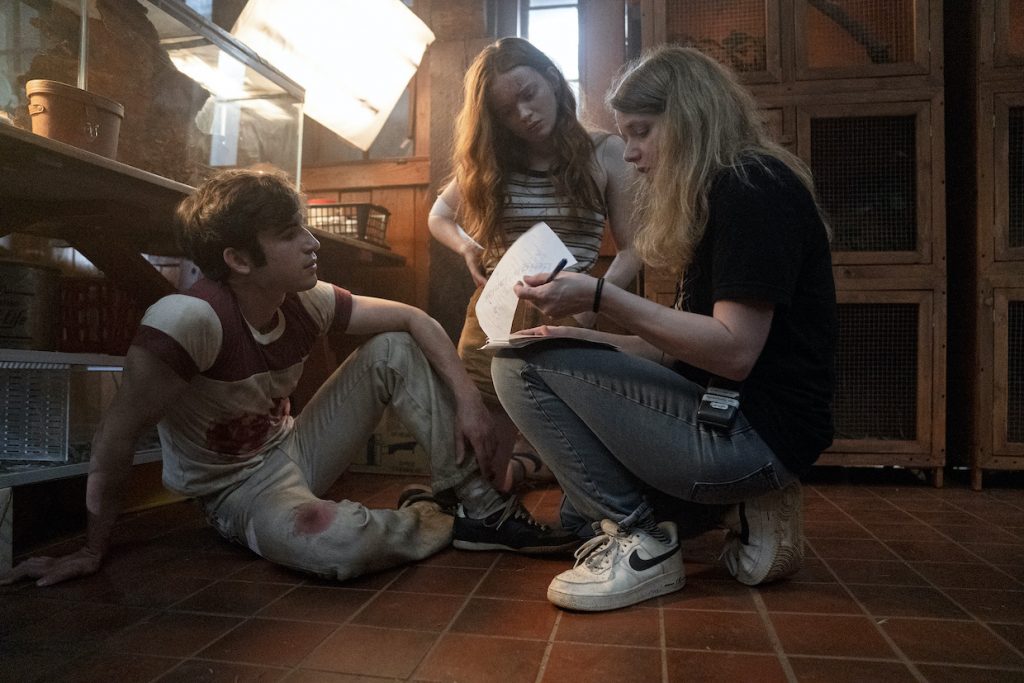
Heymann: I like using multiple soft lights from the key side so that the one nearest the camera can be dimmed down to where it just catches the eye on the fill side. We had these lights that were basically mini book lights—Astera Titan tubes stuck to Coroplast and diffused through muslin [seen in the production photo above]—that were RGB and fully battery powered. So, you had the effect of a bounced light further diffused through muslin, but [the entire book light set-up] was only a couple inches thick and could be made into different sizes. We could throw two up to create about a six-foot long key light and maybe have the one nearest camera dimmed down, which is just faster and more controlled than having to deal with larger frames. Speed was important because we were shooting about 35 to 40 setups per day, as Leigh wanted to have a fast-paced edit. So not always having to run power to each unit saved us a lot of time.
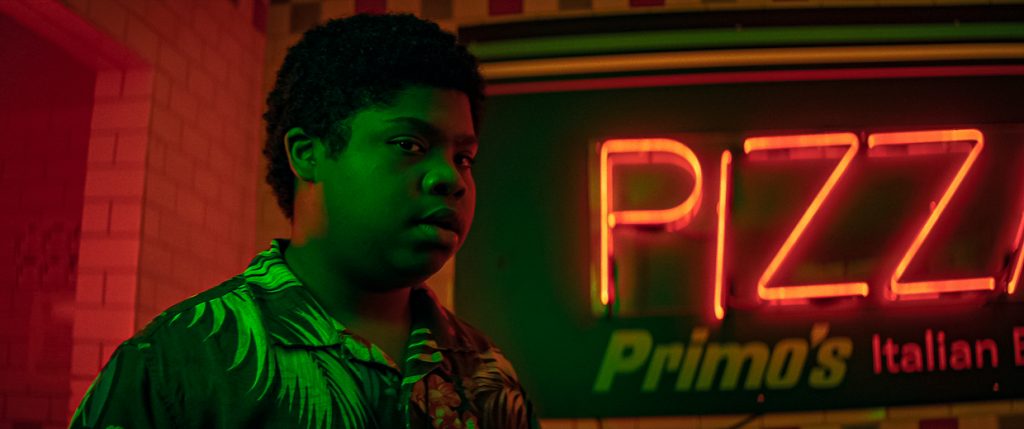
Filmmaker: The opening mall scene for 1994 is a Scream homage in terms of the score and some of the framing, but you make it your own with vivid primary colors. They reminded me more of Italian horror—Argento or Bava—than ’90s slasher revival.
Heymann: There’s this South African photographer, Elsa Bleda, who does these striking city nightscapes, often under neon light, and I definitely found inspiration in her work. Maybe on some subliminal level Suspiria was an influence, but, consciously, it came more from wanting 1994 to have this embrace of bold color and all these artificial sources that would not be there in 1978 or 1666 and would set these periods apart visually. I really love how these super saturated neon mall signs bounce around all the shiny glass and tiled surfaces at night when you turn off all the other lights. The pockets of colored light could help orient you in space to differentiate where you are in the mall, but they could also disorient you like in the Spencer’s Gifts-type shop with the blacklights and cheap plastic toy lights with names like “aurora borealis.”
Filmmaker: The witch’s curse in 1994 is set in motion by a crash involving Shadysiders on a bus and Sunnyvalers pursuing in a car. What were the challenges of mixing the stage work of the bus interiors with the location stunt pieces?
Heymann: That one was definitely a challenge because we had all these beats inside the bus where the characters needed to interact with the car outside—opening the bus door, throwing the Gatorade cooler, and causing the car to swerve and crash. The bus interiors had to be shot on stage, whereas the exterior shots where the cars are swerving were second unit on location until the car finally crashes, at which point we’re main unit on location. For a section like that to work it really helps to have it storyboarded. So this was one of the few times we used boards.
For the bus interior on stage, we didn’t have the budget to build LED walls just for this one scene so we had to come up with an array of lights outside the bus that would mirror the effect of moving streetlamps, then used Par cans outside to simulate the effect of the oncoming convertible headlights that flare and get Deena’s attention. 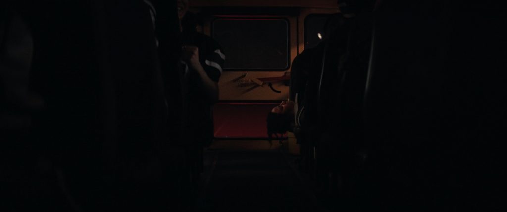
Filmmaker: I love that push-in you do on Deena down the bus aisle as the car approaches
Heymann: For that shot there was no room for a dolly, but we wanted that precision of movement so our awesome key grip Mike Duarte built us a rig that allowed the camera to travel down an I-beam that was mounted to the roof of the bus, allowing the camera to travel smoothly down an aisle that was only like a foot and half wide.
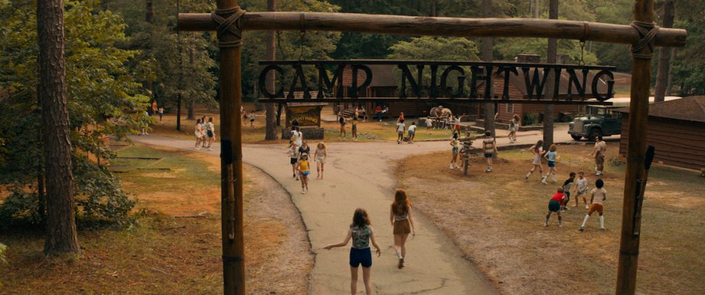
Filmmaker: Unlike 1994, day exteriors are a big part of the next two movies. For the 1978 summer camp, you have these warm, bright summer days. Then for 1666, the faces are largely in shadow even for those afternoon exteriors.
Heymann: From the script, it was clear we wanted to really feel the sun on skin and the golden sunlight of summer for 1978. We were lucky to have an awesome location that felt very authentic and had great windows to light from. Because the walls were dark wood, we could throw a lot of hard sun inside, then use the floor bounce to motivate warm light on the actors’ faces or take it away and go dark with the shadows. Most importantly, it had this lake that we could swim in at lunch, which was a must on those sweaty days where it was 96 degrees with 98 percent humidity in late summer Georgia.
For 1666, we wanted it to look like a Terrence Malick film, but due to our schedule we often had to shoot at the wrong time of day, i.e. when the sun was very high. To control the sun and create shade we had a 40’ x 60’ quarter grid silk hung from a construction crane that had a reach of about 250 feet, and at times that’s what allowed us to get a moodier or softer look when the sun was high. We also had a 20’ x 20’ solid black that we could drive around on a Pettibone and create negative fill on the faces so that we maintained those shadows.
Filmmaker: 1666 also has a few pre-electricity night exteriors. Cinematographers always seem to have very passionate opinions about how moonlight should look.
Heymann: From the very first chat with Leigh, she said she hated the way moonlight looks most of the time in films and especially in the woods. So, that was a bit daunting, but I got what she meant. It’s just so easy to screw it up or make it look artificial. Yet we had all these scenes in 1666 where that’s all you’ve got, including a full moon party in the woods at night. I think the key was keeping the moonlight dark enough and soft enough and then, wherever possible, contrasting it with either candles, lanterns or some firelight. Fortunately, the same construction crane that we used to diffuse the sun during the day could be repurposed as a 40’ x 40’ “moon box” for our night scenes and that gave us the sense of a soft moonlight. We planned the placement so that it could serve as a soft backlight much of the time and could be far enough away to cover a couple hundred feet with a natural falloff. When we went into the woods we used HMI balloons spaced out wherever we could fit them in the canopy and found good fire sources like double wick candles and lanterns that gave us long flames to get the most out of the fire sources. Even so, we were often on the verge of where the light meter stopped working—that last stop of a readout between 0.5 and nothing, and then Leigh would turn to me and ask, “Could we go darker?” It was such a gift to be able to work with a director with such a strong vision and constantly push each other creatively and go all out for the darkness, and to be able to photograph the beautiful sets production designer Scott Kuzio and art director Sean Brennan created that were so full of detail and authenticity.
Matt Mulcahey works as a DIT in the Midwest. He also writes about film on his blog Deep Fried Movies.