Shutter Angles
Conversations with DPs, directors and below-the-line crew by Matt Mulcahey
“It’s My Job to Make Sure That the Viewer Looks at the Right Thing”: DP Autumn Durald Arkapaw on Loki
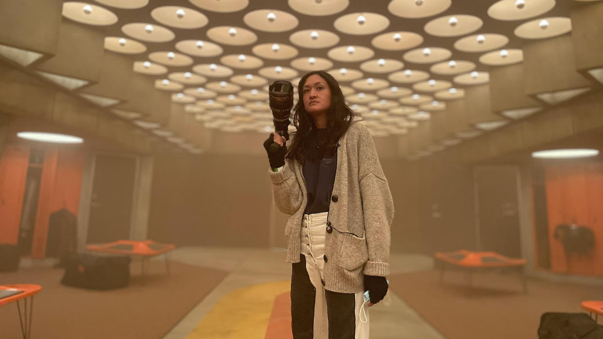 Autumn Durald Arkapaw on the set of Loki
 With two dozen films since 2008 and 60-odd years of comics, there’s a nearly infinite amount of source material to pull inspiration from when embarking on a new endeavor in the Marvel Universe. But what makes the new Disney+ series Loki such a visual delight is how it derives inspiration from beyond the bounds of that universe. Melding classic sci-fi and midcentury modern design, Loki is “Blade Runner meets Mad Men,” embedding the titular God of Mischief into a dystopian bureaucracy bent to the aesthetic peculiarities of Gilliam, Kubrick and Fincher.
With the show’s entire first season now available on Disney+, cinematographer Autumn Durald Arkapaw spoke to Filmmaker about her compulsion for symmetry, the delicate math of a balanced frame and infusing Loki with the vintage texture of 1970s cinema.
Filmmaker: Your last three features‚Mainstream, The Sun Is Also a Star and Teen Spirit—were all shot on Alexa Minis with Panavision C Series anamorphics. What lured you away to the Sony Venice and the T Series for Loki?
Durald Arkapaw: I’ve been very happy with the image quality that I’ve gotten from the Alexa Mini, but I did a Samsung commercial not long before Loki and the director had been using the Sony Venice. That was the first time that’s happened, where a director suggested a camera I hadn’t used before. S,o we went with the Sony Venice and Cooke Special Flare anamorphics for that commercial and it was just gorgeous. There’s something about how that camera renders color and contrast that I love. I started using it on other commercials and when Loki came up I had probably used it five times and I suggested it to [Loki director] Kate Herron.
I mostly work with Panavision—99 percent of the time—and usually go with my favorite, the C Series. But for Loki, we decided to shoot with modified T Series lenses to cover the larger sensor on the Sony Venice. The C Series can be aggressive if you’re looking for consistency in focals in a highly VFX’d show. Some of my favorite focal lengths in the C Series can be quite soft wide open, which I prefer to shoot, and they can have unique distortion and falloff. I had two references for [Panavision Vice President of Optical Engineering] Dan Sasaki: The Yards—James Gray directed and Harris Savides shot it—and then the original Blade Runner that Jordan Cronenweth shot. I wanted to try and get the quality of our modified lenses into a similar zone. So Dan, who’s a complete genius and so lovely to work with, took the T Series and infused some of the personality of the C Series into them.
Filmmaker: Which of the Venice’s dual ISO options did you use, 500 or 2500?
Durald Arkapaw: I shot the whole movie at 2500 ISO. I really love the flexibility of that camera. For me, it just renders such a nice filmic image with the right density. As much as I can, I want to make the digital image look like film. No one wants to watch—I say “no one” as if everyone has the same opinion of it as I do (laughs)—but when I watch a movie, I don’t want it to feel digital. I came up loving the films of the 1970s, and especially for this project it felt right to want to feel that type of vintage texture. To get that, you have to light for that camera. It requires attention and every choice you make as a DP informs that look and quality. You have to fill in the shadows the right way; however, there’s nice shadow detail with that camera even at that high ISO. Having a very set-based show was also part of that decision to shoot 2500 ISO, because I also have more control over the lighting scenarios.
Filmmaker: Does Disney+ have any technical specifications they want you to follow, along the lines of Netflix’s 4K mandate?
Durald Arkapaw: It’s interesting, because I went into it already wanting to shoot the Sony Venice, but as far as ever hearing from them that there was a requirement for deliverables, that did not come up. Black Widow had already shot on the Sony Venice, so they were familiar with it. When discussing using that camera with post and shooting anamorphically—which, Black Widow was also anamorphic—it was a great conversation and Marvel was on board. That’s the thing with Marvel—they want to support your vision and your ideas. So, if you come to the table with an idea, it’s like, “Let’s discuss what you guys are thinking and what’s going to make the project better and we’ll do all that we can to help you.” As far as VFX, they just want to make sure that everyone is on the same page so that the final product can look great and everyone has the base that they need as far as exposure and detail.
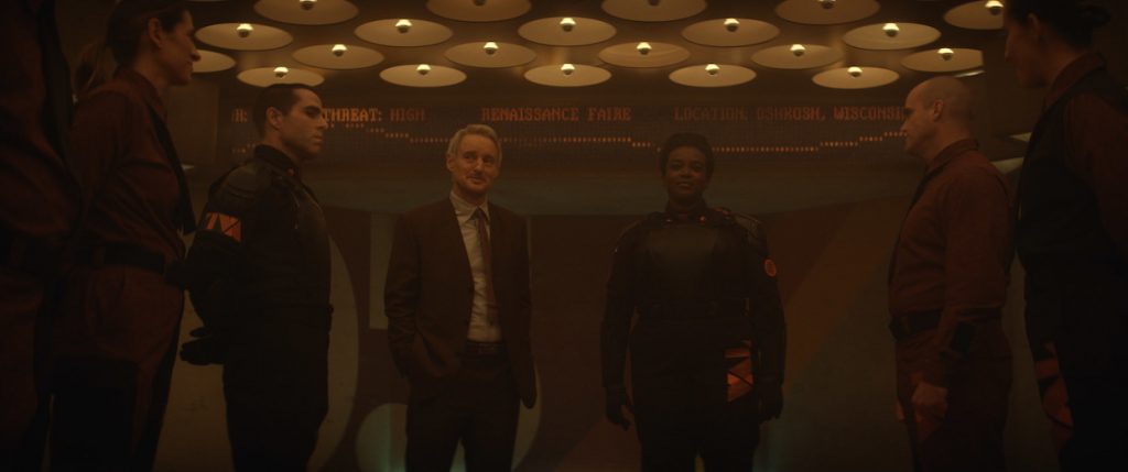
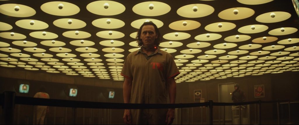
Filmmaker: For the Time Variance Authority (TVA), Loki production designer Kasra Farahani has talked about the bureaucratic world being a combination of dueling midcentury modern influences, incorporating both British and European Brutalist influences with American midcentury design. He had this great quote that he wanted the TVA to feel like, “You can’t tell immediately if this is a warm and friendly place or if it’s a place that wants to destroy you.” How did you create that same feeling in those spaces?
Durald Arkapaw: There’s a particular way that I like to frame—I’m kind of crazy about symmetry and low angles. Shooting low in those spaces creates this feeling that they are almost looming over you. Building practical ceilings was a big part of our discussions, and we were fortunate to get them because, budgetarily, it’s not always cheap.
The Brutalist architecture references that Kasra had were so beautiful and had these strong shafts of light coming in. I was a huge fan of those illustrations and decided for the interrogation scenes in the Time Theater to make the overhead lights move during some scenes. We don’t know who’s controlling the light and who’s controlling this world. I feel like the light in Loki is its own character and that has a lot to do with Kasra’s unique designs.
I didn’t know Kasra previous to this project, but we just hit it off from the start. We have the same taste in design and architecture. He’s very thoughtful and thinks about what the DP is doing on set as well and that makes my job so much easier. You can design something that just looks beautiful to the eye, but you also have to think about it being shot and that there’s going to be cameras and gear in there and people walking around and blocking scenes.
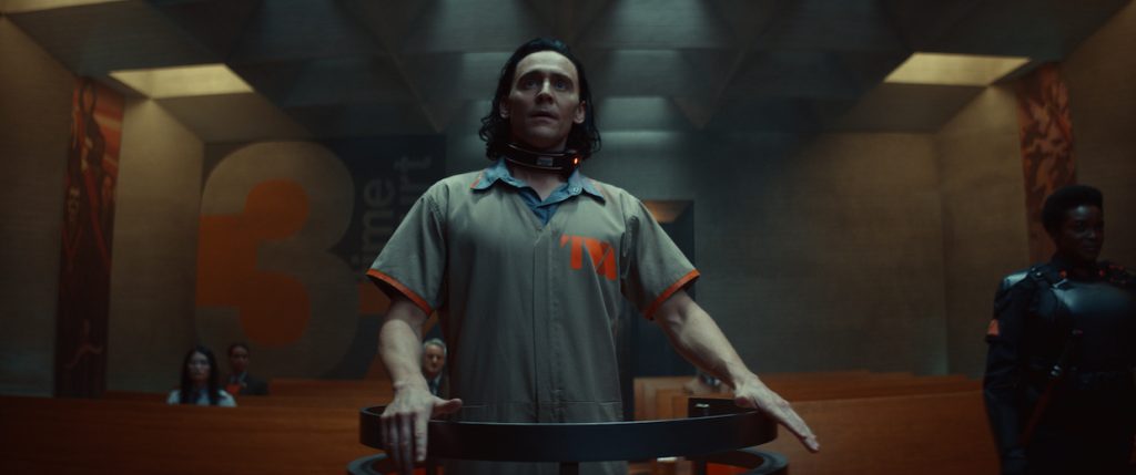
Filmmaker: Brazil and A Clockwork Orange are two influences you’ve mentioned for the TVA, but you’re not using the distorted super wide focal lengths that those films sometimes employ.
Durald Arkapaw: My widest focal was a 28mm in anamorphic, and a lot of the wide shots were done with either a 28mm or a 35mm. Symmetry is so important to me. That’s just the way I like to frame. I’m definitely compulsive about compositions. The 28mm we used didn’t have a lot of bowing on the sides, which was cool because when you want symmetry in these spaces you don’t want [the edges and lines in the frame] to bend so much.
I am a big fan of shooting wides. I want people to see the space. It helps drive the story forward and inform the character arcs. I’m not really the kind of shooter that puts on a long lens and everything’s blurry in the background. And Kasra’s sets were so beautiful to photograph. Sometimes you can be in a set and it’s like, “I can’t get a good wide shot anywhere in here.” On Loki, you could find a beautiful wide shot from so many camera positions.
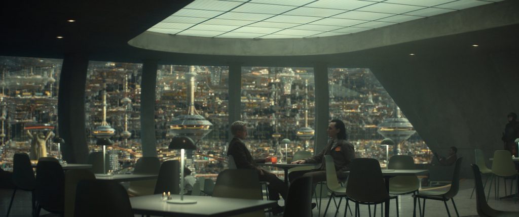
Filmmaker: There is such a diversity of colorful stops along the way in Loki—from Pompeii to 16th century France to a 1980s Wisconsin Renaissance Fair. But I have to say, my favorite scene in the series is just a sit-and-talk in episode two when Loki and Mobius (played by Owen Wilson) discuss faith and free will. The first thing I thought of when I saw that scene was Fincher’s Mindhunter and its serial killer interview scenes.
Durald Arkapaw: That was a reference for me, those conversations in Mindhunter and how they’re framed and even lit. Again, amazing design by Kasra with thoughtful consideration of light in the space. That set is mostly lit by that overhead light source above them. We put a milk Plexiglas in there as the diffusion, then there’s SkyPanels rigged above that. A lot of work goes into designing and constructing a ceiling piece like that. My team, my gaffer and key grip, worked with construction and production design to make sure we could rig all of this and have flexibility for it to be dimmable and have the diffusions we preferred. For coverage we would turn on and off certain quadrants based off of where we were shooting. So, for tighter shots, we’d bring up the key side with another unit that we brought in off of a menace arm that had diffusion on it so it’s a soft light that wraps into their eyes. My very talented gaffer Brian Bartolini, who I’ve worked with for years, and I have similar taste in lighting, where we prefer certain contrast ratios on faces. We’ll always have a negative side so there’s falloff on the face.
Filmmaker: The coverage choices remind me of Fincher too, where you’re doing different sizes of each actor that may only be one or two focal lengths apart and they’re on almost the same exact axis.
Durald Arkapaw: I generally used the 60mm for my medium shot, somewhere on that beautiful ¾ line over the shoulder, then for B camera I would sneak a 100mm in there on the outside of the A camera, so the cameras are tight next to each other. The B shot should be just as good as the A shot. No one wants to watch a movie and think, “That’s clearly a B camera shot.” Maybe that’s something silly only a DP would say. (laughs)
For some of the sets that we were in over and over again, like the Time Theater, we would sometimes switch it up and do stuff like a longer lens in profile. Kate is a big fan of noir films and likes a moodier tone, so she’s always open to the camera being in interesting places.
Your eye is always looking for balance ,and it’s my job to make sure that the viewer looks at the right thing, even down to where you place background actors in the frame or how much of the practical light source is in the frame. That affects that balance. If certain sources are too bright, then my eye goes there instead of the actors, but if it’s the right exposure and placement, it all feels balanced. David Fincher does that so well. He’s so particular in his framing. I’m a big fan of that and take a lot of consideration when framing.
Filmmaker: I love the set for the Miss Minutes waiting room. How did you figure out the wattage and temperature for all those bulbs?
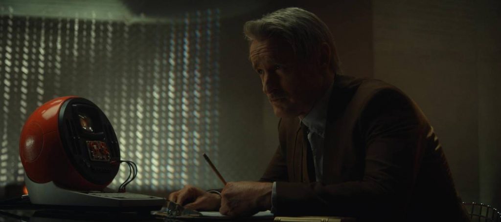
Durald Arkapaw: The Marcel Breuer building in New York was Kasra’s reference for that. That was one of my favorite sets for sure. Kasra talked about [the bulbs] being like the eyeballs of the TVA. In this space, the light is all coming from the ceiling and all those lights were dimmable, so we would dim them to taste and then they’re frosted as well. We did some tests where production design had us come in and look at the bulbs with different paint colors for the interior of those domes. The only time I brought in something to fill in Tom’s face was for the medium shots, just enough so his eyes didn’t go too dark.
Filmmaker: The Time Keepers room, with these striking cyans and magentas, is the one place in the TVA where you really break out of that midcentury modern office look.
Durald Arkapaw: I love that set. We had huge light boxes from above, then built LEDs into the set for the magenta neons. We did tests prior to shooting to test the two colors we wanted to use, because I’m shooting with a particular LUT, and with that LUT color doesn’t always render exactly the way it does to the eye. The LUT, which is kind of like your digital film stock, is super important as well in rendering a more filmic image. I’ve worked with [Company 3’s] Tom Poole a lot and he’s a genius. Tom and I made a LUT for this project that we used for the whole show.
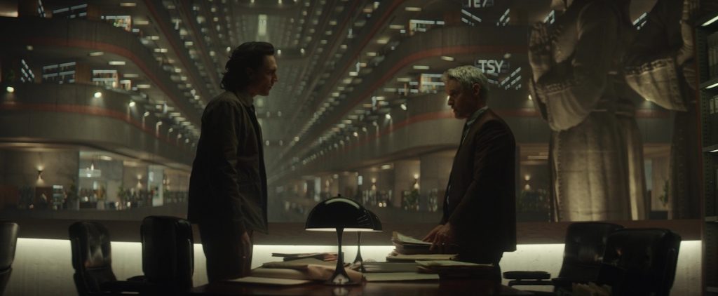
Filmmaker: Let’s talk about one of the practical locations. You shot the TVA’s archive at the Atlanta Marriott Marquis hotel.
Durald Arkapaw: Obviously the statues are fake, but all that was shot on location. We basically lit one floor. then VFX took that vibe and replicated it on all the other floors. I love that sequence. It’s one of my favorites lighting-wise, when they’re sitting at those tables, because I feel like Tom is so beautifully lit. I remember it was up front on our schedule, maybe even like week two, and I was really happy with the dailies there. My gaffer and I decided to add a little bit of green to it. Seven was one of our references for Loki and I love the little green kick in that film.

Filmmaker: For the scenes that take place on the moon Lamentis, you’re shooting that on the backlot?
Durald Arkapaw: Yes, the Lamentis day exteriors are all on a backlot with blue screen. Shooting in Atlanta with the weather can be tricky, not knowing what’s coming at you. I had large 60’ x 60’ overheads for negative fill that I put up in the air because Lamentis is not supposed to have harsh sun. It should be more soft light. As far as the color, that evolved. There was a lot of discussion that went into that, then in post they added more pink because on the actual shoot day we were just shooting exteriors with the sun.
Filmmaker: What goes into the decision of what to build and what not to build?
Durald Arkapaw: Well, every department has their own budget, right? That’s one of the keys to a great production designer, considering the story and how much to build and when to potentially go on location. Kasra makes these beautiful illustrations to give VFX that informed the world in post so that they’re riffing off his designs. Those illustrations also help me, because they make me aware of what the final image might look like before we shoot.
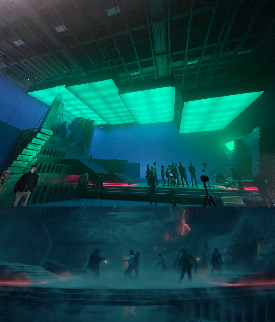
Filmmaker: Lamentis was one of the locations where I thought maybe shooting on the Volume [the virtual production stage of LED walls used on The Mandalorian] might have been useful.
Durald Arkapaw: Practically, you’d love to go somewhere like Iceland and build the sets on that type of landscape where you’re getting that soft overhead light, but it’s expensive to take this big of a project or crew there for just one location. I haven’t shot Volume yet for a project, but there are certain sequences in Loki that would’ve been interesting to do on the Volume. The issue would’ve been the size of stage you’d need. We have some pretty lengthy walk-and-talks that cover a lot of ground. The set we used on the backlot was huge. You could potentially break up those [tracking] shots, but Kate wanted the actors to be able to walk the full length in one take—not walk 100 feet, stop, then have to turn around. Kate is such a great collaborator. She trusts the people she works with and on Loki everyone on the team had similar tastes, a clear vision and we all got along very well. We worked on this for a year—Kate much more than that—and, looking at all these images that we created together, this project could not have been more extraordinary.
Matt Mulcahey works as a DIT in the Midwest. He also writes about film on his blog Deep Fried Movies.