 Back to selection
“450 Resin-Coated Pieces of Plastic”: Production Designer Ethan Tobman and Mark Mylod on The Menu
 Ethan Tobman
 Ahead of the first-ever International Production Design Week, the Production Designers Collective has coordinated a series of interviews with directors and production designers, in which they discuss their working dynamics and mutual passion for the craft of storytelling.
Ethan Tobman describes production design as the art of “visually interpreting the world of a director through emotional architecture.” Below, he and director Mark Mylod discuss their film The Menu and going from reference images on the wall to a fully realized world structured to best absorb the viewer emotionally while furthering the narrative (along with meticulously crafting a last-minute birthday cake and a finale involving a carefully choreographed 30×60-foot flaming dessert).


Filmmaker: Let’s start at the beginning. I’m intrigued to hear what connected you two in that first job interview. What made you confident that you found the right partner?
Tobman: In The Menu, Mark invited such a unique tonal ambiguity, similar to his work on Succession, Shameless and Entourage. These are very tricky, funny, scary, dramatic and, in some parts of The Menu, horrific observations of society. I’ve been pretty obsessed with the particular culture that this film skewers, so I was inspired to share my knowledge of high-end cuisine with him. By the way, we’ve learned over time that you can’t speak about The Menu without using a food pun, no matter what you do.
Mylod: I was just bowled over by Ethan’s knowledge of the world of high-end cuisine, which is something I was almost entirely ignorant of. But beyond that I was attracted to his boundless creativity, a well that never gets dry. He has this quenchless thirst for new ideas that was just joyful for me.
Tobman: It felt like an old friend, or a long-time creative partnership, from the moment we met. It was like we were already dancing in the room, and I loved watching him spin me around and seeing what I would bring, then I’d spin him around. I think that’s what you’re looking for in a film, because you spend a lot of time together with people you don’t really know. Every job interview is a first date, and then you literally go from that to getting married. There’s no ramp up. So, I think you look for people you can dance with.
Mylod: What was gorgeous and surprising to me was Ethan’s emotional approach beyond the expertise. His ideas supported the staging and raised the stakes both architecturally and emotionally. Part of trying to get the correct tone for the film, as well as having the authenticity to support the satire, was to crank up the tension whenever possible. I was obsessed with tension. For anyone that hasn’t seen The Menu, 80% of the film is set in the restaurant building, which puts added pressure on the architectural choices for that set. So, Ethan comes up with this idea, which would never have occurred to me in a million years, of a long hallway that leads from an extraordinary door and opens out into the cavernous restaurant space. This architecture was not only beautiful, but it built anticipation, both in the characters as they enter the restaurant, and by extension in us the viewers. They were being fed into this mince on some level—more bad puns.
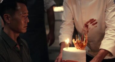
As soon as I saw Ethan’s first sketch for this idea, I knew I was in safe hands, and that continued to be true of every architectural detail. For example, I was worried about a transition between two scenes, so I spoke with the writers and we came up with this little skit where the tortured guests are being sung “Happy Birthday” to by the staff. I asked Ethan if his team could come up with a birthday cake. In my head. it was a one-level sponge cake with a candle on top, but in Ethan’s head it was a creative opportunity. His team literally stayed up all night and came up with this beautifully designed cake that was completely edible and extremely high end, with a specially designed flaming emblem to go on top, which foreshadowed the fiery ending of the film. Ethan took this annoying late request from a director, and not only produced it for the next day, but came up with something extraordinary that was so additive to the whole piece.
Tobman: The cake that Mark is describing was one of the funnest, most creative nights we had on that job. What I find fascinating about what we do for a living is that we make each other’s ideas better. Art is not created in a vacuum. My first drawings of the restaurant were heavily informed by Mark’s needs as a storyteller, a technician and a performance enhancer. For example, it was Mark’s idea that everything in the restaurant would be harvested from the landscape, because Chef Slowik is obsessed with nature. This is the perfect note to give a production designer; it’s like a gold mine. So I thought, “Fair enough, but Chef Slowik is really a dictator. He imposes his will on nature. He’s not embracing it. He’s manipulating and transforming it, and ultimately making it perverse.” And I thought about Macbeth and how the trees are moving closer and closer to the castle.
Mark also really pushed for something that informed every choice that I made, which was that he wanted us to start with daylight and slowly move into night. It’s a horror movie trope. So long as the sun is up, you’re going to be okay, but sure enough, once the sun goes down, you’re dead. And again, that was the perfect dance for us. I created a set that had incredibly porous windows, while also being a jail cell, which was a really interesting riddle to attack together. I definitely took everything I learned from doing the movie Room, which mostly takes place inside one small box.
Filmmaker: What do you think are the best communication tools between a designer and a director?
Mylod: I just love that Ethan covered the walls of the art department in every kind of visual emblem or artwork that you could possibly imagine. Because then, just as you’re walking along, something catches your eye, it becomes a spark of a conversation. I’m a bit insecure about my visual vocabulary, so being able to talk directly about an image is much more in my personal comfort zone.
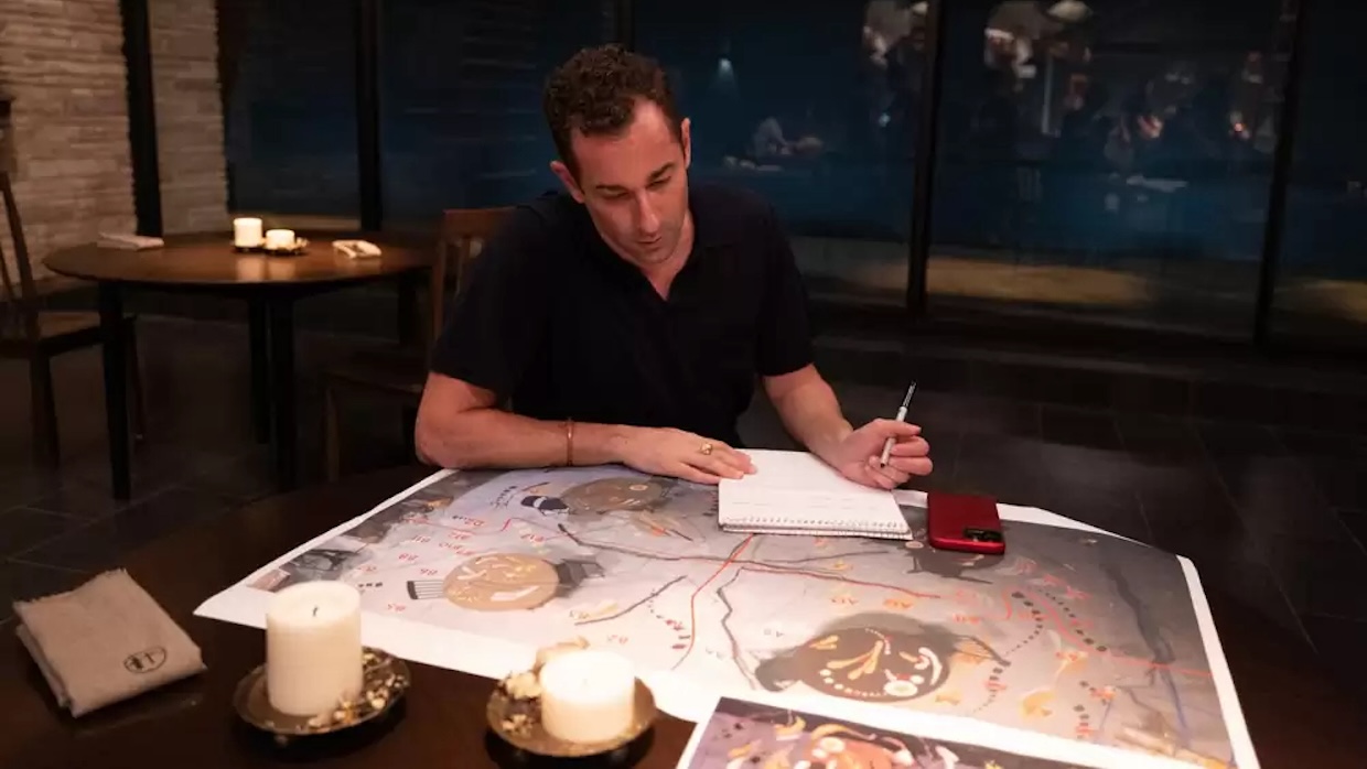
Tobman: I couldn’t agree more. I mean, this is a really pedantic thing to mention, but production always wants to give you a color copy 10 days into a job, and I always spend $300 printing things before I even get on the plane. I don’t want a director walking into a blank space. That’s not a way to start a job. It doesn’t mean that we won’t change everything on those walls throughout the process, but the process begins with something already there. If you start ideating together by talking too much and not looking at things, you’re on the wrong journey.
I’ll sketch immediately, but I start with heavy, heavy research. What was so fun about working with Mark, our producers and our actors, was how open they were to many different sources of inspiration. So the grotesque still lives of the Dutch Masters, Nordic Opera and theater houses. Churches were a huge one for us because his kitchen—ultimately, I wanted people to worship him. There’s an ecclesiastical geometry to it.
Filmmaker: I’m curious, you both wear multiple hats. Mark, you’re also a producer and Ethan, you’re also a creative director. Do you think the experience from those other roles informs your work as a director and designer, respectively?
Mylod: That’s a lovely question. I think my producer role reflects more my mentality rather than the other way round. If I’m in, I’m in a hundred percent and I’m interested in everything. The producer role, especially in television, gives me a voice in areas that perhaps if I was just to wear a director hat, I would not necessarily have a voice in that area.
Tobman: My primary talent, I feel, is visually interpreting the director’s world through emotional architecture. I like to describe our job as externalizing someone’s internal emotional change. Every story obviously has an A to a B, and there’s a reason to tell it, which is the transformation of the character. The architecture is there to ultimately either contrast or support it.
Filmmaker: Going back to The Menu, what do you feel was your largest challenge and also what was one of your greatest lessons from the experience?
Tobman: For me, it was the final course: 30- by 60-foot dessert. 450 resin-coated pieces of plastic. We had to figure out how to turn a Kandinsky into some form of material that looks like food, but a hundred people can walk on. Also, we only have ten minutes to set it up and it has to be mathematically accurate because we’re going to see its construction from many angles, and then it has to look breathtaking from one revealing overhead shot.
At the end of the day, I’m just a complete and utter nerd who just wants to figure out something tricky for hours and hours. And that was fantastic because my art director, Lindsay Moran, and I are geeky in the same way. We ended up using black light markers to trace shapes, so we could turn the film lights off and the black lights, see where the shapes go, number all of them. We rehearsed it on the weekends, bringing Mark in, getting his notes. And Mark was so great. He just looked at me like we’re at Burning Man or something. It’s like this incredible creative installation that you never knew you were gonna need four or five days earlier.

The greatest thing I learned is to really lean into people’s talents around you. I think Mark was marvelous about hiring the right people in every position and then watching them do what they do. Mark had the great idea of having a person specifically dedicated to overseeing the actions of the extras in the kitchen every day. They became a micro world making their own movie, always doing the right thing. And just watching everyone do what they do best and watching somebody allow them to do that, it’s actually kind of rare and makes things delicious.
Mylod: I agree with Ethan about the biggest challenge, certainly in terms of physical production. The evolving idea of this top shot, talking it to Ethan about how we can do this with the time and resources available. Then the execution of it, the crazy level of detail and beautiful kind of nerdism. The creative solutions were genuinely breathtaking, and the result was just tremendous fun and very singular.
I think it really reinforced the idea that when you pay such attention to the details, collectively that comes together to make a strong piece. In television, by necessity, and perhaps by the nature of the medium, it can be about broader strokes. To actually work with creatives who hone every detail knowing that that’s an awfully big screen up there, which is going to show everything, was a great learning curve for me, and an incredibly satisfying one.
