Shutter Angles
Conversations with DPs, directors and below-the-line crew by Matt Mulcahey
“A Frankenstein Set of Lenses”: DP Matthew Libatique on Maestro
 Bradley Cooper and Matthew Libatique on the set of Maestro
 25 years ago, Pi—a $70,000 indie about an obsessive mathematician shot on 16mm black and white reversal stock—put cinematographer Matthew Libatique on the map.
In the intervening quarter century, Libatique has earned three Academy Award nominations and shot multiple films for Spike Lee, Jon Favreau, Joel Schumacher and Darren Aronofsky. He helped inaugurate the Marvel Cinematic Universe with Iron Man and dipped into the D.C. sandbox with Birds of Prey. He’s shot horror movies, westerns, sci-fi flicks, war dramas, biopics and whatever genre mother! falls into.
But what Matthew Libatique hasn’t done since Pi is shoot a film in black and white.
That changed with Maestro, a new Netflix drama that reunited Libatique with A Star is Born director Bradley Cooper and earned the cinematographer his latest Oscar nod. The film follows decades in the life of composer Leonard Bernstein and his wife Felicia, with the early days of their relationship unfolding in black and white before shifting to color as the couple’s marriage complicates over time.
With Maestro up for seven Oscars this Sunday, Libatique spoke to Filmmaker about dusting off Zip Lights, simplifying the digital intermediate and overexposing the negative for his return to black and white film.
Filmmaker: I was looking through your credits trying to figure out the last time you shot black and white on a feature. Do you remember?
Libatique: Pi.
Filmmaker: Really?
Libatique: Yeah. You have to go all the way back to the beginning.
Filmmaker: And that was 16mm. So, this is the first time you’ve actually shot 35mm black and white on a feature film?
Libatique: I believe it is. Pi was 16mm black and white reversal as well, so that’s a completely different animal.
Filmmaker: Over the years with commercials and music videos, you probably did some 35mm black and white on short form projects.
Libatique: Oh yeah, absolutely.
Filmmaker: Tell me about the Kodak Eastman Double-X 5222 stock you used for the black and white portion of Maestro. I was reading up about it and apparently it came out in the late 1950s.
Libatique: Yeah, it was their high-speed version of black and white stock. Before that, there used to be a stock called 5231 Plus-X that was a little more contrasty.
Filmmaker: What was that Plus-X, like 50 ASA?
Libatique: Something like that. It was low. The 5222 has a box rating of 200 or 250 depending on if it’s tungsten or daylight, but I rated it at either 100 or 125 because it needed more light for what I was after. I had to go 180 degrees from what I’ve been doing for years, which is underexposing things. I actually had to overexpose the film and it took me a couple tests to figure that out. I did that to get the contrast I wanted. I was trying to get the same tonality that I see in these beautiful black and white photographs from Elliott Erwitt or Saul Leiter.
Filmmaker: How do you light differently when you’re shooting black and white—both in terms of the specific units and the quality of light you’re after?
Libatique: Well, I always meter reflectivity. I don’t use an incident meter that much unless I’m matching one side of a room to another. So, when I’m lighting, especially faces, the barometer for me is the reflectivity on the face. And what I realized in black and white is I needed a lot of reflectivity. So, the soft light that comes out of the newer units—which are tailor made for digital, because you want to soften the light—was counterintuitive to what I was trying to accomplish here. So, I went back to 5Ks, 10Ks, 20Ks, Tungsten units, Fresnels—all going through frames of diffusion. So, I was still softening the light, but there’s a reflectivity to it, because the light is ultimately direct even though I’m softening its path to its eventual goal. That was a relearning for me. It’s sort of where I started at AFI back in the early ’90s and I hadn’t really done it (in a while). When Kino Flos came out, we started bouncing light and the light just kept getting softer and softer.
Filmmaker: Were there any units that you dusted off after, like, 15 years for this one?
Libatique: We used 2K Zip Lights. It was fun to use that sort of old school fill light. Those lights just worked in black and white. I used to work for Ed Lachman [the Academy Award-nominated DP of Carol and Far From Heaven], and he still works with this amazing gaffer named John DeBlau out of New York. I have never seen anybody wield the Zip Light like that man. It brought me back to those days where I was learning lighting and being inspired by Ed.
Filmmaker: The color section of the film takes place over a couple of decades. Did you rate the film stock differently or develop any differently to get variations in the look for the 1960s, ’70s and ’80s?
Libatique: Well, I was just aiming for timing lights in the low 30s, which is what I like the look of. I wanted to shoot as much of it as I could on Kodak 5213 200T stock. Years ago, when I was testing for Black Swan, I had this idea of rating that at 400 and just printing it up—not doing any special processing or forced processing, because I didn’t want the extra contrast. I actually wanted to lower it, because I find 5213 to have a nice robust contrast to it and it really holds up to underexposure when you print it up. I think some interesting things happen [when you do that] and you get the benefits of the color. I think the color is a little more vibrant and more interesting than 5219 500T. So, I used 5219 as that $5 bill you put in your wallet, so you have something in there if you run out of money. I honestly tried to use 5213 the entire time and I’d rate it at 400. It worked magnificently when we tested the wardrobe and that was the main thing. Whether it was black and white or color, I wanted the wardrobe and walls and colors placed by production design to read the way they were intended. I’ve done movies where I’ve affected the color so much that the colors that are in the set that people worked on to try to put in there have been altered—for good story reasons, but in this film I really wanted the colors to sing the way they were meant to. That was my guiding light in terms of how I went about things in the color temperatures and matching color temperatures and being very strict about that with the tungsten stocks and using them in daylight with 85 filters.
Filmmaker: How do you approach collaborating with production design and costume and all those elements in black and white? If a dress or a wall is red or blue or yellow, it’s going to have a different tonality.
Libatique: You have got to be careful. One thing I learned is that red specifically is problematic, because the tonality changes if you’re shooting in daylight or tungsten. You’re talking about a predominantly blue light versus a predominantly warm light. If you shoot the black and white stock in tungsten, the red is going to read with a similar tonality as it does in real life in terms of its placement in the gray scale, but if you shoot it in daylight, it turns black. So, I would do a variety of things. I would counteract the blue with an 85 filter (used when shooting tungsten balanced stock in daylight). I also used an 85C at times as well when there was a red dress, like at Tanglewood at the beginning of the film when they first meet. There are moments where I had to use an 85C just to knock down the quality of the blue light.
Filmmaker: How is the digital intermediate different when you originate on film? Are you doing less adjustments? Are you tweaking different types of things?
Libatique: I didn’t do a lot to be honest. I think it’s really about responding to the cut and making sure things cut seamlessly, or maybe not so seamlessly depending on what the effect needs to be. But it wasn’t reinventing. Sometimes in digital you’re reinventing. You’re starting from scratch, because maybe the LUT’s not quite right and you’re going, “Well, that’s not what I expected. That’s not what I saw on set.” With film, as long as it’s scanned properly, the film is the film. You’re tweaking colors here or there, but there’s a simplicity to it.
Filmmaker: You did an extended period of testing for Maestro, shooting test scenes with Bradley as far back as 2019. At the end of testing, you essentially had a 40-minute proof of concept. Tell me about the process of landing on the Panavision PVintage lenses. What characteristics did they have that you liked for this particular project?
Libatique: Panavision has such an enormous world of glass that you can explore and discover. Ultimately, I wanted something interesting, but also something that was going to be reliable. With the PVintage lenses, I liked the fact that they were tunable. I could take them down a little bit. I was talking to Guy McVicker at Panavision Hollywood, who I’ve worked with for years, and I said, “I’m after something that is going to be the workhorse lens of the show. Something that’s going to give me a vibe and give me some aberrations, but, at the same time, if I point them towards a hot window, it’s not going to destroy the entire frame.” So, I was sort of riding that line between something of high quality and something that’s degraded. Panavision has the ability to tune those lenses and Guy said to me, “From a level from one to ten, what do you want to start with?” I said, “Let’s start with five,” and that’s how we came to it.
Filmmaker: You had a few other sets as well? Some Super Speed Mark IIs?
Libatique: Sometimes you use multiple lenses for a film because you’re trying to create an entire quilt of atmosphere, then you can switch it up to create the vibe. That’s sort of what I was after. I filled in focal lengths, too, with some Primos, just so I could make sure I had like a 27mm. It was a Frankenstein set of lenses.
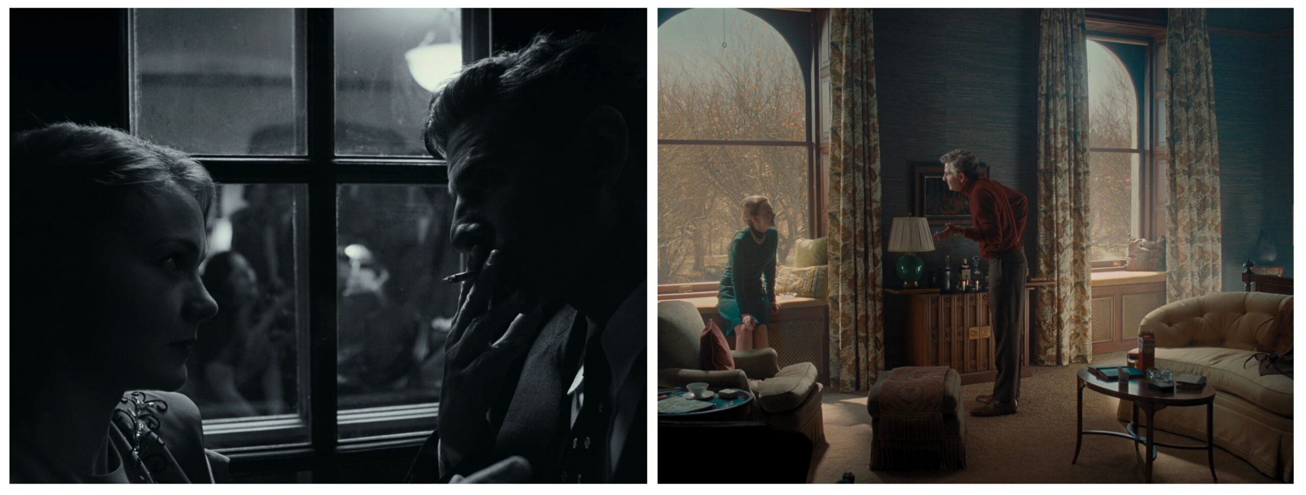
Filmmaker: The use of both 1.33 and 1.85 aspect ratios in the film isn’t based on the timeline of the movie. It’s not 1.33 for older scenes and 1.85 for more contemporary scenes. The 1.33 represents when Felicia [played by Carey Mulligan] and Leonard [played by Cooper] are together, and the 1.85 is for when they’re not. Within those aspect ratios, you’re using blocking to communicate the state of the relationship. [Seen in the images above, which contrasts the closeness of the early romance in the frame on the left with the distance that forms between them in the frame on the right.]
Libatique: We discovered that approach after testing and testing and doing our proof of concept. We shot a test with Carey and Bradley where we did the Cherry Lane Theatre scene. We shot in black and white with the (Eastman Double-X) 5222 and framed for 1.33. That was the scene where it clicked and was like, “This is the way we want to shoot the film.” We had toyed with the idea of expanding the frame to 1.85 right at the transition to color, but there was something about the 1.33 frame. I think those two frames that you picked out are really the reason why. In the black and white frame, these two people are huddled together, pushing the frame left and right, then you jump forward in their lives and they’re just in complete discord and there’s all this space between them on the left and right, but it’s still the same frame size. The bookends of these two shots really exemplify why 1.33 worked for us.
Filmmaker: When I was looking back over my notes from watching the film, I kept jotting down how striking Mulligan’s eye lights were. Did you have a special trick for those?
Libatique: In my entire career I’ve never felt like I’ve mastered the eyelight. I’ve always struggled with them.
Filmmaker: Well, you’ve got some nice ones here.
Libatique: There are, but it’s because the key light is in the right place. I guess that’s actually a good rule. If your key light isn’t giving you an eye light, then maybe your key light is in the wrong spot.
Filmmaker: Going back to those contrasting frames from earlier, the scene of Leonard and Felicia arguing in their apartment in the Dakota building during the Macy’s Thanksgiving Day Parade is all done in one take. What did you put out the window of that set when you were shooting?
Libatique: There’s actually a Translite out there. We had Rosco create the Translite of Central Park in winter, but there was some animation that went in behind it as well. We had it there just for the vibe and lit it and it all looked beautiful, but obviously Snoopy had to be placed in there at the end of the scene [when the parade balloon floats by the window], so there’s some visual effects involved and probably some cleanup to that Translite.
Filmmaker: How did you light that space?
Libatique: In each window there’s a 20K coming through, and above in the ceiling I had about six moving lights just in case I needed a light here or there. You’ll see there’s a little bit of light hitting Lenny in the back—if you look at his legs you’ll see it. That’s all coming from a moving light bouncing into a little bounce card. There was also—I think it was a SkyPanel 360 on a scissor lift behind Felicia, creating the light that’s hitting Lenny in the face.
Filmmaker: That scene is a good example of how blocking can be transformational. When you started shooting the scene, Felicia was on the loveseat. Then Carey Mulligan moved her character to the windowsill, and it shifted the dynamic.
Libatique: Absolutely. One thing about working with Bradley is that you have to maintain a mindset of being open, because things are going to change for the better as he’s responding to inspiration [on the day]. That was a moment of inspiration. Carey went to the window and all of a sudden something changed. As a director, and also as a brilliant actor, Bradley is smart enough to be able to adjust to that and respond to it. We did a take [after that blocking shift] and Bradley didn’t want to do it again. We actually took a finder and lensed up coverage and he just said, “I don’t think we’re going to ever get [to that same place] again.” With all the nuances and subtleties and choices that were made [in the wide shot] that were so beautiful, why would you cut into it? And if you cut into it and then cut back wide just for the joke of Snoopy going by, it becomes trite. Bradley wanted to preserve it as something special that comes as a surprise.
Filmmaker: Where did the idea for that Snoopy balloon come from?
Libatique: This picture from Elliott Erwitt of a woman and a child in the Dakota as Snoopy is going by. It’s one of my favorite photographs. It’s just so funny.
Filmmaker: For the long take when Felicia brings Leonard to the theater space she’s performing in, I saw a behind the scenes shot and the dolly is just on the floor without any track. You said in an American Cinematographer interview for the film that you’d love to do a whole movie just with the dolly on dance floor. What is it about the way the camera moves on that platform that you respond to?
Libatique: There’s just a weight to it. It feels grounded. I love shooting moving masters, a shot that might go from wide to tight to medium and then maybe back to tight and it tells a whole story within that one shot. I’m not saying I want to do oners all the time, but I do love designing a moving master, where we’re moving the camera and staying with the characters. When the characters need to stop because they have something they need to say, the dolly allows us to stop for that moment. Steadicam can stop, but ever so slightly you still get a little bit of [movement]. A fluid head or a geared head on dolly also pans and moves in a different way than a Steadicam. I just prefer it.
Filmmaker: Those moving masters remind me of classical 1940s and 1950s studio filmmaking, where they would frequently move the camera to change the shot rather than using an edit. That seems like a lost art.
Libatique: Well, I think there’s a lot of filmmakers right now that are trying to be more patient, but the majority of filmmakers are, through an abundance of caution, trying to get as much coverage as possible. Then they try to tell their story in the editing room rather than trying to tell their story when they’re shooting the film.
Filmmaker: I haven’t really heard you talk about the song and dance number much, where Bernstein takes Felicia into the theater and performers appear on stage and break into some of Bernstein’s musical numbers.
Libatique: It was painful to shoot. That’s why. (laughs)
Filmmaker: Well, let’s relive it. (laughs) Tell me about the walls of lights that you had on either side of the stage.
Libatique: We were able to source all these old school scoop lights that looked of the period. I had a dimmer board operator I loved named Nic Jones, and we would go through the choreography of the camera, and I would give him cues and moments where he needed to change light levels. For example, if the camera wrapped around to downstage right, then the stage right lights would come down, and the stage left lights would come up. So, it was a dance with the lights as well as a dance on the stage. We rarely had to [physically] get to a light [to adjust it]. Everything was rigged above us, and I would literally just call out lights and Nic would change everything on the board.
We did a lot of rehearsals for that scene. Bradley worked hard on the dance. We took our time there. Rarely do you have enough time, but [production] gave us ample time to shoot that scene. And we shot it all in sequence. We very deliberately went through it from beginning to end, not going backwards, but always going forward, and I think shooting it [in continuity] helped. It was a particularly hard scene, probably the hardest for me in the film.