 Back to selection
For Your Film Set or Living Room, Dean Fleischer-Camp’s “Hyper-Generic” Prop Posters

When, in 2013, I spoke to Dean Fleischer Camp about his exquisitely deadpan web series, Catherine, created with Jenny Slate, I immediately wanted to know about its production design. How did he come up with its uncannily bland, generically discomforting visual spaces? The director told me that his inspirations included the ’90s TV show Kids in the Hall as well as Lars von Trier’s The Kingdom, but that part of the show’s visual aesthetic came from the porn-movie sets he was renting as a location.
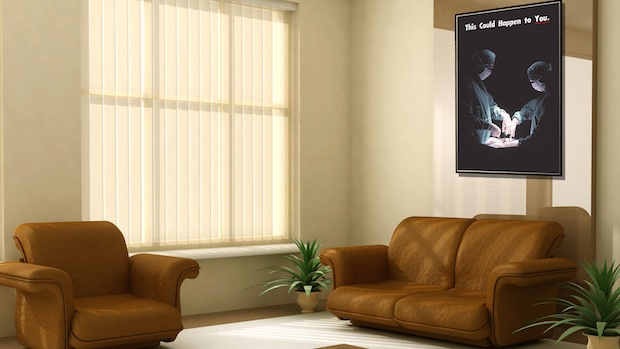
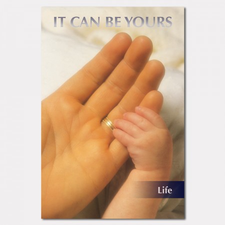
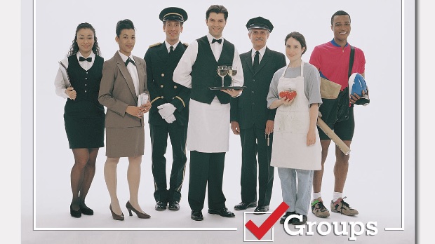
Now, Camp writes with word of a new project that furthers the aesthetic he’s been developing with Catherine and other recent shorts. TOP Posters and Prints are “hyper generic prop posters,” which recall the kind of royalty-free images production designers find at rental houses. In these cases, however, the posters boast a commodified sincerity that seems just a bit off. Shots of food recall posters at no-name refreshment stands at some run-down stadium. Sunsets and snow-capped mountains summon up the memory of a trip to the dentist. Other images — featuring babies, guns or even a patient on an operating table (see above) — seem to have a unspecified but still alarming political purpose. Via email, I asked Camp a few questions about his new project.

Filmmaker: Who are you targeting these posters towards? Who will — or is — buying them? Other art departments or real people?
Fleischer-Camp: Both! Mostly I hope that people are buying them for the simple pleasure of waking up next to a big picture of a gorgeous mountain or whatever. Google Analytics is insufficient to tell me with what level of irony people are buying my posters, but I hope it isn’t 1,000%? They’re meant to be enjoyed on that level too, of course, but there’s a big part of it that is totally sincere for me. I truly love these images, so I hope that after the laughter subsides, people who maybe bought one on a lark find themselves unexpectedly transfixed by its simple beauty.
Filmmaker: Where does that uncanny valley between “realistic” and “blandly eerie” lie, and which side of that equation do you think you land on with these posters?
Fleischer-Camp: We weren’t always at the top of the food chain, and I think that the “eerie” feeling you get is actually a latent animal instinct crying out, trying to claw its way thru the evolutionary strata and alert your mannered human nervous system to a new, as-yet-unidentified threat. I think that probably the location itself is contextual and will shift from generation to generation. It will be interesting to see if children are still super creeped out by Robert Zemeckis’ Polar Express in 20 years (or merely bored to tears). I think the straightforwardness of some of these posters might not have been considered unsettling 30 or 40 years ago when we were more trusting of corporations and not so savvy about advertising.

These posters are designed to toe that line, to evoke an uneasiness, and so are most of the shorts I’ve made. Cringe reflex is interesting to me because it’s a transitional stance between fight and flight: We’ve recognized a threat but we aren’t sure what it is exactly, or what to do with it yet. That seems like the best possible state to put your audience in if you want them to see things anew, to laugh at the mundane and reevaluate the world around them.
Filmmaker: Are you thinking of branching into other kinds of merch?
Fleischer-Camp: We’re in the final stages of prototyping our app for Digital iPotty.
Check out Catherine, the web series by Camp and Slate that inspired these posters below.
Catherine from Dean Fleischer-Camp on Vimeo.
