 Back to selection
The Six Fonts of Cameraperson
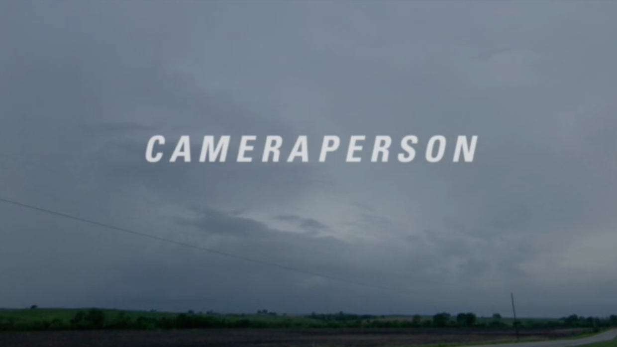
Much has already been written about the piercing human insight of Kirsten Johnson’s Cameraperson. Working with material originally shot for a dozen other films, Johnson refashions the offcuts of her two-decade career as a documentary cinematographer into a patchwork memoir — one that reveals just as much about the woman behind the camera as the individuals who pass fleetingly before its lens.
The effect is emotionally exhilarating, but the approach is unabashedly formal — and less has been written about the ways in which Johnson fractionates her footage in order to create a film of clear divisions and implicit rules. The film’s formal rigor might seem at odds with its emotive tenor, but it’s precisely Johnson’s stylistic precision that allows her to carve out such a dynamic headspace for Cameraperson — one able to contain ideas both loose and refined, abstract and hyper-specific.
Consider the film’s fonts. By my count, Cameraperson makes use of six, and each one speaks volumes on the film’s intentions, as well as how it goes about realizing them. Like so many of the apparently trivial choices made by Johnson, editor Nels Bangerter, co-producer Danielle Varga and graphic designer Dave Tecson, they have an outsize impact on the finished film. So let’s take a closer look.
(And before the “typeface” crowd weighs in, let me say this: get with the contemporary usage, yo.)
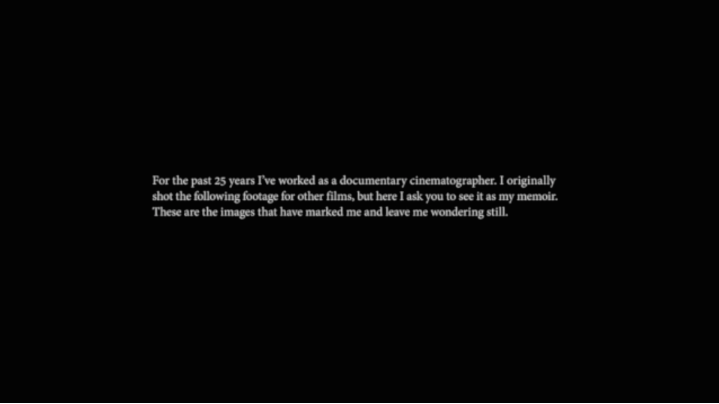
Font #1: Adobe Devanagari
Cameraperson begins traditionally enough, with a block of white text on a black background — a stylistic device that’s long used to convey information considered vital to an audience’s understanding of a film and yet somehow unable to be contained within its body. Where most introductory notes fill in historical background or statistical context, however, Johnson’s serves as a personal request, imploring the viewer to interpret Cameraperson as her “memoir.” In the process, the film takes a formality (and a stately, serif font) normally used to convey factual truth, and puts it to work in the service of emotional truth — coaxing the viewer into accepting Johnson’s artistic terms sight unseen.
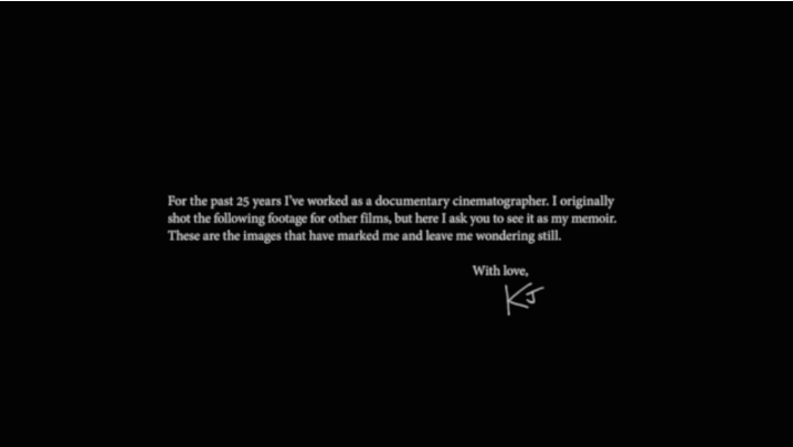
Font #2: Non-typeset handwritten signature
If the lyrical content of Cameraperson’s preamble suggests a subversion of documentary cliché, its sign-off confirms the film’s rejection of non-fiction norms. Johnson stamps the sentimental formula “with love” underneath the text, along with her handwritten initials. This juxtaposition of the personal and the formal hints at Cameraperson’s central dichotomy: on the one hand, the film is a crisp work of meta-textual survey; on the other, it’s an intimate travelogue. And though initials can connote everything from punctiliousness to anonymity, in this context they suggest familiarity — indicating Johnson’s intention to reveal a side of herself beyond her work within the film.
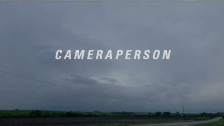
Font #3: Univers 67 Condensed Bold Oblique
So who is Kirsten Johnson, beyond the images of hers we’ve seen in films like The Oath and Fahrenheit 9/11? Most documentaries tell you very little about their creators — even those that position themselves as autobiographical — but Cameraperson gets to the heart of its director’s sensibility within the first few minutes. As the film’s title sequence begins, Johnson places us at the side of a road in Nodaway County, Missouri, where she fills the majority of her frame with a boundless, brooding sky. The shot is dramatic, but also functional (it provides a blank canvas for the film’s opening credits) and we suspect that Johnson — an adventurer of the most pragmatic kind — appreciates both qualities.
Suddenly, a lightning bolt cuts across the sky, causing Johnson to gasp behind the camera — seemingly delighted both by this spontaneous display of nature’s turbulence, and her own fortune in being there to capture it. Where so many filmmakers feign indifference to the beauty of their work, Johnson reveals the mix of awe and pride that comes with committing a remarkable moment like this to tape. It’s a deeply human scene, made perfect by what follows: a fit of uncontrollable sneezing from Johnson, which comically rattles the camera on its axis.
No film is unthinking in where it chooses to place its title, but few find as perfect a moment as this to epitomize their aims. Deploying an expanded, italicised font straight out of a classic American road movie, Cameraperson announces itself in a blaze of lopsided verve and charismatic fallibility.

Font #4: Helvetica Neue
All this formal ingenuity does risk reducing Johnson’s source material — and the human lives captured within her countless hours of tape — to artistic putty, there to be molded into whatever shape best advances Cameraperson’s intellectual goals. Alive to this danger, the filmmakers know precisely when to rein in their stylistic daring, or rather, when to exploit the power of stylistic minimalism. The unadorned sans-serif font they use to identify Johnson’s interviewees feels utilitarian to the point of thoughtlessness (it could easily be mistaken for an offline-edit placeholder) but the font’s very unobtrusiveness signals the film’s desire never to let its larger ambitions divert from its ethical obligations.

Font #5: Helvetica Neue Condensed Bold
Of course, sometimes the very presence of text can be obtrusive, especially in a work of such intimacy. Cameraperson is above all a film about compassion, often as expressed through nonverbal means. Speaking to one young interviewee, blinded in a Helmand rocket attack, Johnson tells the boy, “you’re making me cry even though I don’t understand the language.” Subtitles can get in the way of this kind of connection, serving to create an emotional barrier even as they lift a linguistic one.
It’s impractical for Cameraperson to forego subtitles entirely, given the wide array of languages spoken across its runtime, so the filmmakers instead find a way to distance the film from its own reliance on translation. They mimic the dominant subtitle aesthetic by employing a garishly outlined, inelegantly compressed font unlike anything else in the film. As a result, we begin to think of Cameraperson’s subtitles as a blunt instrument imposed by some imaginary third party, rather than an intrinsic part of the film itself. It’s a great example of another responsibility Cameraperson delegates to its formal elements: not just the task of making clear what the film is, but the task of making clear what it’s not.
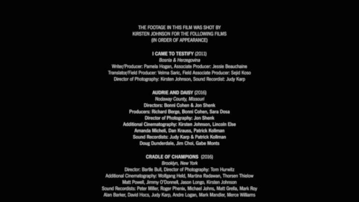
Font #6: News Gothic FS (Book, Book Oblique and Demibold)
Speaking of which, here’s something Cameraperson is most certainly not: its constituent parts. There’s something simultaneously gratifying and deflating about the list of movies that Johnson provides in the film’s end credits, which bestows identifying names and dates on what were previously elliptical glimpses into her back catalogue. We can almost feel the spell breaking, even as we rush to scrawl down titles for further investigation.
The slender font in which the list is rendered — the same one used in the opening credits of Star Wars and Hitchcock’s Psycho — characterises these movies, broadly speaking, as cinematic. And yet the disorientation we feel at seeing them so clearly defined tells its own story: if these movies constitute cinema, then Cameraperson must be something more.
