Graphic Design
-
The Clear Identification of Priorities: Ricky D’Ambrose on Being His Own Graphic Designer

It was apparent early on that I would design most of the paper props for Notes on an Appearance: The film’s predecessor, a short called Spiral Jetty, relied, in a similar way, on a cache of fictitious newspaper and magazine clippings. Both films were made quickly, with meager ledger books (Spiral Jetty, if memory serves, cost less than $500; Notes on an Appearance was shot, edited, color-corrected and sound-mixed for less than $30,000); and both films were made without much infrastructure, relying on small, resourceful crews. Under these conditions, I became the films’ art director and production designer, learning and […]
by Ricky D'Ambrose on Jun 19, 2019 -
How Home Video Art Direction Can Undo Stanley Kubrick’s Careful Work

It’s long bothered me that all the design work that goes in to film promotion—often deliberated over at length by industry-leading art directors and designers in conjunction with the actual filmmakers—is routinely discarded when that film hits home video. The world of home video is, for the most part, unregulated in such matters; whether it be studios’ own in-house art departments or boutique labels, they all take different approaches to art direction. Some employ actual living and breathing art directors and some leave it to a dilettantish coterie of everyone-including-the-tea-lady chipping in with their own thoughts. Many home video distributors […]
by Nick Wrigley on Oct 17, 2018 -
The Graphic Design of High Rise

Here’s a fascinating article by Mark Sinclair in the Creative Review about graphic design in Ben Wheatley’s High Rise. In most films, contemporary and near-period, production designers will seek clearance to use actual logos and products. When those clearances aren’t granted for whatever reason, the art department will mock something up. But unless there’s been real attention paid to these graphics, they can often look cheesy — like the film equivalent of clip art. The fantastic, dystopian qualities of High Rise — a science fiction tale set in an imaginary pre-Thatcherite early ’70s — has enabled Wheatley and his designers […]
by Scott Macaulay on Mar 21, 2016 -
Charting the Course: Data Visualization in Documentary Film

“Every single pixel should testify directly to content.” So says Edward Tufte, a professor emeritus at Yale and pioneer in the field of data visualization. And if this emphasis on clarity and, essentially, story is true in the world of static infographics, it’s exponentially so when content comes at 24 frames per second. In the short PBS film The Art of Data Visualization, Tufte reaches far back in time, before the mundane pie charts and bar graphs that school children are taught to decipher, finding the beginnings of data visualization in stone-age cartography and the rise of science during the […]
by Randy Astle on Oct 20, 2014 -
Graphic Design: Jeff Soyk on Hollow

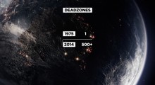
Elaine McMillion Sheldon’s award-winning interactive documentary Hollow employs a particularly bold use of graphics, using them to provide bursts of information quickly, to frame interview material and to even provoke calls to action. Of her approach, McMillion says, “I would provide photographs and quotes [to designer Jeff Soyk], and we would talk about what ways they would work in the piece. And then he’d do the graphic design. Below, Soyk talks about the above data visualization. Jeff Soyk, co-producer and lead designer: When reviewing the project assets, I came across Elaine’s photo of the abandoned police department in War, W. […]
by Randy Astle on Oct 20, 2014 -
Graphic Design: Joshua Ligairi and Darin Anderson on Plan 241

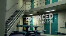
Plan 241 is an in-production, feature-length documentary about the FBI investigation into Alaska militia leader Schaeffer Cox, who was convicted of stockpiling illegal weapons and conspiracy to murder federal agents. From filmmaker Joshua Ligairi, it tells a human story enriched by the copious documentation and statistics generated by a criminal case. Below, Ligairi discusses his decision to incorporate graphics in his documentary, and designer/animator Darin Anderson elaborates upon the specific approach. Joshua Ligairi, director: The people who make the most interesting characters aren’t always the best choice for delivering information in a clear and concise way. Text, when created with […]
by Randy Astle on Oct 20, 2014 -
Graphic Design: Miao Wang’s We the Economy

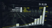
For We the Economy, the 20-part web series collaboration between Paul Allen’s Vulcan Productions and Morgan Spurlock’s Cinelan, documentary director Miao Wang tackled the topic of globalization and trade with China. Her short intercuts interviews with elegantly designed yet informationally dense graphics. Below, she and her motion graphic artist discuss challenges and solutions. Miao Wang, director: The biggest challenge of this project from day one has been how to address such an immense topic in such a short five-to-seven minute film. I knew I wanted to make a film driven by poignant human elements and stories, while also providing concrete […]
by Randy Astle on Oct 20, 2014 -
RODDY BOGAWA ON “TAKEN BY STORM”
Excuse the inconsistent audio levels, a few bad edits, and the boom-y sound of some of this, but I decided to simply take the recording of my interview with Roddy Bogawa about his new doc, Taken by Storm, and run it as an audio podcast. I may try and do some more, and if they get smooth enough, start uploading them to iTunes. Taken by Storm is a portrait of artist Storm Thorgerson, who is best known for his work with the graphic design company Hipnosis designing album covers for bands like Pink Floyd and Led Zeppelin. His sometimes surreal […]
by Scott Macaulay on Mar 11, 2011
