How Home Video Art Direction Can Undo Stanley Kubrick’s Careful Work
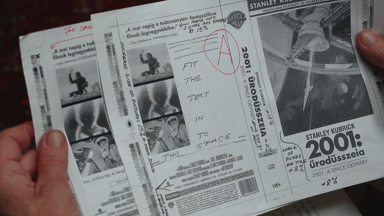 Leon Vitali inspects Hungarian DVD artwork for 2001: A Space Odyssey (framegrab from the documentary Filmworker)
 It’s long bothered me that all the design work that goes in to film promotion—often deliberated over at length by industry-leading art directors and designers in conjunction with the actual filmmakers—is routinely discarded when that film hits home video. The world of home video is, for the most part, unregulated in such matters; whether it be studios’ own in-house art departments or boutique labels, they all take different approaches to art direction. Some employ actual living and breathing art directors and some leave it to a dilettantish coterie of everyone-including-the-tea-lad
Many home video distributors believe the artwork on their releases must conform to certain rules for it to be successful—”success” they only measure in sales, and thus is ruled by what’s gone before. If they’re employed at all, art directors usually find themselves in meetings with sales/marketing types who mostly shy away from anything new they haven’t seen before–they typically want everything to look like pre-existing hits so they can ensure success by association. In a worst case scenario, where a title bombs, they then can’t be blamed for going out on a limb. They’re oblivious to how repetition guarantees diminishing returns, because everything starts to look the same and nothing stands out. Even influential buyers from major retailers can get involved and, unfortunately, sway the artwork the same predictable way as the marketing dept—that is, if the distributor is feeble-minded and unsure of what to do. This is why home video sleeves often have multiple 5-star pull quotes and “floating head” designs of the lead actors, and it’s why trailers are so hackneyed (“let’s not fuck with the formula, folks!”)
Home video distributors often encounter many contractual artwork obligations, yet none of over 500 I’ve worked on insist upon the continued use of already-made, already-decided-upon theatrical artwork—or at least a close variation upon it. Sometimes the director’s name must only appear on the front of packaging in the same size, color and typeface as it appears in the billing block on the rear; certain lead actor names may have to appear before others, sometimes above the film’s title (“the title treatment”), sometimes below, and sometimes they have to be the same size and color as the title treatment; sometimes the producer’s name must appear and perhaps be larger than the director’s, etc—and all these requirements are policed by the licensor’s legal department and have to be approved for fear of being sued. But no film I’ve ever worked on stipulates to protect the sanctity of original artwork.
This is where the art director should come in. Artwork that has already seeped into the public consciousness benefits greatly from being re-used for home video; there’s no need to redesign the wheel if original designs are good. (I would argue that pretty much everything prior to 1990 has value and is emblematic of its period. Once desktop publishing arrived, and anyone could commandeer the mouse, consistently great design fell off the edge of a cliff.) An art director must be able to realise when to back off, to recognise that great work has already been done, has historical significance and must be respectfully reused. Whole generations grow up seeing these original designs—the recognizability of this artwork and title treatments in the mass consciousness, often percolating for decades, is an extremely valuable asset. A key skill of the art director should be to understand film history, graphic design history and the public’s muscle memory for decades-old original designs–skills that marketeers and retailers rarely attain. When bad decisions are made, this continuum of visual language across time ends. Why don’t directors with control over their own marketing start insisting on its continued use across home video, streaming, and beyond—forever?
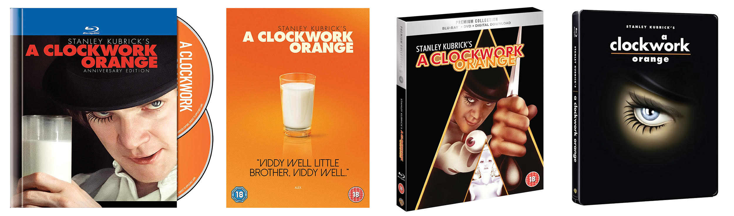
Back to Stanley Kubrick: can you imagine A Clockwork Orange without Philip Castle’s iconic title treatment and Alex’s airbrushed glinting knife? Here are a selection of official Warner Bros Blu-ray covers for A Clockwork Orange, which deviate by using three different non-original title treatments, new color schemes and new art. [Click on all images to expand.]
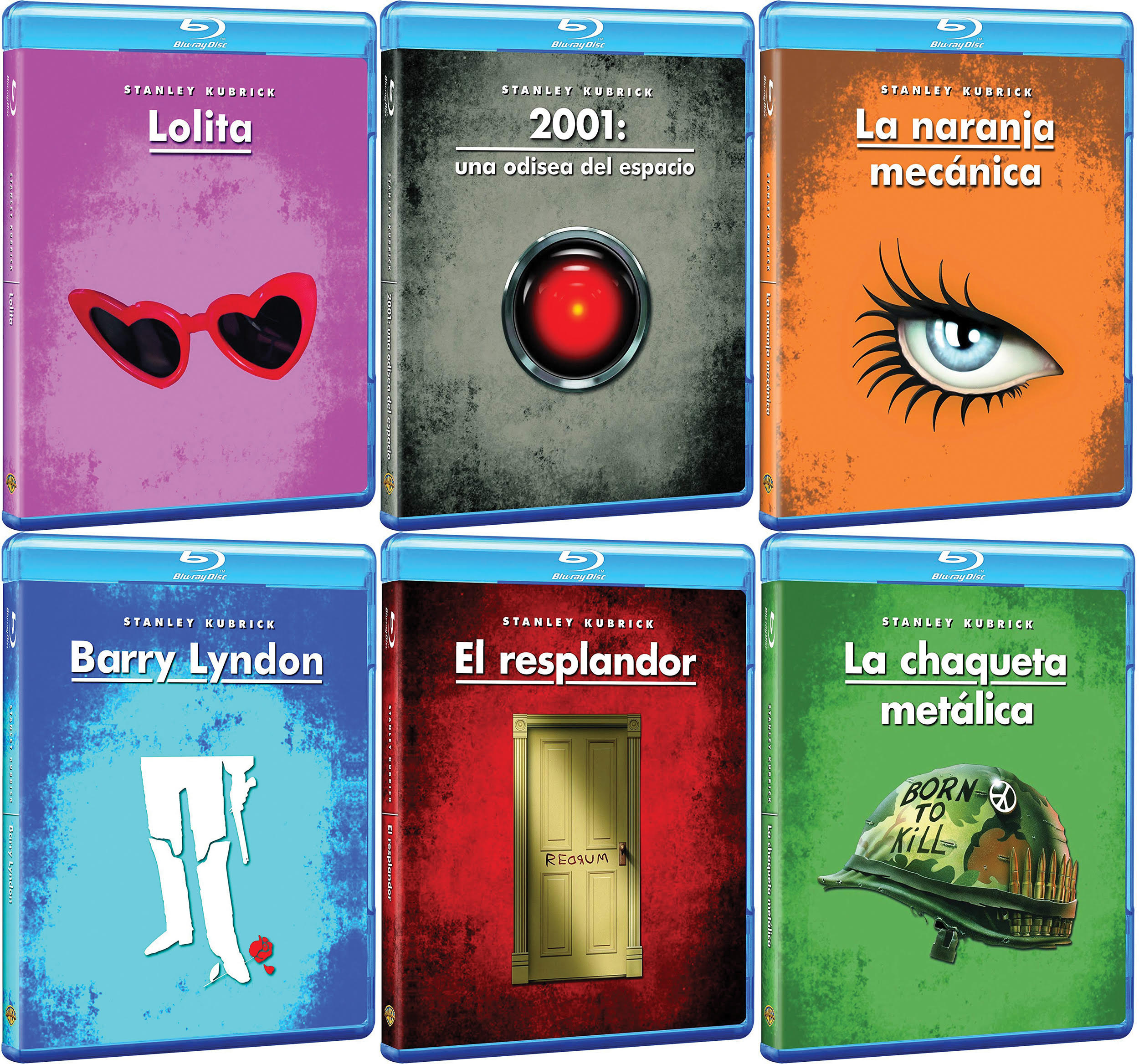
Here are some official Warner Bros Blu-ray covers from Spain, which introduce garish color schemes, use only details from the original artwork and in one case introduces an element that has never been used in promotional material before (the door on The Shining).
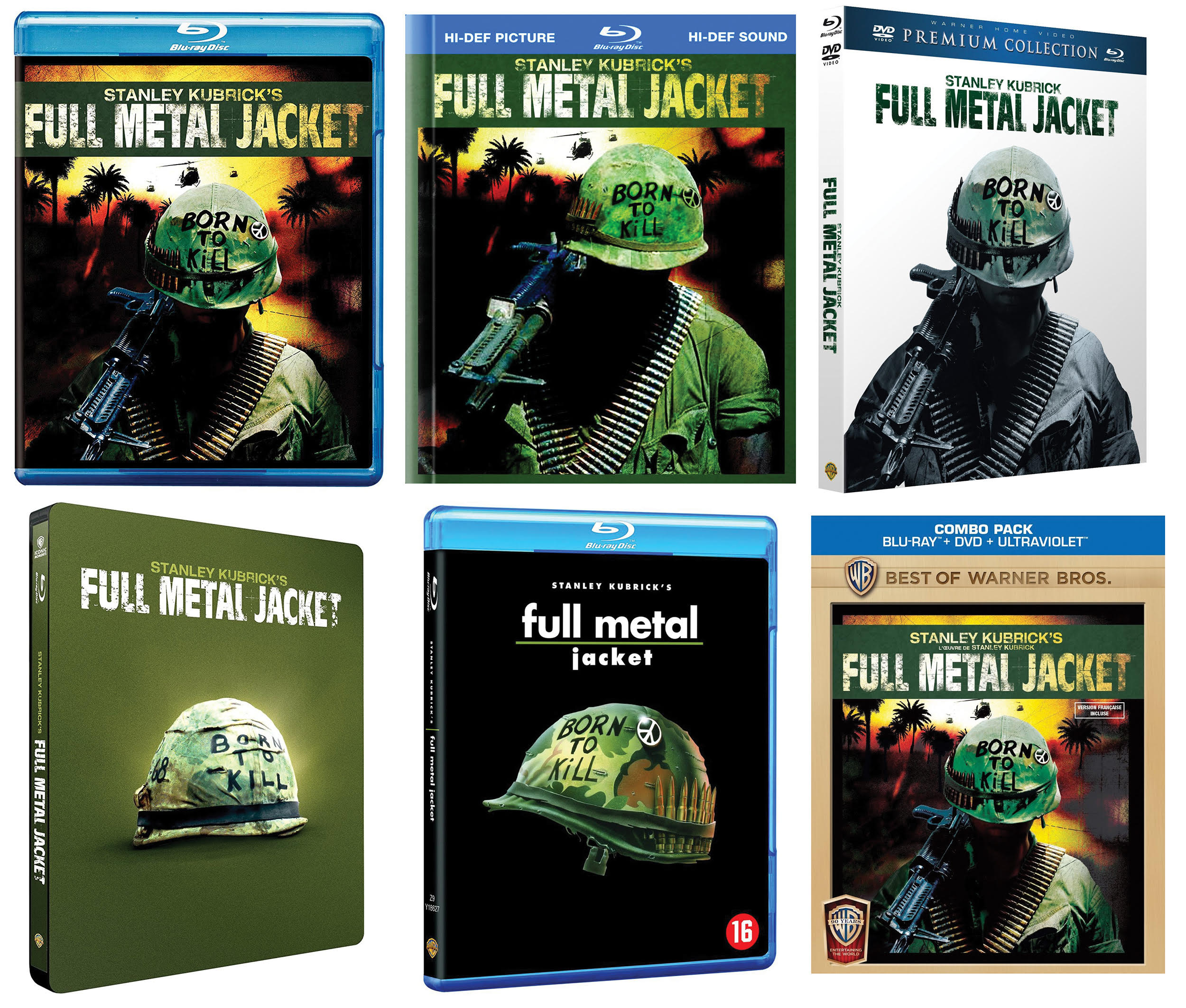
Can you imagine The Shining without the yellow and black poster Saul Bass and Kubrick designed around just a title treatment? Full Metal Jacket without Philip Castle’s “Born to Kill” helmet and striking, iconic title treatment? Well, Warner Bros did and they dispensed with the lot on their various messy Blu-ray designs around the world. Here are six official Warner Bros Blu-rays covers for Full Metal Jacket, none of which use the original iconic title treatment, and only one of which uses original artwork (but inverts the original background color).
Philip Castle believed that Kubrick wanted to shape every aspect of the film’s reception: “He had people going to the cinemas where it was going to be shown to make sure that the screens were clean. […] Kubrick was interested in details such as how a finished design would look in black and white in a single column of a local newspaper.” Julian Senior, ex-Vice President of Advertising & Publicity for Warner Brothers Europe worked closely with Kubrick. He recalled, “He taught me—how publicity, advertising, and marketing operates. The most pragmatic, logical human being in the world, and of course advertising and publicity is essentially logical common sense. You produce a product, you define the audience, and then you tell them what the product’s like.” Kubrick worked with legendary graphic designer Saul Bass on the poster of The Shining. Apparently not an easy one for Bass, due to Kubrick’s infamous obsessive perfectionism—the poster went through 300 versions before Kubrick was happy. The poster for Full Metal Jacket was carefully prepared and designed by Stanley Kubrick, again with illustrator Philip Castle.
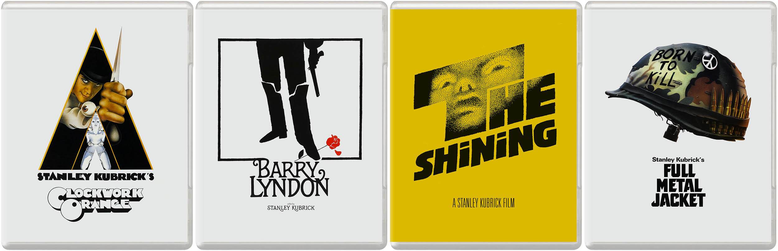
In Filmworker, Warren Lieberfarb, former president of Warner Home Video says: “Stanley intuitively came to distrust the managing director of Warner Home Video in the UK. Going as far as to send people across England to take photographs of the instore displays and the store windows. [..] His attention to perfection could periodically be maddening. The reality: these were his works… and he brought the passion of an artist who wanted the audience to see the movies in the highest quality form and to have them marketed properly.” Julian Senior hints at the cause of the friction: “This great behemoth that was Warner Bros, a huge, huge powerful corporation, rather like a dinosaur, wonderful mass, power body, and a tiny little brain pan.” With so much at stake, and so much care taken in the creation of the artwork, one can understand Kubrick’s constant state of dismay at Warner Bros’ failure to carry out basic instructions. Here are four simple Blu-ray covers which I created by reformatting the original posters. I did the whole filmography, including research and cleanup, in an afternoon. Anyone could have done it—by being respectful and following simple rules.
The esteemed French designer Jouineau Bourduge created the main design for Kubrick’s Barry Lyndon poster: A simple, Saul Bass-like image, now iconic. When the film was released for the first time on Blu-ray by Warner Bros themselves (almost as an afterthought, as an old scan, in the widely debated wrong aspect ratio, without the original monaural soundtrack or vintage WB logo at the start) they were almost faithful to the original design. They used the original artwork, but added “Stanley Kubrick’s” before the title in an unrelated typeface. Thankfully, the Criterion Collection undid all these schoolboy errors by issuing the film properly on Blu-ray in 2017, with a new 4K scan in the correct aspect ratio, original monaural soundtrack, vintage WB logo at the start and the original artwork. All simple things Kubrick would no doubt have hoped Warners got right in the first place, but my main point here is: Criterion, the much-respected home video company—famous for bringing a new look to their sleeves—understood all the issues I’ve been describing. Criterion’s producer Curtis Tsui and art directors Sarah Habibi and Eric Skillman nailed it by realising how important the original Kubrick-approved art is, and how fruitless it would be to try anything else.
The Stanley Kubrick Archive at the University of the Arts London, which spans his entire career and houses extensive materials, describes Kubrick as having “an unprecedented level of control over his films, [he] was interested in every aspect of the film making process.” After his passing, Warner Bros are failing in their duty to present the films the way Kubrick fought for at every turn. His ‘unprecedented level of control’ is being undermined by their shoddy presentation, and when a filmmaker cares as much as Stanley Kubrick did about how the public encounters his films, why wouldn’t you use these already made, beautiful, immediately identifiable Kubrick-approved designs? The arrogance with which anyone could ever suggest anything else is more suitable, astonishes me.