 Back to selection
Color Grading Film and Digital for Wonderstruck
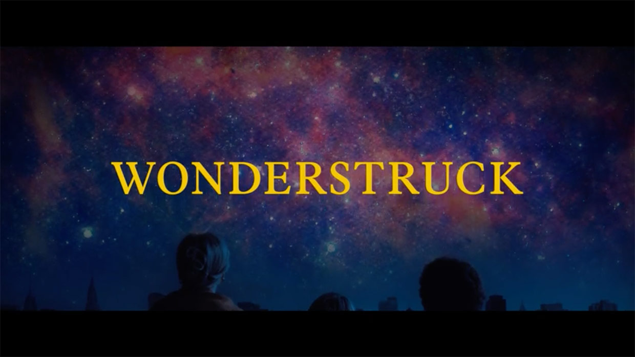
Colorist Joe Gawler of Harbor Pictures has worked on a number of films and television shows over the years, including A Most Violent Year, Midnight in Paris and Arrival. For Wonderstruck, Gawler had to work with multiple film stocks. The story takes place in two time periods—the 1920s and the 1970s—and black & white and color film were used to convey the different time periods, while digital material was also shot for both periods. In this interview he talks about working with film and digital and how to become a better colorist.
Filmmaker: How did you become involved in this project?
Gawler: There’s a company called the Criterion Collection who remaster important movies, and I’ve been working with those guys for years. I’ve probably graded more Criterion titles than anybody else. While Todd Haynes was cutting Carol, I actually remastered Safe with him, so that introduced him to Harbor and myself. Ed Lachman came in on some Criterion titles as a color consultant—he did the Douglas Sirk films, Written on the Wind and All That Heaven Allows, which I think actually inspired work that Todd and Ed have done together. So I got to know both of them through these Criterion titles. When Wonderstruck came about, we had been doing work with Amazon here at Harbor, and Todd’s editor, Affonso Gonçalves, was cutting back-to-back projects here. They edited here on the same floor as my DI theater, so it’s really powerful creatively that I’m seeing Todd and Affonso for months before the DI starts and we’re able to talk about ideas.
Filmmaker: Talk about the workflow. Is grading for film different to working with digital?
Gawler: I’m not sure that working with film specifically is that much different. What I can say, in my experience, is I feel like I’m able to find the look more quickly with film. I think with digital it can take a little more time to find it.
I’m a big fan of both formats. The majority of the work we are doing these days is digitally acquired. It always looks terrific, but you’re always trying to find some kind of photochemical aesthetic to it. Maybe dirty it up in some way? With something that’s shot on film, I feel like it just kind of goes there—I don’t know if instinctually it’s already there in the negative. I also feel that with film, there’s a little more room to play. The colors move a little more fluidly than maybe they do with digital.
What was interesting on Wonderstruck is that they shot both digital and film. I’ve had this experience in the past which I find really beneficial—if you set the look on the film-acquired footage, once you have that reference, then you’re able to go there pretty easily with the digital. But it’s valuable to find that special look in the film-acquired footage. I feel, at least personally, it comes to me more naturally, and then you’re able to build that into the digital footage without too much effort.
Filmmaker: Do you know why they shot on digital and film?
Gawler: I’m not sure of all of their reasons, but a good portion of the film takes place inside the Museum of Natural History and there are a lot of limitations on lighting in the museum, so they were able to move faster and I think get more exposure shooting Alexa than shooting film.
Filmmaker: You started with the film, and came up with the look, then made the digital footage match?
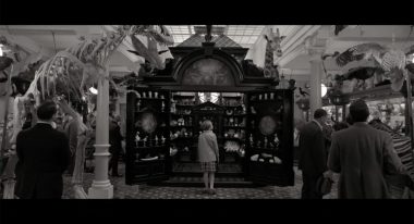
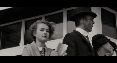
Gawler: That’s right. That task was, this is the look, how do we port this over to the digitally acquired footage? It was a two-step process. There was the color matching, but there’s also the particular film stocks used; it’s a period piece so the black and white film was quite grainy. It was supposed to be the 1920s and even the color footage from the ’70s had a real texture to it.
The Alexa gives a nice digital texture to the footage, but it wasn’t enough, it wasn’t matching up to the film negative. So we used an external plug-in called LiveGrain. It has the same film stocks that Ed shot, and we were able to incorporate those into the digital footage. I know that Todd and Ed were amazed at how seamlessly we could move from film to digital within the movie and nobody would notice.
Filmmaker: Do you know what film stock they used?
Gawler: Kodak 5219, 5222 and 5203. There was a black and white stock, and then color. Half the movie is black and white and half the movie is color.
Filmmaker: The film was sent to LA for processing. Was it digitized there and you were sent the digital files?
Gawler: That’s right. At that time there was no laboratory in New York City — though Kodak has since opened their lab, something we’ve all been waiting for for a long time and we’re happy that’s here now. It gives us more options and flexibility. But at the time the option was to process and scan at FotoKem.
Ed is very particular about the color on his dailies. It’s really important to Ed that he can sit with somebody and improvise and lock down his intent in the dailies, which is really smart because the director and editor and everyone are going to be living with this color for the next couple of months, and we didn’t want to be fighting any battles in the final color by pushing it in a different direction than people were already comfortable with.
They did a flat telecine scan at FotoKem, and they would send that over a private network to Harbor every night. We would take the media and did all the color and the dailies processing here in New York.
Filmmaker: What are you color grading in?
Gawler: I color in DaVinci Resolve. For the dailies we work in Colorfront.
The first couple of weeks I was coming in at two, three o’clock in the morning to sit with Jamie Payne, who’s our dailies colorist on this project. I would help set the look, then we would speak with Ed over the phone to communicate things to make sure that he was happy. I was always there looking at what was shot and processed the night before, and tweaking things, finding the look with Jamie, but then he would go through everything matching it up after we set the look.
Filmmaker: Did you have many conversations with the director or the cinematographer prior to receiving material?
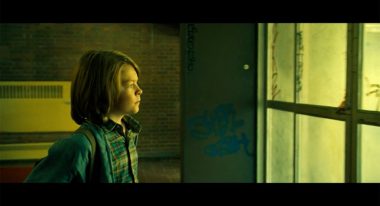
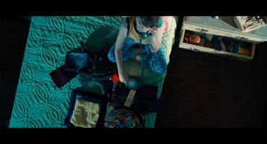
Gawler: Yes. Ed really liked to put the stylized yellow, warm green kind of look on this. It’s the ’70s, it’s New York City, it’s gritty, it’s a certain sort of aesthetic, it’s very much in the lighting and the production design. It’s not like we were miles away from the look with what they’d exposed on the negative, but we did go a little bit further based on the intent that you get from the lighting. Then in the finishing process, Todd came in with a whole binder of different inspirations that he had when they were putting the film together and he and I spent some time looking at that before digging into the final DI color.
Filmmaker: What mistakes do first-time directors and cinematographers make when working with a colorist? Or what could they do to make your life easier?
Gawler: I like when we are able to have these conversations in pre-production, and I like working with a production that has a clear idea of where they want to go with the color while they are shooting it. There’s some intent baked into that negative or that digital file, so that in the DI we’re not working with something that’s very vanilla that you can make look a hundred different ways. It’s always going to look better if there’s some intent baked in at the capture and then it’s up to us in the finish to really enhance that and pull the most out of it.
Working with Ed Lachman was a dream. He’s a prolific, accomplished cinematographer, just awarded a lifetime achievement award from the ASC a couple of months ago. You learn a lot sitting with filmmakers like that, and I just absorb as much as I possibly can to help develop my eye and inform all the other work that I do. I feel very fortunate; it’s like the best film school you could possibly go to, sitting with these guys in an intimate environment like that.
Filmmaker: For someone starting out in color grading, what advice would you give them?
Gawler: Watch as many films, and keep looking at as many images as you possibly can. I love to go to FilmGrab and constantly cycle through stills of movies that you can search by title or cinematographer or director. I find that really valuable.
There are a number of different platforms that you can use today. I use DaVinci, but I’ve used a number of different systems over the years. Master your tool set so that when you are with a client you can move quickly, speed is so important to keep the process moving.
Personally, I like to use nuance. I try to keep a natural photochemical look to projects that I work on. There’s all sorts of different tools in any color correction system, but make sure that you have the basics of balancing out an image properly before you start jumping into all the different tools and filters that you have.
