“It Is Always Tempting in Animation to Show More Than You Need to”: Art Director Jess Nicholls on Flee
 Flee
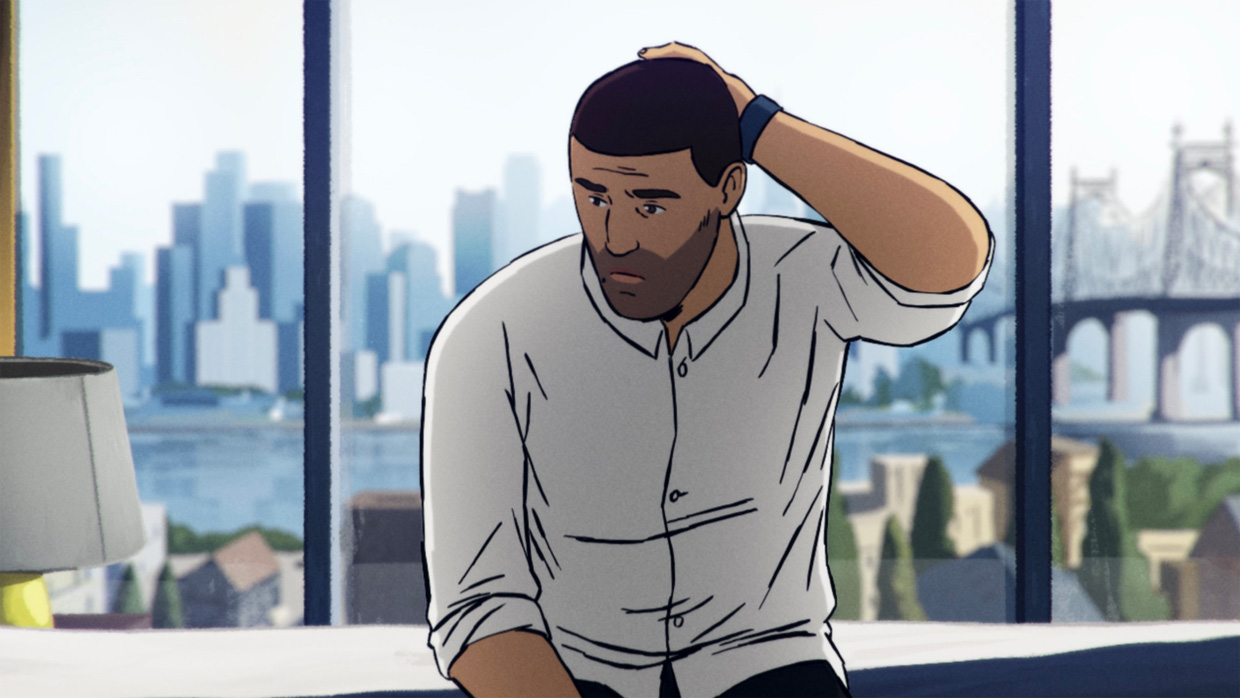
Flee Deftly merging animation and documentary, Jonas Poher Rasmussen’s Flee tells the true story of a gay Afghan refugee living in Copenhagen since being granted asylum. Art director Jess Nicholls shares how they protected their subject, Amin’s (a pseudonym), identity through the unbounded use of animation, and how to tell a true story through unique mediums.
Filmmaker: How and why did you wind up being the cinematographer of your film? What were the factors and attributes that led to your being hired for this job?
Nicholls: Just to clarify, I’m not a cinematographer but an art director as Flee is an animated documentary.
I was working for Sun Creature during the early development of Flee, on another project. Jonas and I had talked a couple of times, but it wasn’t until the film was getting ready to move into pre-production that the idea of me joining came up. At that point there had been some successful style tests, and character designs for Amin and his boyfriend were in place. Guillaume Dousse had been in charge of the visuals of the film, but wanted to move on to focus on his own projects.
I stepped in to take over the rest of the visual development, and to focus on cinematography, alongside the storyboard team (headed by the animation director Kenneth Ladekjær). Due to the film being animation, roles are structured a bit differently from live action.
My role as art director included overseeing all visual aspects of the film. Cinematography is a large part of that, as well as style, quality control, set design and dressing, character casting and post production. Actual animation—acting, movement, what happens in a scene—those things were dealt with by Kenneth. Jonas oversaw and worked with us on all aspects of the film. Nothing left the workshop without his fingerprints on it. In this way, the three of us, as well, of course, editor, Janus Billeskov Jensen, formed the core creative team.
Storyboarding involves making so much of the film from nothing. Our roles meant Kenneth was able to focus on acting and scene structure whilst I could contribute with set design, research and cinematography. Jonas and Janus were able to act as conductors, pushing us in the direction the scene needed to go.
As to how I ended up on the project—Flee is the kind of project I live for. One that has meaningful emotion and truth behind it. It is hard to find these kinds of projects in animation, due to the workload and budget required. My student film, Tsunami, which was selected as part of the Cinéfondation Selection at Cannes 2015, was a similarly structured film in that it dealt with a story set in a real time and place (the aftermath of the 2011 tsunami in Japan). Both Tsunami and Flee required a lot of cultural sensitivity, deep respect and therefore very thorough research, for as accurate as possible representation. This was especially difficult in both cases, as the Kabul of Amin’s childhood, like pre-tsunami Tōhoku, to a certain extent, does not exist anymore. I think acknowledging that from the outset was very important for Flee.
I have worked in commercials, tv and features in animation since my work on Tsunami, but it was mainly this project, my passion for these sorts of stories, and long discussions with Jonas about his intentions for Flee, that landed me in the Art Director position.
Filmmaker: What were your artistic goals on this film, and how did you realize them? How did you want your cinematography to enhance the film’s storytelling and treatment of its characters?
Nicholls: Flee, at its heart, is about how constantly having to flee our situation can affect us in our day to day lives and relationships. Our aim with the cinematography was to reflect that through the camera—to show Amin’s emotional state at any one time.
The film takes place across multiple locations and time periods. Principally, there are two main states of time—the present (where adult Amin is living in Denmark with his boyfriend, Kasper), and the past—where Amin’s narrative from his interview with Jonas runs over scenes from his memory.
The scenes in the present we wanted to film more like a documentary, with the insinuation that Jonas is behind the camera. This involved a consistent camera placement—around chest/eye height, and “faked” jump cuts, where framing changes slightly during conversations.
The scenes in the past are framed more cinematically. The camera is more free to move around here, to show narrative intent, rather than just being purely observational. We went for strong horizontal compositions, with a lot of negative space with shadow and light. This made the most of the frame, and made the landscape seem to stretch forever.
Sense of place was very important, as we move around so much in the film. We used the framing and lighting as much as possible to capture the feeling of being in a location, both physically and emotionally. Making the space feel large, open and disconnected, with lots of sky and strong views all the way to the horizon, helps us feel Amin’s emotional distance from where he’s living at any one point in time. Within the scene, placing Amin in areas of light or shadow gives us a sense of when he has to hide, and when he can’t get away—either from authority or when confronted in his relationships.
This disconnection continues into the placement of the characters on screen. Relationships in which Amin struggles are shown by keeping distance between characters, often meaning that they struggle to share the same frame and instead are kept apart by cuts.
These two parts of the film, past and present, with their different approaches to camera, made the shift to archive footage both stand out more, but also feel more intentional. The shift being a separate, grounded take on the reality at the time.
Finally, we have some more graphical sequences in the film, which are more abstract. These reflect memories and scenes where Amin was not present, and so we used theory of memory and imagination to craft a sort of stream of consciousness and emotion. Simon Rouby and Gilles Cuvelier did a great job at orchestrating these sequences.
Filmmaker: Were there any specific influences on your cinematography, whether they be other films, or visual art, of photography, or something else?
Nicholls: Guillaume brought some great references to the table initially, that we expanded on after I joined the project. Edward Hopper was a big influence in terms of framing and light composition. His paintings capture a sense of detachment as a part of scenes from everyday life, which really spoke to the meaning behind the film. The same goes for Vilhelm Hammershøj in his paintings of life in Denmark. Nicolas André’s paintings helped us simplify shapes to keep the style realistic, but also limited in detail. This makes the style feel like a memory—capturing important details without becoming photorealistic.
For a lot of the compositions, we looked at Alexander Gronsky and Korean cinema (particularly Lee Chang-dong’s Burning). Gronsky makes great use of open space and dramatic, yet stable, framing. This supports the sense of disconnect we were trying to create, and also helped a lot in trying to represent Moscow in the Russian sequences. His muted colors give a sense of faded glory that add nuance to the scenes following Amin’s departure from Kabul.
What we really liked from Korean cinema was the lighting and colors. Burning specifically makes great use of negative space through light and shadow, whilst keeping a realistic color palette that feels very grounded, at times. These tactics helped us simplify detail, and force Amin into areas of the frame that made him feel uncomfortable, forced to confront people or truths that he otherwise might have avoided.
For Kabul specifically, we had consultants who were able to guide us in the representation of the place. We used as much as we could find from the time period as reference, in the form of photos, news archive and books, like Alexander Prokhanov’s The Tree in the Center of Kabul. Marc Forster’s The Kite Runner was also a good guide for how others have approached portraying an older Kabul.
Filmmaker: What were the biggest challenges posed by production to those goals?
Nicholls: The biggest challenge in the animation process is that everything happens at the storyboard phase. You are trying to work out your location, camera placement, acting and rough edit all in one process. There isn’t really extra footage you can cut with—you have to purposefully create everything. We had to coordinate a lot between Jonas, Kenneth, Janus and I to find the best approach. You might end up with a great scene in terms of acting, only to realize that it doesn’t work with the way you want to shoot it. Then, the choice is to redesign the scene or try to frame the characters differently whilst capturing the same dynamic with the dialogue.
It’s a chicken and egg situation, as often the best way to start storyboarding from a script is just to hash out the dialogue with rough sketches. Decisions made for cinematography’s sake can be challenging to implement—either you have to think of everything at once or try to implement it after the fact. At the same time, the storyboard is the blueprint for the film, so if you neglect cinematography there, it will never make it into the final cut.
Filmmaker: What camera did you shoot on? Why did you choose the camera that you did? What lenses did you use?
Nicholls: As we were drawing our scenes by hand, we didn’t have to confront the camera question too much. There is a certain amount that can be faked, or distorted, in the perspective of a shot. At the same time, it is good to start with an idea of the kind of distortion and depth you want from shots, especially in films like Flee where the approach is more realistic than not.
We aimed for lenses in roughly a 35-70mm range. For locations that we reused a lot, like the Moscow apartment, we built a mock 3D model and used cameras with these lenses to frame up shots, as a test for storyboard. We wanted fairly flat but realistic perspective, where we could show a good amount of landscape whilst keeping a lot of strong parallel lines. Our main types of shots were wide, establishing shots, that benefitted from the vastness of the space; medium close ups for dialogue and character interaction, where negative space and creating distance between characters was important; finally, extreme close ups were used for moments of high tension and stress, to isolate important objects or people from an out of focus background.
Filmmaker: Describe your approach to lighting.
Nicholls: Our lighting approach was very high contrast, especially in the “past” sequences of the film. The lack of soft lighting makes the scenes where Amin is uncomfortable more intense. The high contrast allowed us to think of the compositions quite graphically, and push Amin into areas of the frame that aren’t as comfortable, or are more unbalanced. We used bright light to signify when Amin has to tell the truth, and shadows to show when he has to hide or run. More diffuse lighting comes in more in the “present,” to make those scenes feel more grounded in reality, rather than a reconstruction of a memory.
For 2D animation, the style of lighting is quite realistic, but exaggerated in the same way as Hopper employs in his paintings. This was to make the scenes feel relatable and real, but to also make it feel as though something isn’t quite right—the light is always too bright or too dark, and so off-balance.
Filmmaker: What was the most difficult scene to realize and why? And how did you do it?
Nicholls: There were a few difficult scenes. The scene with the storm on the boat was particularly hard to realize from a cinematography and storytelling perspective. No matter how we approached it, the scene always left us feeling like we were too removed from Amin’s own experience. More like a spectator than a participant. In the end, we realized we were simply showing too much of what should be an overwhelming scene. It should feel like it’s difficult to get an overview of the situation, when you’re lacking that much control, and in fear for your life.
It is always tempting in animation to show more than you need to, as you have relatively few limits on what can be drawn. Our research into memory and trauma told us in these moments of stress, it is common for people to focus on one thing that represents a threat—a sort of “weapon focus.” To solve the issue on the boat, we limited the scope of the camera, and focused in on what Amin was experiencing in his retelling of that moment—mainly, his mother. In this scene and others, we extended the technique to eliminating facial features in the crowd—to show the people and objects in detail that Amin actually focuses on in his memory. This technique made this scene, and others, feel much more traumatic and uncomfortable, but also relatable.
Filmmaker: Finally, describe the finishing of the film. How much of your look was “baked in” versus realized in the DI?
Nicholls: Due to the nature of animation, the finishing process is quite different from live action. We were able to get pretty close to the final look for individual shots in the compositing phase. This meant that the finalizing process was mostly about using grading to unify sequences, and to push scenes to be more effective, than it was anything else. The grading process allowed us to add more nuances of color and consistency to the film, giving it more of a realistic and polished look. We aimed to avoid too many overlays or having one color dominate a scene too much, as, although this would have helped separate locations more clearly, it would have made the narrative feel more biased and stylized, than true to life.
TECH BOX
Film Title: Flee
Lenses: As this is animation we didn’t use real lenses, but we aimed for a style matching lenses in roughly a 35-70mm range
Lighting: High contrast—Inspired by Edward Hopper