Judy Becker’s Top Ten Films (That Most Influenced Her Work as a Production Designer)
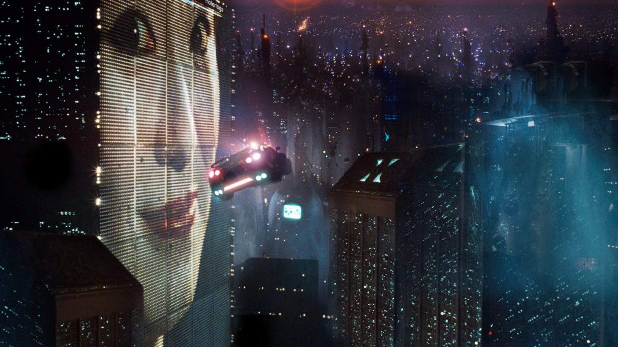 Blade Runner
 I came to production design as someone who has always loved movies. I also loved art, design, architecture and photography, so discovering that I could have a career that combined all my loves was one of the greatest moments of my life.
I have a realism-based approach to filmmaking — most of the worlds I create are fictional, but within the context of the film my goal is to make them feel real, grounded, worn, authentic. If a director wants a stylized or surreal approach I would need to find a way to dirty it up and add imperfections to make it feel real. Believability and realism in the context of the story are the things I care about most, and my goal is for the design to be part of a cohesive whole, not a stand-out element.
The teamwork and collaboration of filmmaking is one of my favorite aspects of my work — which is a bit counter-intuitive since in the rest of my life I’m a bit of a loner, and a pretty independent thinking and non-conforming person.
People sometimes compliment me by telling me they loved my work, but the best compliment is when they say they loved the movie.
My First Loves: Blade Runner, 1982, directed by Ridley Scott, production design by Lawrence G. Paul; and Se7en, 1995, directed by David Fincher, production design by Arthur Max.
When these films first came out I was not a production designer, but I think what attracted me (and many other designers) to them was the utter believability of the mythic worlds they took place in, one futuristic and high-tech, the other its grimy opposite. Both influenced countless of other movies and TV shows, and I am absolutely convinced Blade Runner even influenced the re-design of Times Square in the 1990s.
2. My True Love: Taxi Driver, 1976, directed by Martin Scorsese, production design by Charles Rosen.
The worlds that Scorsese depicts in Taxi Driver, most of them shot on location in New York City, feel real and genuine, yet fresh and eye-opening at the same time. The use of color is virtuosic. Everything created for the film fits perfectly within the existing world of New York in the mid 1970s yet adds so much to the storytelling — for example, the red white and blue campaign office. I remember finding out that the final shootout scene was shot on location, with special scaffolding built for the overhead camera, and I was in awe — it shows how much the filmmakers appreciated what shooting on location gives to the story.
I’ve seen this movie countless times, and every time I discover something new. If I could have designed any movie in history, it would be Taxi Driver.
3. Less is More: The Last Picture Show, 1971, directed by Peter Bogdanovich, production design by Polly Platt.
The Last Picture Show is made with a minimalism that is realistic for the place and era of the story, appropriate for the characters and perfectly done. Nothing in the film seems out of place, and there is nothing I would want to add.
The first time I designed a movie (Sublet, 1992, directed by Chus Gutierrez) my two crew members and I went through enormous effort to get a refrigerator up six flights of stairs so that the tenement kitchen we were filming in would be complete. As soon as the DP walked in he told us to lose it, permanently. I learned then that no one misses what isn’t there — they only notice if something there is wrong.
4. Dirty Realism: The Last Detail, 1973, directed by Hal Ashby, production design by Michael Haller.
I first saw The Last Picture Show and The Last Detail well before I even really knew what production design was. But they must have inhabited me strongly because when I rewatched them after becoming a production designer I realized what major influences they were. From the first film I designed I had a knack for making a realistic looking mess, and I also really enjoyed it — maybe because at home I’m a bit OCD about order.
I think The Last Detail is an under-appreciated work of genius. Shot primarily on location, the attention to detail creates a strong sense of time and place crucial to the trajectory of the story. I remember rewatching it and the awe I felt at the litter on the ground in the Penn Station scenes — these details make such a difference, yet nowadays we have almost no time to dress them in.
Shortly after I rewatched The Last Detail I designed Garden State (2004, directed by Zach Braff). I had never done something with so much comedy before, and I was nervous about making the scripted sight gags work, but I realized the solution was to ground them enough in reality that they looked organic. The bathroom wallpaper has a strong pattern but doesn’t call attention to itself, so when Zach stands in front of a mirror in a matching shirt the gag is surprising.
5. Hot and Cold: Hardcore, 1979. Directed by Paul Schrader, production design by Paul Sylbert.
Hardcore was one of the first films where I realized how much could be done with the color palette in terms of telling a story, and yet still remain grounded in reality. George C. Scott moves from his icy cold, white and blue home in Minnesota to the lurid red hot world of Los Angeles, searching for his missing daughter in the porn industry. The colors are so organic to the worlds that nothing seems contrived or “designed”.
I always focus on designing and figuring out the color palette at the very beginning of a project — it’s important because it’s something the costume designer and director of photography will weigh in on as well as, of course, the director.
Sometimes the director comes to the project with an already inspired view of the use of color, and such was the case when I designed Ryan Murphy’s American Crime Story: The Assassination of Gianni Versace. The mini-series goes backwards from the killing of Versace in South Beach at its height — 1980s hedonistic partying among the AIDS crisis reflected by crumbling pastel colored Art Deco buildings and the color pink in particular. As the series moves backwards in time with each succeeding episode the palette changes according to the nature of the characters and what was happening on screen until at its most reductive level we see Andrew Cunanan alone in a beige room signifying the nothingness of his world and his non-existent sense of self.
6. Location, Location: In Cold Blood, 1967. Directed by Richard Brooks, production design by Robert F. Boyle.
One of the challenges inherent in production design is that after spending considerable time and money trying to make a set look real, little is left over for the truly creative part of design. Any way I can find to help a set feel real I will use — for example as many real, as opposed to faux, materials as possible. I once had a construction coordinator tell me that using real materials “wasn’t really designing,” and this couldn’t be farther from what I believe.
Of course shooting on location helps enormously. In Cold Blood was made in the new 1960s world of shooting on location, and is notable for the extremes to which the filmmakers went. Based on the real-life Clutter family murders, Brooks wanted to shoot in as many of the real-life locations as possible, and even tried to get permission to shoot the execution scene at the actual gallows where Perry and Dick were hung (permission denied). I found this movie absolutely terrifying, and I think much of that is due to its almost verité approach.
7. Unlikely Sources: Walkabout, 1971. Directed by Nicholas Roeg, production design by Brian Eatwell.
When I started prepping Brokeback Mountain (2005, directed by Ang Lee) two references immediately came to mind: Richard Avedon’s In the American West, which was then out of print, and Walkabout. The first time I saw Walkabout I found the ending so sad and depressing I was never able to put it out of my mind. And that’s what I thought of when I first read the script for Brokeback Mountain — the bliss that Jack and Ennis found in nature versus the dreary reality of civilization. That might have been the first time I thought about contrasting worlds and how to create them visually when I was designing a movie.
8. Relax and Think of : Boogie Nights, 1997, directed by Paul Thomas Anderson, production design by Bob Ziembicki.
The first period film I designed was Brokeback Mountain. Ang’s goal was that no viewer of the film would be able to find any anachronisms for either time or place. This type of ultra period fidelity was crucial to the telling of such a daring story set in the early 1960s.
But exact period accuracy doesn’t always matter. One of my favorite films is Boogie Nights (1997, directed by Paul Thomas Anderson) which starts out in 1977. When I first saw the movie in the theater I was just attempting to start my production design career, and I was (and still am) awestruck by the greatness of the filmmaking. The continuous, almost three-minute-long opening shot starts wide on a busy nighttime street in the San Fernando Valley and continues into the club, introducing us to the main characters and ending on Mark Wahlberg. After a lot of experience doing period movies and shows, and knowing how hard and expensive it is to do a period streetscape, I rewatched the film and realized that most of the signage and neon in the opening shot (possibly my favorite film opening ever) was contemporary for 1997 – but it didn’t matter! You felt you were there and that was all that mattered. A big lesson.
9. The Real and the Unreal: Salesman, 1969, directed by Albert and David Maysles.
Soon after Brokeback Mountain I designed Infamous, directed by the late Douglas McGrath. I was diligent about making sure everything was accurate for the period and the characters. As part of my research I watched Salesman, which had been made around the same time Infamous takes place. Every mid-century design cliché Ang and I had studiously avoided on Brokeback Mountain was in almost every real home in the documentary — the Sputnik clock, the Googie-style formica kitchen table, the cheap vinyl covered chairs. That’s when I realized that sometimes reality doesn’t look real on screen — and that knowledge became part of my design arsenal.
10. Perfection: Rosemary’s Baby, 1968, directed by Roman Polanski, production design by Richard Sylbert.
This movie takes what could be seen as an insane story and makes it absolutely believable. A big part of that are the pitch-perfect sets, locations, set dressing and color palette (and cast!). The Woodhouses’s starter apartment seems young and contemporary to this day; the annoying, seemingly benign, old world neighbors, the Castavets, could live next to me right now (hopefully not!). Almost no aspect of the film is tweaked for horror; in fact the opposite is done — everything seems boringly mundane. And that’s what makes it so scary — you can imagine this actually happening in your, the viewer’s, world.
The above is an expanded version of an article Becker wrote for the AMPAS website.