 Back to selection
“Getting Funded is Only Part of the Story”: Kickstarter Embraces Timeline Film Pages with Spotlight

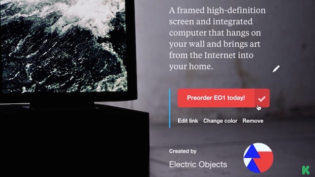
Kickstarter has rolled out today Spotlight, a very clever new design option for their project pages. On first glance it seems simple — sort of like Facebook’s Timeline, Spotlight turns your Kickstarter page into a reverse chronological story of your project’s inception, development, successful funding (you hope) and afterlife. By organizing your updates and milestones in the form of a clean narrative scroll, it encourages you to continue that story long after your campaign ends — making Kickstarter a stickier site. (More traffic for Kickstarter!) To make it worthwhile to filmmakers, as the video below shows, you’re given a prominently placed call-to-action button that can send visitors to other sites, like your own website, or Twitter or Facebook, or which can be used to sell merchandise or a copy of your film.
What makes this particularly useful, I think, is that frequently a Kickstarter page is where the most detailed information about a film can be found. Any number of times I’ll search a film and wind up pulling a description or confirming a key detail not from its website — which often doesn’t exist — but from its Kickstarter page. By increasing the utility of that page, Kickstarter is adding a bit of the functionality Assemble and VHX (which both integrate with Kickstarter too) provide their filmmakers. The difference is that many filmmakers launch a Kickstarter early, so that early placement and the traffic generated by the campaign will rank that page high in SEO results.
Check out the Kickstarter video about Spotlight below.
