The Mankalorian: Two Approaches to Digitally Captured 35mm Looks
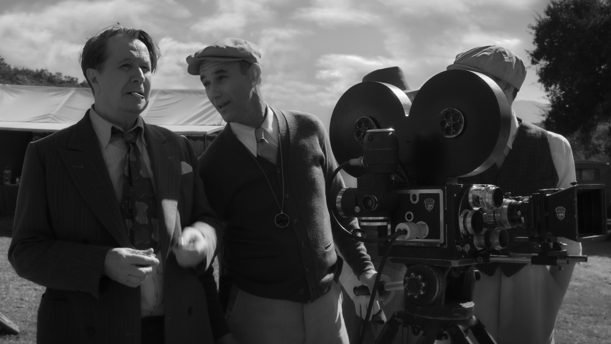 Gary Oldman and Jamie McShane in Mank
 The last time I wrote about film color for this magazine was on the ways 35mm shooting and digital color combined in Uncut Gems and Star Wars: The Rise of Skywalker to create contemporary looks strongly engaged with the past, resulting in what we might call a look “more filmic than film.” David Fincher’s Mank, along with a second season of the Star Wars TV series The Mandalorian, gives us an opportunity to consider how digital and celluloid tendencies combine from the opposite direction—both were shot digitally, then graded to explicitly evoke celluloid. Once again, color grading and capture format compress our sense of history and time, but here the results are more “outside of time,” more uncanny, and perhaps more unerringly of the now.
The Mandalorian’s approach is simple: the series grades its photography in a manner mimicking the colors achieved through 35mm shooting in every main entry in the Star Wars trilogy of trilogies. (The recent standalone films at times eschewed a classic celluloid look for something more in line with contemporary trends, with Solo in particular flitting through a remarkable number of color styles.) As a low-key, deliberately simplistic series that strips Star Wars down to its basic serial Western tropes, The Mandalorian’s colors follow suit. Watch any episode of the series and the look is fairly consistent with the rest of the Star Wars live action canon, with saturated mid tones and cool highlights, warm skin tones and pops of bright reds often punctuating the image in lasers, flames, logos, text and signs. It isn’t the high-saturation, high-contrast look of some of the Marvel TV series, which cover for their lower budget by using a few splashes of intense color to mimic the bright, splashy look of their higher-budgeted theatrical siblings, nor does it often tend to the one- or two-color blue and orange schemes associated with contemporary action film (a much-noted but effective phenomenon used to blend disparate computer and live action elements in a striking frame). The Mandalorian, by contrast, simply uses a clean version of the classic Star Wars palette, whose muted tones may have something to do with its newer-than-new shooting style of using a motion-tracked camera against live-animated LCD-panel CGI backgrounds on set. You see it all in the last few seconds of the season recap before season two begins: a sunset sky of purples and reds, the crackle of a lightsaber and fire, the rich skin tones of the series villain.
It’s not celluloid, though, and some things can’t be mimicked—the highlights in particular fall quickly into pure whites, giving them that flat, cold digital look associated with Fincher. What’s stranger, though, are the blacks. Inexplicably, throughout the entire show, they’re almost never anywhere near true black, but are considerably brighter and more grey than we see in either film or digital shooting (aside from the early years of low-budget HD more often associated with Sundance narrative features). The first episode takes place largely at night, making it particularly apparent and odd that the blacks are more a light grey-yellow-green never approaching true black, but you see the same thing in that final sunset shot of the first season. It’s an odd choice, one that leaves the images oddly flat and one-dimensional despite their considerable high production sheen and sleek high production sets and backgrounds. Milkiness, for a contemporary viewer, tends to suggest an “impoverished aesthetic” of sorts. It’s a washing out of the image more often associated with necessity than with choice, which regardless of the cause, creates an image that keeps the viewer at remove, the lifted blacks giving the image a sense of weightlessness. While it’s likely not a result of budgetary concerns, it’s a choice that estranges us from the image—perhaps heightening the sense of fantasy, perhaps lowering the stakes, leaving us with a series that feels rather lightweight, its images rarely striking us strongly. Perhaps this is to create a more playful feel for the series, to echo its deliberately lower narrative stakes. It does impart a sense of remove, of coldness but also of coolness in the sense of how what culture terms “cool” is often slightly chilly. It’s not constant, but it is frequent. In any case, it’s an odd choice, particularly when taken alongside a color grade that is elsewhere highly evocative of the ’50s adventure films from which Star Wars sprung, landing us in a strange, timeless feeling—Star Wars out of time, Star Wars as the endless adventure, Star Wars as the past dragged into an eternal present of the digital age, beautiful but slightly distanced, a bauble.
David Fincher’s Mank, a black-and-white biopic about the screenwriter of Orson Welles’ Citizen Kane, also floats in time, but in a far more explicit and seemingly intentional way. In keeping with the filmmaking of the ’30s and ’40s Hollywood world in which the film is set, the film was shot on extremely high resolution B&W digital, then heavily post-processed to resemble a wide range of classic black-and-white films, with grain, scratches and even completely superfluous cigarette burns in the upper right corner, which would be used to signal a transition between reels to the projectionist on a 35mm print but which are obviously unnecessary for a digital film that will be streamed and/or screened digitally. On the one hand, Fincher’s decisions are in all likelihood simply practical for him—he famously loves to shoot at an extremely high resolution so that he can then reframe a shot in post-production, adding pans and framings that weren’t included on set. At the same time, Fincher, DP Erik Messerschmidt and colorist Eric Weidt have clearly decided to run with the process of coloring digital footage to look like film as far as possible, emulating a wide range of B&W looks beyond the classic Hollywood look or Welles’ signature high-contrast chiaroscuro, and creating new looks in the process that would have been utterly impossible when Citizen Kane was filmed. An aside—despite the name, color grading is equally important for black-and-white films as it is for color films. Even though there isn’t color in the image, a “colorist” must still adjust each shot to choose where the blacks, whites, and grays should fall in relative brightness to one another, matching that across all the shots in a scene. They can make adjustments to various segments of the image relative to the others, and can choose looks as to how highlights and lowlights blow-out or fall-off.
An opening title sets the scene, with classic Hollywood titling geographically off-axis, the diagonally slanted crew and cast titles going deeper into the frame from left to right, their aggressive positioning echoing Panic Room’s opening—the film is an exercise in feeding classic looks through modern tools and styles, updating, reformatting and recontextualizing them. We have classic Wellesian looming shadows in, appropriately, a dinner party at William Randolph Hearst’s palatial estate, but Fincher picks out Amanda Seyfried’s Marion Davies from her co-stars with a beatific white light, grading her as a crisp white burn into a darkened set. When she’s first introduced on a Hearst set, we get a glamour shot with clean even grays and few highlights and blacks in the classic Von Stroheim signature (the director’s seen earlier), but rather than the blown-out warmth of those shots, we get Fincher’s famously digital crispnesss. Elsewhere there’s nods to the European art films of Antonioni or Fellini, with the highly textured darks and stark skies of Antonioni appearing in a nod to his iconic shots of industrializing landscapes with oil derricks in the frame’s background, and with the cascading blow-outs of on-set lights from 8 ½ used throughout. In each case color timing renders them a bit more, a bit crisper, more blown-out, sleeker, and always with that digital hyper-crispness poking out from behind his added grain. These amplified classical looks are all unmistakably still Fincher’s, with his characteristic love of pillowy yet cleanly delineated whites, and dark, enveloping shadows.
On one level, the effect is simple—William Randolph Hearst’s attempts to swing an election through his control of Hollywood media contains obvious contemporary echoes of our outgoing US administration—but, on another, allows Fincher to situate his film between the classic studio world Welles inhabited and the Netflix-enabled world Fincher has gingerly stepped into. It sits uncomfortably on the edges of color grades and lighting patterns that harken across the scope of film history, a self-consciously ’40s look that is at the same time hopelessly contemporary. We indulge in nostalgia in the look, but the film constantly subtly cues us to realize it is a digital, 2020s creation. Nostalgia for the glory days of Hollywood is no easy thing in Mank, for looking back here entails wrangling with how the present future warps the past. If The Mandalorian’s color grade situates us in a cool approximation of the Star Wars audiences crave, Mank’s creates a more difficult relation to history—torn between times, reaching for new forms to pull out of the past. Digital color and its celluloid ancestors are far from settled mediums, particularly as celluloid once again becomes a resurgent shooting format. Mank lets the tension spool out.