The “Film Look” and How The Holdovers Achieved It
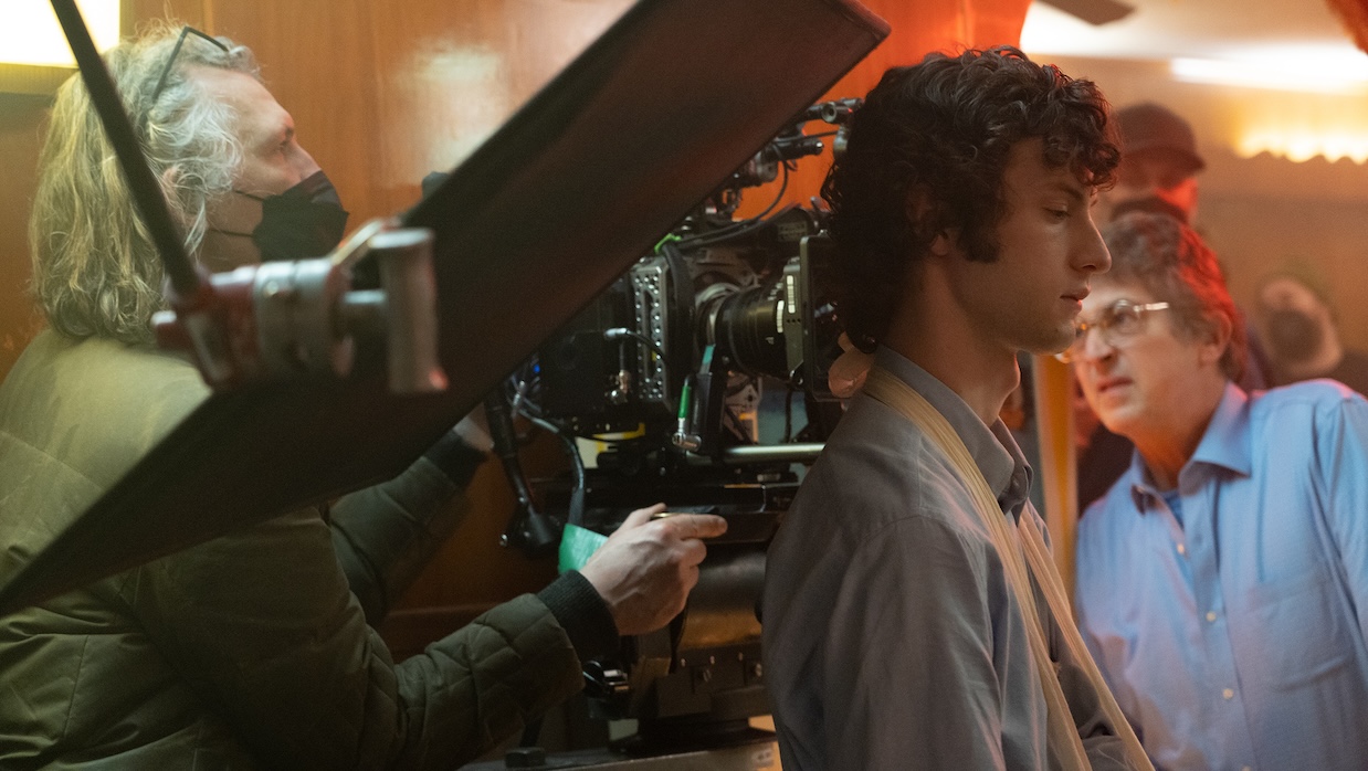 Eigyl Bryld, Dominic Sessa and Alexander Payne on the set of The Holdovers
 A working digital colorist or cinematographer in 2024 is likely all too familiar with one particular question: “Can we get the ‘film look’?” A decade into the age of digital sensors as the increasingly dominant and default shooting format, filmmakers at all budget levels are increasingly looking back at celluloid for inspiration. Phenomena once seen as drawbacks to be minimized—grain, chromatic aberration, anamorphic distortion, lens flares, halation—have not only become desired, but, if hordes of YouTube camera gurus are to be believed, “cinematic.” That is, these elements associated with this particular image formation workflow are essential to what constitutes “cinema,” a form that within this logic reached its textural apex in Hollywood at some point in the 1970s. A sort of textural neoclassicism has taken hold.
Within this framework, The Holdovers must seem like some sort of singular achievement. Director Alexander Payne, cinematographer Eigil Bryld and colorist Joe Gawler have seemingly employed every trick imaginable to bend their footage, digitally captured via the Arri Alexa Mini, to appear as if it was not only shot on a 35mm film stock circa the winter of 1969-70, but projected on, as Gawler puts it, a “questionable release print.” Virtually every celluloid-related textural element one might expect is present, yet The Holdovers doesn’t stop there: it was conceived from the ground-up to, in Bryld’s words, “look like it was a movie found in the cans in someone’s garage.” The film’s visual language, camera operation, monaural soundtrack (lovingly rolled off at around 8khz to resemble the Academy Mono standard), title cards, editing toolkit and studio logos are rendered as indistinguishable from a film released in the year of 1971 as one can conceivably get.
These last steps place The Holdovers in a different category entirely from the more à la carte approach taken by most filmmakers: it’s a thought experiment in the vein of Steven Soderbergh’s The Good German, an attempt to pick a date, shout “stop!” and make a movie as if the intervening years hadn’t yet occurred. Film emulation, of course, is a key part of this, and an ideal starting point.
The Film Look
Cinematographer Steve Yedlin, whose display preparation demo is the closest the world of film emulation has to an essential popular text, defines the post-production film emulation1 process as four basic operations: color response (achieved via a complex color transformation), grain, halation and gate weave.
The most complex of these by far is the first: color response. Imagine a digital camera not as an artist might imagine a specific palette of paints but as a data-gathering system. Light is measured by an array of photosites, tiny light wells that collect and measure photons before transforming this data into an electrical signal. Then, whether in-camera or on a separate device, this data is interpreted and formed into an image legible by human vision. This is the beginning of the process known as “image formation.” The resultant image, contrary to what is often assumed, is not “neutral”: it is the outcome of a set of decisions and assumptions made throughout the formation process. In cinematography, this image is usually an aesthetically arbitrary intermediate image, encoded for maximum data retention purposes2, which can then be transformed via any number of standard operations to arrive at an image that can be best described as “what the camera’s manufacturer recommends.”
The colors of this image are usually informed by film photography— part of the Arri Alexa’s early appeal was its relative aesthetic proximity to the color response of modern Kodak film stock—but aren’t designed with the intent of approximating all of the ways in which different film stocks would respond in identical situations. To do so, one needs to model a specific in-camera film stock (usually referred to as a “negative,” but it may also be a positive stock), and a certain film print stock, which has a similarly significant aesthetic impact, compare that against a similar model of the camera’s tonal response and bridge the gap with a transformation. These transformations are often very complex and can involve any number of intra-pixel operations. The result, if executed correctly, is ostensibly3 an image wherein the colors and contrast are perceptually indistinguishable from an identical subject shot on any given film stock and transferred to an exhibition film stock.
The Holdovers was treated in this manner, but just as important to the film’s period faithfulness are the tools the creative team took off the table. Bryld says that early on a rule was established that “We can’t [power] window the hell out of this movie,” referring to zone-specific color tools like digital vignettes and graduated filters. When color correction was required or color grading was desired, Gawler stuck to digital tools designed to replicate the effect of printer lights in a photochemical color timing studio so as to maintain the illusion. A specific algorithm for “subtractive” color was also used to achieve an effect similar to the way celluloid increases in density as more saturated colors manifest. This differs from behavior germane to digital systems, which are additive and light-based.
Color celluloid film contains three layers of emulsion: blue, green and finally red. When light passes through and hits the back layer of film, some bounces back and scatters largely in the red layer. The resultant phenomenon is known as halation. CMOS sensors, used in all modern digital cinema cameras, are not subject to this effect. As such, a spatial algorithm is necessary to replicate these elements in digital images. Similarly, film grain—a necessary biproduct of the very nature of celluloid film stock—is made up of silver halide crystals of random sizes and shapes. These individual crystals form an image that, frame by frame, is fundamentally randomized and unique. Digital noise is neither mechanically nor aesthetically equivalent, as digital photosites are arranged in a grid and static. These are just some of the variables that make digital noise perceptually distinct from film grain.
Gawler has been adding grain to digitally-sourced films for years; for Kelly Reichardt’s First Cow, he and cinematographer Christopher Blauvelt turned to Livegrain, a service that generates bespoke algorithmic grain widely considered to be among the best currently available. Far from being a mere overlay, these grain patterns respond to the luminance and chrominance properties of each frame. The result is a layer of grain that feels embedded within the image, as it is on celluloid film, rather than imposed. Four years later, the team behind The Holdovers utilized a similar approach alongside a strategy of digitally “pushing” the Alexa Mini. Bryld exposed the film for ISO 1280, two thirds of a stop more than the default recommendation for the Alexa. This allowed for an increased amount of definition in the highlights and less in the shadows, which enforced a lighting and exposure methodology in-line with film stock.
“We added a little subtle gate weave throughout the show,” says Gawler. Gate weave refers to a biproduct of the fact that film strips travel, at great speed, through a motion picture camera, while digital sensors do not. As a result, an image captured on film bobs and weaves ever so slightly. Unsatisfied with the results of algorithmically-agitated images, the creative team decided on a similar strategy to that which Guy Maddin and the Johnson brothers employed in The Forbidden Room: they motion-tracked a sample of 35mm film and anchored their digital images to this tracking data, thereby creating a believable mimicry of this gate weave.
The remainder of the tools most commonly employed by most filmmakers to replicate those of celluloid image workflows are employed on-set, framerate (24 or 25fps), shutter angle (180 degrees) and exposure decisions chief among these.
Perceptions of Film
While replicating the mechanical and photochemical elements of a film camera might technically allow one to satisfactorily emulate film stock, audience expectations don’t stop there. One need only look at the late 35mm work of Roger Deakins to see why: True Grit and A Serious Man are in many ways more texturally similar to his digital work, such as Prisoners, than they are to the early-’70s films that inspired The Holdovers. Part of this is due to changing film stocks: modern film is designed specifically for scanning. “We tested film: 16, 35, reversal, all sorts of things,” says Bryld. “Most of the negative stock has been digitized in a way, because it’s all designed after DIs became common. Kodak started calibrating it for the optimal digital transfer—low contrast, very fine grain.”
The bulk of this disconnect, however, is a result of elements that, while not connected to celluloid film, are popularly associated with “vintage” aesthetics. In this respect, The Holdovers is an uncommonly rigorous work: certain cliches, such as anamorphic lens artifacts and strident softening filters, have been avoided and the aspect ratio was “cheated”4, but other elements have been foregrounded: gimbals and steadicams were avoided in lieu of fluid-head tripods, dollies and the occasional optical zoom. Dissolves4 are employed unexpectedly during dialogue scenes in ways that feel distinctly out-of-step with contemporary expectations for such gestures. The soundtrack was mastered in an imitation of mono and distorted so as to resemble an optical track on a release print.
The lighting ideology employed is of particular interest. Here, as with the choice of camera, Bryld did not limit himself to period-accurate tools: LED fixtures were widely employed, as were modern light modifiers such as octagonal softboxes. Bryld’s philosophy prioritized attitudes and ideology over concrete adherence to physical tools: “Rather than trying to send myself back to the ’70s… I’ll bring that mindset here.” He continues: “If it was 1970, with this kind of movie with this kind of budget, I would shoot digital, I would use LED lights…It would have been obvious in something like this to say, ‘OK, let’s only use tungsten light’ or ‘Let’s try and find an old arc light so we can do daylight’ or whatever. But all of that would really have gotten in the way of everything else this movie was about.” Decisions to limit otherwise available tools were made only when they were aesthetically consequential: high-powered HMI fixtures, commonly used to imitate daylight, were de-prioritized because “had this movie been made in 1970, it would have been low budget as well. So, we wouldn’t have had big arc lights.”
Bryld’s conclusion that period lighting aesthetics lie more in ideology than in the finer points of toolkits is evident everywhere in The Holdovers: the sourcing throughout the film is reminiscent of the naturalistic and unshowy work of cinematographers like Michael Chapman and Bill Butler. The radical and relatively “crafted” work of cinematographers like Gordon Willis was avoided: “It’s not a Michelin star restaurant experience where you come in and everything is beautifully composed on a plate… I think it takes a lot of discipline not to fuss.” Current trends in independent cinema lighting—dogmatic adherence to natural sourcing, an aversion to hard fill light—are studiously avoided, as the film is full of hard frontal sources throughout its daylit interiors and routinely plays fast-and-loose with motivated directionality during its nighttime scenes.
Contemporary Texture
“I think in some ways we’re [at] a little bit of a crossroads, because we’re at the peak of the control we have with digital,” says Bryld when asked about the epidemic of film emulation sweeping contemporary cinema. In so holistically turning back the clock, Payne and company have created a sort of meta-narrative that rhymes as much as anything with Rhys Thomas and Alex Buono’s work throughout Documentary Now! (itself a marvel of format emulation) and Richard Ayoade and Matthew Holness’s Darkplace. Each of these works asks the viewer to not only consider the diegetic “reality” common to all narrative fiction, but that of the crew making the fictional work we’re viewing. In the case of Documentary Now! , that meant researching the specific personalities of individual camera operators. A key part of the success of that show’s period format emulation lies in the meticulous attention paid to the differences in camera operation styles between folks like D.A. Pennebaker and Albert Maysles. Likewise, The Holdovers asks us to imagine a crew that never existed and isn’t explicitly acknowledged. First Assistant Camera Glenn Kaplan let a shot involving Paul Giamatti go out of focus for a moment and Payne left it in: are we to take this as a gesture by Payne or a mistake by an imagined crew circa 1970 left in for the sake of believability and character development?
This meta-narrative play-acting allows Payne and Bryld to regularly engage in similar “uncinematic” gestures throughout the film. Elements that frequently appeared throughout films of the late 1960s and early 1970s and have since been marginalized are evident throughout: rough, halting pans and tilts; reverberant and tinny dialogue scenes’ unconventionally-timed dissolves; moments of proscenium-aware blocking; unsightly magenta skintones. In a more conventional and contemporary formal scheme, any of these might immediately stick out as “mistakes.” Here, they’re an expressive and unusual toolkit to play with. “People [in the 1970s] broke away from studios and went out into the streets and shot handheld” says Bryld. “All of a sudden, you told different stories.”
The act of looking back at old mediums and techniques to inform one’s own work, as commonly practiced, often manifests as a conservative impulse: “let’s not design something new: the old one will do, old ways were better.” The Holdovers is a worthwhile study in the ways in which this need not be the case: by focusing on passé and “un-cinematic” working methods in the context of an intellectual exercise in period dress-up, Payne and company have managed to sneak an unusually concentrated set of aesthetic gestures which violate current ideas of the “cinematic” past audiences worldwide. What’s more New Hollywood than that?
Check out author Devan Scott’s accompanying video essay here.
1 In his document “On Color Science,” Yedlin groups these elements and others into three categories: spatial, temporal and intra-pixel.↩
2 “Aesthetically Arbitrary”, in this case, means that the image’s color and luminance values have been encoded in such a way as to maintain dynamic range and destroy as little data as possible: the side-effect of this is that these unfinished images will generally not represent anything resembling the intended final image aesthetically.↩
3 Whether or not technological progress has truly resulted in perceptual indistinguishability between film and digital-based image formation systems is very much not a settled matter. The Creator cinematographer Oren Soffer argues: “I think it is currently possible, right now, for digitally-shot images with a fully digital workflow to emulate every perceptual characteristic of celluloid-based workflows.” while Bryld says “I’m not convinced it’s 100% true…I think it depends on what sort of environment you’re shooting.”↩
4 A North American spherical release would have been projected in the aspect ratio of 1.85:1 in 1971: Payne and Bryld opted for the European standard of 1.66:1.↩
5Interestingly, no attempt has been made to replicate the generational loss that the optical printing work required for such dissolves would create.↩
Works Cited:
My own interviews with Eigil Bryld and Joe Gawler at the Harbor Picture Company, conducted January 2024.
FRAME & REFERENCE interview with Eigil Bryld (with permission, all instances noted above)
Display Prep Demo, Res Demo, “On Color Science” by Steve Yedlin