“Letting Brooklyn be a Constant but Subtle Presence”: DP Martim Vian on Love, Brooklyn
 Still from Love, Brooklyn. Courtesy of Sundance Institute.
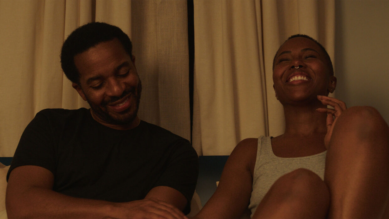
 The U.S. Dramatic Competition entry Love, Brooklyn follows the lives of three Brooklynites as they navigate the trials and travails of everyday life. The film is the debut film by Rachael Handler, who has directed episodes for a number of streaming series.
Serving as director of photography on Love, Brooklyn is Martim Vian. Below, Vian goes into detail about the film’s cinematographic principles and bringing its setting to life.
Filmmaker: How and why did you wind up being the cinematographer of your film? What were the factors and attributes that led to your being hired for this job?
See all responses to our annual Sundance cinematographer interviews here.
Vian: I had worked with Kate Sharp, one of the producers of the film, on a few commercials in the past. When they were gearing up to make Love, Brooklyn, she threw my name in the hat. I interviewed with director Rachael Holder several times. Our conversations slowly started becoming more and more specific, and it felt like we were already collaborating on our approach to the project. I then met with the other producers and was eventually offered the job.
Filmmaker: What were your artistic goals for this film, and how did you realize them? How did you want your cinematography to enhance the film’s storytelling and treatment of its characters?
Vian: A romantic drama at its core, Love, Brooklyn, centers on characters wrestling with change and uncertainty against the background of an evolving city. Our main goal was to create an honest and poetic visual language that authentically reflected the film’s themes of personal transformation and evolution in the characters, as well as in Brooklyn itself. The goal was to achieve a balance between realism and beauty, allowing the visuals to feel grounded yet poetic with the city and its textures contributing to the emotional depth of the story. We wanted the cinematography to situate the audience firmly within the characters’ world.
To realize these goals, the cinematography followed some key principles in its composition, lighting and color. First, we chose wider and mostly static compositions, creating a window into the world these characters inhabit. This allowed for an observational, fly-in-the-wall approach. This restraint in movement, as well as long uninterrupted takes, hopefully allow viewers to absorb the fullness of each moment, and by placing the camera quite close to the actors, it creates a feeling of intimacy without voyeurism.
This type of composition also allowed us to frame the characters within their surroundings rather than isolating them. Using wider lenses and deep apertures (T8, T11, T16), we ensured that both the characters and the spaces around them were in focus, bringing context into every shot, and emphasizing the symbiotic relationship between the characters and their environment.
Second, we focused on lighting spaces rather than faces. Motivating light from logical, often visible sources helped create an authentic, lived-in feel while maintaining a sense of cinematic beauty. This approach gave the actors the freedom to move naturally within their environments, enhancing the believability of their performances. Brooklyn’s neighborhoods, with their unique light and texture, became a key part of the narrative, reflecting the film’s emotional tone.
Finally, director Rachael Holder and I worked closely with colorist Roman Hankewycz to develop a color story. Inspired by ’70s and ’80s street photography and 35mm films, we created a custom LUT in prep that added a warm, nostalgic quality to the imagery while remaining true to the contemporary setting. Ultimately, the goal was to ensure that the cinematography supported the characters’ emotional arcs while letting Brooklyn be a constant but subtle presence in the film.
Filmmaker: Were there any specific influences on your cinematography, whether they be other films, or visual art, of photography, or something else?
Vian: Rachael’s main reference was Call Me By Your Name. She loved the warm tones and the no-frills, beautiful, and naturalistic photography of Sayombhu Mukdeeprom. With so many exterior scenes in the movie, I looked at a lot of street photography as well and was really struck by Kwame Brathwaite’s use of color and treatment of faces.
Filmmaker: What were the biggest challenges posed by production to those goals?
Vian: A week into our four-week shooting schedule, most of our locations started falling apart. Strikes, weather, budget and scheduling issues meant that we lost most of the spaces we had lined up in pre-production, and, with them, a lot of the prep work we had done at a creative and technical level. That meant that for the rest of the shoot, most of the locations were scouted over photographs while shooting, and we were walking into them for the first time on the day we were shooting there.
Initially, that was very frustrating, but as I embraced the circumstances and realized my role was to make the best I could with what I was given, there was a freedom that came with it as well. Sure, a lot of the specific prep I had done with gaffer Justyn Davies and key grip Chris Keenan had to be abandoned or reworked, but we knew the approach we had in mind, and shooting from the hip actually made everything a little more reactive, and I think that might have brought an immediacy to the photography that maybe wouldn’t have been there had we planned everything out as much.
Filmmaker: What camera did you shoot on? Why did you choose the camera that you did? What lenses did you use?
Vian: We shot on an Arri Alexa Mini and an Amira. I’ve been using this sensor for over a decade now, and on a movie with a tight schedule and limited resources, I like limiting my variables so I can focus on what’s happening in front of the camera. I know how the sensor is going to respond in most situations and how much latitude I have, and that familiarity allows me to make fast decisions and light without constantly looking at a monitor.
We paired that sensor with Master Primes. We wanted a look that was clear and defined without being overly sharp. I find that the Master Primes actually have more personality than they get credited for, especially when compared to more modern lenses mostly designed in computers. We knew we were going to stop them down as well, and since they were designed to perform better at wider stops, they started to fall apart a bit when stopped at T11 and over. That brought an imperfection and slightly ’70s vibe to the out-of-focus parts of the image that I really appreciated. I also rated the camera at 1600 ISO quite often, to gain an extra stop on the lens, and I know I can do that based on previous experiences with this camera. The small build of the Mini also allowed us to easily place the camera in the interior locations, which were all real with one exception that was shot on stage.
Filmmaker: Describe your approach to lighting.
Vian: Lighting was designed to strike a balance between realism and poetry, motivating light from logical sources while infusing scenes with a subtle enhanced beauty. The goal was to render spaces that felt lived-in and believable in an organic and naturalistic way but imbue them with a warmth and care that matched the film’s emotional tone without ever overstepping. We weren’t trying to just photograph things as they were: we were constructing and elevating a world. Rachael and I had a mantra about this approach: “Beautiful, not pretty.” This meant that if we were ever making things too perfect, too pristine, we had taken it too far. I remember a moment on day two when we were setting up for an exterior scene. Two huge dumpsters full of graffiti were right where we wanted to shoot. I asked someone to remove them. When Rachael came to look at the frame, her first question was: “Where are the dumpsters?” I said they were ugly, and Rachael said, “No! They’re Brooklyn! That’s Brooklyn!” So, back the dumpsters came, and now I absolutely love them in frame. I had to see Brooklyn through Rachael’s eyes, this beautiful but real place she grew up in.
Overall, we prioritized lighting spaces, giving actors the freedom to move naturally within the environment. As a character-driven piece, this approach was key to creating a set where the performances could thrive. When the camera moved closer, I often softened the lighting further or brought the sources closer, to render a more flattering result, wrapping light around faces without losing too much contrast. The make-up in the film (done by Shannon Renee and her team) is some of the best I’ve ever seen, which made lighting a real pleasure.
Filmmaker: What was the most difficult scene to realize and why? And how did you do it?
Vian: One of the locations required a lot of different looks, including night shoots, where the lights were mostly “off” inside. This was one of the locations we weren’t able to scout, so we had to improvise ways to make those different looks come to life. One shot included the character sitting at a desk with two windows on either side that I wanted to light from outside as if there were a streetlamp, but we weren’t able to place any lights outside, because there were power lines very close to the window. To me it was essential that the lighting was coming from outside, to maintain the look and approach of the movie. After a bit of brainstorming, the gaffer and I decided to hide four LED tubes on the edges of the windows, covered by the curtains. This glowed the fabric as if it was being hit from the exterior and worked out really well. It was a neat trick that I will be using again in the future, and one I probably wouldn’t have thought about otherwise.
Filmmaker: Finally, describe the finishing of the film. How much of your look was “baked in” versus realized in the DI?
Vian: After shooting some camera tests during prep, we worked with colorist Roman Hankewycz at Harbor to create a show LUT. Rachael’s references all had a lot of warmth and were mostly from movies shot on 35mm, so we went for a pretty strong look that was somewhat inspired by the hues of movies and street photography of the ’70s and ’80s. That custom LUT brought in the nostalgic tones that Rachael envisioned, and a strong, filmic curve to the imagery, serving as the baseline look for the entire project. This look was carried through from set to post-production and was the starting point for our final grade, ensuring a cohesive visual language that was as rooted in the past but with a modern flair, a reflection of contemporary Brooklyn.
TECH BOX
Film Title: Love, Brooklyn
Camera: Arri Alexa Mini and Amira
Lenses: Zeiss Master Primes (and Tiffen Black Satin Diffusion)
Lighting: Arri, LiteGear, ETC, K5600
Color Grading: Roman Hankewycz at Harbor Picture Company