Buying a Burning Building: J.C. Chandor on A Most Violent Year
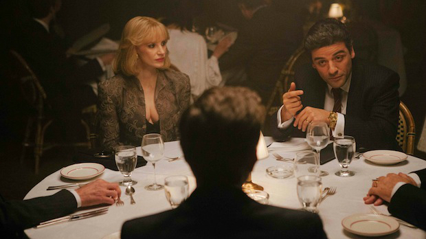 Jessica Chastain and Oscar Isaac in A Most Violent Year
 As a moviegoer, there are few things I find more satisfying than a filmmaker who not only fulfills but wildly exceeds the promise of their early work. With his third film, A Most Violent Year, writer-director J.C. Chandor has done just that, elaborating upon the themes and techniques of his previous movies (Margin Call and All is Lost) to create a work far deeper and more ambitious than anything he’s done before.
It’s another portrait of men and women under extreme pressure, but this time the broader implications are simultaneously more complex and more seamlessly woven into the narrative. Ambitious immigrant Abel Morales (Oscar Isaac) is a heating oil supplier who signs a risky deal early in the movie and struggles to maintain his principles – and idealistic world view – as he and wife/business partner Anna (Jessica Chastain) are beset by economic and physical challenges on all sides. Set in 1981 New York, A Most Violent Year is an incisive snapshot of its period – in which the American dream and its relationship to class and capitalism was being transformed under Reagan – as well as a strikingly relevant statement on our own historical moment.
Raising profound philosophical questions about what it means to be successful, what it means to be good and what it means to be lucky, it’s a riveting moral inquiry reminiscent of the best of Sidney Lumet, containing as singular a view of New York as that director’s finest work. It’s also a beautifully photographed art film that fully exploits every aspect of visual language to convey meaning without hammering the audience over the head. Clear yet subtle, political without being didactic or partisan, it’s a film as necessary as it is massively entertaining. I spoke with Chandor a couple of days after the National Board of Review named A Most Violent Year the best film of 2014.
Filmmaker: One of the things I find interesting about your films, particularly these last two, is the fact that they’re extremely precise in terms of their visual design but also heavily performance-oriented. They don’t have that kind of visual laziness that characterizes some actor-driven films, but it also doesn’t feel like you’re forcing your actors into unnatural behavior for the sake of design. How do you balance those concerns?
Chandor: All is Lost was storyboarded within an inch of its life – I think I had something like 600 drawings and that was what we based the movie on. A Most Violent Year, though it has some action scenes, is a more traditional dialogue-driven movie, and in those cases I prefer to watch a full rehearsal on the real set with the actors, letting them work their way around. Then you have to start compromising, because you want them to be beautiful or you want to make a certain story point visually, so it can become an awkward war of the wills in which there’s negotiation with the director of photography, who’s representing his position, and the actors, who might want more freedom of movement. I needed to make Oscar and Jessica feel that they had that freedom, but I also conceived them as very self-serious people who, once they sit in a seat – they’re not moving. Especially if they’re in some kind of negotiation. That was frustrating at times for the actors, because sometimes they want to blow up.
Filmmaker: How do you handle those conflicting agendas?
Chandor: Luckily Oscar, Jessica, [director of photography] Bradford Young, and I were all very collaborative. It helps that we’re all similar ages and at similar points in our careers, so there wasn’t a lot of ego bullshit – which there can be in those negotiations during rehearsals when someone says “I’m the biggest star in the room, so I’m going to sit over here because that’s where I want to sit.” None of that ever really happened, so we were able to retain the core visual ideas of the movie while allowing the actors to do amazing work.
Filmmaker: What are those core visual ideas? Was there an overriding principle that guided the look of the film, or were there other films you used as visual references? The movie reminded me a lot of the collaborations between Gordon Willis and Alan Pakula, or Willis and Coppola’s work on The Godfather.
Chandor: Because I start as a writer, I don’t do that thing a lot of other directors who I greatly respect do, which is…let me put it this way: if they were doing All is Lost, they would sit down and watch every great disaster and survival movie ever made first. I think as a writer you want to kind of keep arm’s length, so I don’t follow that approach, but I have seen and absorbed all those movies you’re talking about. When I was in my twenties, no one was hiring me to shoot movies, so I watched a lot of movies – I basically tried to watch every movie made on planet earth in that period. I’d start with the first film of a director and watch the rest of the career all the way through, so I have memories of all those movies and they inform what I do, but I don’t go back to them before shooting something and certainly not when I’m writing.
Filmmaker: But clearly you had very specific visual ideas, so how do you communicate those to your collaborators? And what were your models if not other films?
Chandor: I created a look book – more like an inspiration book – that I would show to actors and everyone else I met with. My visual references on this movie came from the amazing street photography of the day. There were all these war photographers who came back from Vietnam, and in the late ’70s and early ’80s they created an art movement where they documented how the cities of America were crumbling. When I sat down with Bradford Young, he had his own look book. I showed him mine and he showed me his, and we looked at these two collections of photographs we had come up with, and there were probably five or ten shared images. Then, when we invited my costume designer into the mix, she brought her own collection, and Bradford and her had five or six shared images that were really abstract. One of them was of a running wolf or some crazy shit like that. Out of the thousands of photographs taken at that time, there was some kind of shared sensibility between all of us.
Filmmaker: Do you recall particular images or photographers that were particularly relevant?
Chandor: Bradford zeroed in on an amazing photographer, Jamel Shabazz, who shot a lot of Hispanic and black kids in Harlem in formal compositions where they’re standing in front of a war-like wasteland. There’s one famous photo I’m obsessed with where there are two kids – there’s a pile of rubble and burned up buildings behind them, and one of the kids is holding one of those old wooden tennis rackets. He’s obviously been looking through the rubble and found this tennis racket, so there’s this great optimism about it. There’s also something about the opening action of this film, when they put that deposit down, that’s very optimistic. Everybody else is running out of the burning building, and they’re buying the burning building. The movie’s kind of dark, but at its core is this optimism that tomorrow’s going to be better than today. The most important thing that I touched on earlier is that I wanted the movie to look like the characters were walking into a painting of their own design – they’re very self-serious characters who are very formal in their presentation.
Filmmaker: Did that inform your decision to shoot in the ’Scope aspect ratio?
Chandor: That came from a couple of things. I wanted the movie to look like a kind of British landscape painting or something where it just keeps going on, and the more times you watch it the more things you notice, hopefully. If you see the movie a couple of times you’ll spot the World Trade Center in the background several times – it pops up all over the movie over people’s shoulders in a subtle way, and I wanted those tableaus to help tell the story. I also wanted to use the negative space that the wide frame affords you; there’s an unsettling aspect to images where an actor is on one side and you’re wondering what’s going to come at them from the emptiness.
Filmmaker: You mentioned the synergy between you, your cinematographer, and your costume designer Kasia Walicka-Maimone, and I was wondering if you could expand on that idea a little.
Chandor: The costume design is a huge part of the movie because of what it says about the characters. It’s armor. They are making a presentation to the world about who they are, right down to Jessica’s absurdly long nails, which were at that time designed for upwardly mobile women. Women who were rich, or getting to be rich, wore these nails. It trickled down the economic spectrum, but it started as a symbol that said “I’m so damn rich, I don’t need to do physical labor anymore.” You can’t do anything with them – when Jessica wants to open a cabinet in the movie she can’t, because she’ll chip her nails. When she’s doing all her math and actually is working on a calculator, she’s doing it with a pencil she has to hold. So those nails are important in terms of what she’s trying to project about herself into the world. Oscar’s suits were designed by this guy out of Brooklyn who has done clothes for something like six presidents – he takes the designs of the day and sort of reconfigures them for businessmen and politicians who want to seem upscale but not too trendy. We gave him an Armani suit from the period as if Oscar’s character brought it to him and said “Can you make me a suit like this that’s just a little more conservative and representative of what I’m trying to be?”
Filmmaker: How does all of that integrate with the photography?
Chandor: For this movie, in the way that it’s so formally composed, each of the shots has to be weighted evenly – or they have to be totally unweighted. There’s not a lot of coverage in these dialogue-driven scenes; it’s alternating shots of characters talking, so in terms of light and color and composition they have to be similarly balanced or you’re going to have a problem when you’re cutting back and forth. So sometimes Bradford would get into a struggle with the costumer, because he’d be trying to get her to change the color of a shirt on one of the three people in the background because it was throwing off the balance, but then she would say it was the perfect shirt for that character at that moment. It was kind of fun to watch, actually, that sort of back and forth. Integrating all of those elements is a huge part of the movie and it’s hopefully something I can get better at as my career progresses. I’m still learning about how to use visual language to get across what you need to get across as a storyteller.
Jim Hemphill is the writer and director of the award-winning film The Trouble with the Truth, which is currently available on DVD and iTunes. He also hosts a monthly podcast series on the American Cinematographer website and serves as a programming consultant at the American Cinematheque in Los Angeles.