 Back to selection
Why Ed Lachman Chose to Shoot Carol in Super 16mm
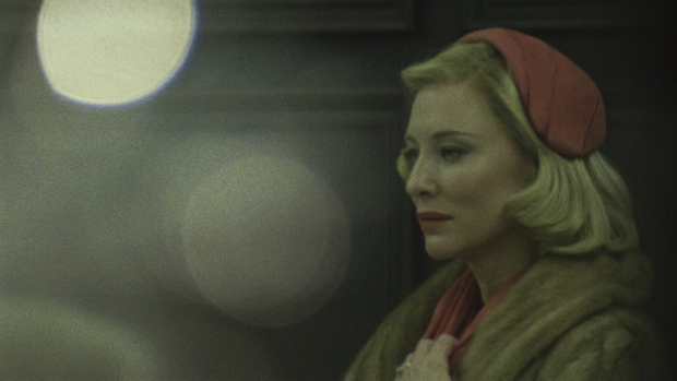
 Cate Blanchett in Carol
 Carol is getting raves not just for Rooney Mara and Cate Blanchett’s subtle performances, but also for Ed Lachman’s cinematography, which was inspired by mid-century street photographers such as Ruth Orkin, Esther Bubley, Helen Levitt and Vivian Maier.
In a first-person story for Indiewire, the veteran cinematographer, who has worked with Werner Herzog, Sofia Coppola, Todd Solondz, Robert Altman and Steven Soderbergh, writes about why he and director Todd Haynes chose to shoot the film in 16mm in order to achieve the look of 1952. “We wanted to reference the photographic representation of a different era,” Lachman said. “They can recreate grain digitally now, but it’s pixel-fixated. It doesn’t have this anthropomorphic quality in which the grain structure in each frame is changing.”
According to Lachman, “the actual physical grain of film adds another expressive layer that is impacting the surface of the characters’ emotional being. It has to do with how film captures movement and exposure in the frame — finer grain for highlights and larger grain for lower light areas — that gives a certain emotionality to the image that feels more human.”
He added, “I really believe with Carol that people would feel something different than if I had shot it digitally.”
Lachman earned an Academy Award-nomination for Far from Heaven, his first collaboration with Haynes, back in 2002. Since then, they’ve worked together on I’m Not There, Mildred Pierce and of course, Carol. All four films were shot on film.
The cinematographer, who was recently honored by the New York Film Critics Circle and the Boston Society of Film Critics for his work on Carol, talked further to Variety about his decision to shoot in 16mm rather than, say, 35mm.
“Even 35mm negative is so grainless that it almost looks digital when you go through a DI. And the same can be said obviously for the digital world,” explained Lachman. “When you shoot digitally they can add grain to the film, but it doesn’t operate the same way.”
According to Lachman, grain has an anthropomorphic quality. “I like to feel, like, a pulsing of something living underneath the surface of the image,” he said. “So by referencing Super 16 I felt it could harken back or it could give a reference to the way you could look at a photograph from 50 or 60 years ago, that the grain structure was different back then. And Super 16, through a DI, through a digital intermediate, would feel like looking at a photograph from the past. So that was the real idea. Then this feeling of another layer of seeing their emotions through grain captured, I thought, another emotional quality of their performance.”
Earlier this year at The New York Film Festival, Lachman chatted with NYFF Selection Committee member Amy Taubin about his love of film grain and why 16mm worked so well for the romantic drama. He also discusses why he used modern stock to create a period look and why he sometimes shot through glass or Plexiglass. “I limited the color palette of the film. We shot with a lot of magenta and greens and yellows. I was trying to shift the color spectrum of the film,” he explained.
Below you can watch his interview with Taubin courtesy of the Film Society of Lincoln Center.
