 Back to selection
Sundance 2023: Nam June Paik: Moon is the Oldest TV, Sorcery
 Nam June Paik: Moon is the Oldest TV
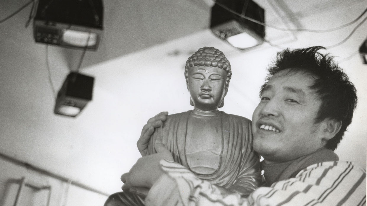
 In celebrating a radical artist via conservative formal means, Amanda Kim’s Nam June Paik: Moon is the Oldest TV represents a familiar contradiction. Paik’s legacy as a video artist and sculptor of television towers hasn’t yet gotten the full-length doc treatment; as a textbook talking-heads-plus-archival assemblage, Kim’s movie is easy to envision becoming a PBS staple. The film is fueled by a genuine desire to introduce his work to a wider audience, and it may well serve that commendable purpose; as an example of the current biodoc form, it’s slow going. Like many such works, it opens with a montage that’s essentially a trailer for the movie you’ve already committed to watching, with a montage of broadcasters from different countries saying Paik’s name over and over a la The Truman Show. Documentaries on artists try to walk a very fine line of educating the curious but uninformed while offering rare archival footage and/or fresh insights for the already initiated; this definitely defaults to the former, assuming (probably pragmatically) that the average viewer knows hardly anything about not only the history of adjacent creators—like Paik’s catalyst John Cage, dutifully described as “one of the most polarizing artists of his time”—or even basic world history, like a map of ’60s Germany that carefully spells things out: “Berlin Wall (the Iron Curtain).”
Moon meets the standard of delivering more information about Paik than a Wikipedia page (and his is a mess—editors needed!). Covering his landmark artworks up to 1986 before rushing through the rest of Paik’s life in a hurry, Moon presents a generically familiar arc about an initially misunderstood but finally widely embraced genius. Information is delivered with a lot of repetition, as if underlining the main points for the especially slow, especially the oft-repeated refrain “The public didn’t understand.” Primers like this allow viewers to retroactively place themselves in this adventurous category without engaging with the present at all. Some opening split-screens mimic Paik’s installations (using the same antiquated video font for the credits as Paik is a nice touch), but those are just easily digestible pastiche. One gesture at the very end attempts to follow in Paik’s footsteps, when interviewee Marina Abramović asks if the filmmakers have settled on a title yet. The interviewer says that they’re wavering between two or three, so Abramović performs a Cage-inspired aleatoric intervention: prospective titles are written on three pieces of paper, then she draws one at random. This is what radical modernism was for?
I kicked off my on-the-ground viewing with Christopher Murray’s Sorcery based on a couple of high-profile attachments: Pablo Larraín is a producer and the film’s financing bodies included the Hubert Bals Fund, whose name generally indicates at least an attempt at arthouse severity. As hoped, Sorcery‘s first shot—following servant girl Rosa (Valentina Véliz Caileo) in a smooth tracking shot as she makes her way from the domestic help’s quarters across a field to her master’s house—owes royalties to either Gerry-era Gus Van Sant or the Carlos Reygadas of Post Tenebras Lux depending on how you look at it, allowing me to play one of my favorite guessing games: “Steadicam or gimbal?” But Sorcery falls apart fast, overturning colonial power in ways that are equally righteous and stock. The opening has Rosa’s father killed by snarling dogs unleashed by his master, creepily blond German settler Stefan (Sebastian Hülk), as retaliation for presumed witchcraft against Stefan’s sheep. The scene is remarkably silly, with the heavily foley’d sound of dogs crunching through bone, while Rosa’s subsequent quest for justice goes about as well as you’d expect. “A dog killed your father, and dogs don’t go to jail,” mayor Acevedo (Daniel Muñoz) tells her. Well, there’s no rule that says a dog can’t play basketball, so why shouldn’t they also be forced to be part of the carceral apparatus?
In Sorcery, both Germans and Chileans display overt racism against the indigenous population of Chiloé Island for predictably racist reasons, and the plot enables supernatural vengeance and righteousness for Rosa and others. (Murray’s film is inspired, with what degree of fidelity I couldn’t possibly say, on court records from a case by the state of Chile against La Recta Provincia, a group of alleged indigenous sorcerers.) But the film’s tone is like a horror film that can’t allow itself to be scary, let alone thrilling, the dialogue is hamfisted and goofy and the look is hideous: the frames are well-composed in generic arthouse ways, both when static and in motion, but this is another film that follows the dire current trend of looking like it hasn’t been color-corrected in any meaningful sense, unfolding in a perpetually displeasing palette that simultaneously looks grey and like purple that’s been drained of almost all color. With plenty of mentally unoccupied time, I zeroed in on technical problems that I shouldn’t have been distracted by. There are a number of comped-in CG elements, and the computer canines in particular move at different speeds within the frame from the humans, like a lower-budget parody of the same motion-speed difference problem in Avatar: The Way of Water. At one moment, a shack is set on fire, shown in one shot where the house is first in focus before a rack reset places it out-of-focus in the background. When the dwelling’s clearly visible, the flames are easily perceptible as laughably fake; blurry, they pass the smell test. Why not avoid this problem in the first place by simply composing the shot in a way that would eliminate the visual distraction and starting with the flames being plausibly suggested rather than laughably seen?
