 Back to selection
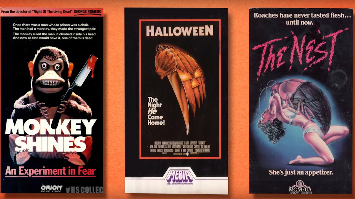
Why Old School Blockbuster VHS Video Cover Art Beats Netflix Thumbnails

Those who remember the days of the neighborhood video store — whether that was, for you, Kim’s Video or Blockbuster — may attribute their fondness for ineffably sleazy horror film VHS cover art to simple nostalgia, but, proposes Entertain the Elk, there’s more to it than that. In this short video he argues that the videobox designers of the day were using the AIDA marketing methods to draw movie fans’s eyeballs to images of bloody knives, hair shaped into a noose and monsters emerging from the toilet. Of note are the piece’s final moments, when he decries the Get Out one-sheet and argues that these old-school AIDA box covers are more effective than the algorithmically-deliverd thumbnails on your Netflix home page.
