How to Cut a Trailer Redux: The Styles and Trends Reshaping the Art of Film Advertising
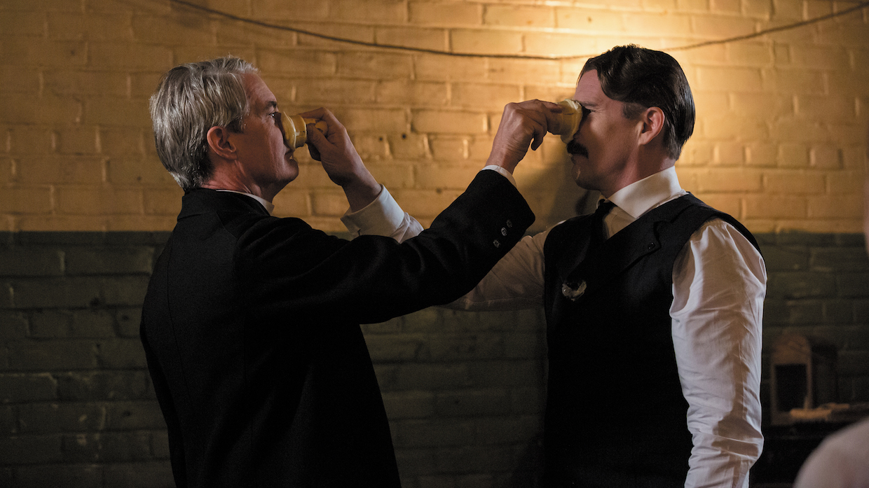 Kyle MacLachlan and Ethan Hawke in Tesla (courtesy of IFC Films)
 The following article was originally published in Filmmaker‘s Fall, 2020 print edition.
We’re drowning in entertainment. Dozens of streamers, from mainstream catnip like Netflix and Disney+ to niche platforms like the Criterion Channel, each offer hundreds of feature films, limited series and TV shows. National theater chains like AMC and arthouse cinemas like the Alamo Drafthouse—at least before and hopefully after the pandemic—serve up fresh options every week on more than 40,000 screens. And legacy networks on basic cable, from NBC to TBS, continue to deliver a firehose of prerecorded content and live broadcasts every day. How to choose? Simple: Watch the trailer.
And by that, I mean trailer, teaser, TV spot, Instagram ad, YouTube preroll, you name it. These bite-sized free samples of digital distraction have become the indispensable Sherpas of modern-day pop culture. Skipped the third season of Stranger Things? Watch the trailer. Didn’t catch that Oscar contender Jojo Rabbit? Watch the trailer. Haven’t seen the buzzy Sundance selection Kajillionaire? Watch the trailer. Trailers are crib sheets for being in the know, the quickest way to get a crash course on today’s trending cinematic topics.
Starting in the early 20th century, trailers were an obligatory but ephemeral part of the moviegoing experience, limited-time pleasures screened only in picture houses before ending up as quirky collectibles in the hands of passionate film buffs. But over the past 15 years (basically since the launch of YouTube), trailers have become an instant-access reference tool. They’re a millennial staple, they’re permanent advertising and they’re essential. If there’s no trailer, then it’s like it never happened.
Back in 2012, I wrote an article for Filmmaker that’s still available on its website explaining how to make a trailer. The industry has naturally evolved during the past decade: fads faded and new trends sprouted. My business cutting trailers has also shifted, as my former partner retired and I started a new company called Jump Cut. In the period since, my staff and I have worked on trailers and TV spots for close to 400 films, mainly for independent, foreign-language, and documentary releases.
What are some of the stylistic changes? Voiceover is long gone. Graphics are more dazzling than ever. People curse like sailors, and blood sprays in scarlet ribbons. All the action kicks and sways to relentlessly percussive beats—even when the film isn’t an action movie. But certain fundamentals have stayed the same: character arcs, emotional investment, high stakes, relatable conflict, strange but inviting worlds. And beware spoilers!
Meanwhile, the trailer itself has only grown in importance. Every piece of content virtually requires it. Digital editing software is more powerful and more affordable than ever before, so the only hurdle left is skill. In this article, I’m going to concentrate mostly on the traditional two-minute trailer. How do you cut one? Here are a few tips.
GETTING STARTED
You made a movie. Congratulations! Now, you need a trailer. First word of advice: Don’t cut the trailer. Get someone else to cut it for you. Trailer editors offer fresh eyes and no emotional attachments. They will look at the material differently, and they will respond accordingly. If they do their job right, they will make your footage feel surprising. Unexpected. New.
If you’re the trailer editor, first things first: Watch the film, then discuss. What material pops out? Which characters seem too subtle? Which visuals are strong, and what lines of dialogue really startle? What story do you want to tell?
Trailers are short, and trailer editors thrive on shorthand. Use genre, lean into it. If the movie is a straight-up gross-out horror flick, then the trailer needs to be scary. But if the film is a sci-fi romance with slapstick humor, then you need to choose a dominant genre and hint at the others. For the trailer, make the film a romance tinged with sci-fi. Or a broad comedy with a veneer of high-tech futurism. But pick a dominant genre. There’s very little time for subtlety. People like to be intrigued—not confused.
Audiences want to see something new, but they also want to know what they’re getting. It’s frustrating: They want novelty and comfort. Most of all, though, audiences want to get excited. And, more than anything, trailers need to create anticipation.
After a creative conversation determining the overall direction, you break down the film. Cherry-pick the best-looking shots, the most arresting sound bites, the moments of great production value and emotional performances. And while you’re creating a string of dialogue selects and visual selects, you might notice a word and a shot that naturally attract each other. Embrace that serendipity.
Maybe a woman is talking about unrequited love, and maybe a man in another scene is cutting onions and wiping away tears. Juxtapose the two. Suddenly, you’re communicating loss. Or an old man tells a bad joke in one scene, and then 20 minutes later an unrelated little girl has a laughing fit. Cut them together, and you’ve got a tender moment. Create these little clusters; let them grow organically, like rock candy, in your editing sequence. They might be useful.
In our trailer for Michael Almereyda’s alt-modernist biopic Tesla, there’s a moment when Ethan Hawke’s Nikola Tesla defensively says, “All my dreams are true.” We followed it with Jim Gaffigan’s George Westinghouse laughing, then saying “Want a lemonade?” Different scenes, different conversations. But combined, the lines create a playfully sardonic moment. It might not make logical sense, but it makes emotional sense. Decontextualize and recontextualize. That’s what trailers do.
Most of all, build a structural foundation. Audio beds usually come first. Rough out the trailer’s body with evocative music cues and suggestive sound design. The audio will set the tone and the pace. Vary the shape, but let it flow. Give it movements as well as movement: Make sections accelerate into other sections.
What’s your opening? How will you wrap up? Find a great moment that summarizes the story; it might be an inspired beginning. That memorable quip? It could be the perfect way to end. Many trailers follow a three-act structure, just like a screenplay. Act One: Introduce a world and its characters. Act Two: Add complications and conflict. Unlike a screenplay, though, Act Three has no conclusion. Raise questions but never answer them. Intensify the situation, but don’t relieve the pressure. Trailers must not resolve anything.
All of these tips, by the way, are optional. The only limit is your imagination. Of course, if you just want to make a trailer that feels like a big Hollywood studio movie, check out the YouTube video “How to Make a Blockbuster Movie Trailer”—it explains everything. If, on the other hand, you have a strange, challenging, unique, hard-to-explain film, you may want a piece of advertising that reflects that. Which means trying an approach that’s strange, unique, challenging and hard to explain. (My most recent rule-breaking faves: the gonzo teaser for Bloody Nose, Empty Pockets and Oscilloscope’s trailer for Madeline’s Madeline.)
The best trailers are full of invention and reinvention. Be different, but be different organically. Above all else: Serve the material.
CAST A WIDE NET
Distributors want their films to attract the biggest number of people. But how do you reach a really big audience—especially when your film is traditionally a niche product? Sometimes with multiple trailers.
Just look at NEON’s masterful handling of Bong Joon-ho’s Parasite. Its multifaceted marketing campaign worked on so many levels, taking a foreign-language upstairs/downstairs domestic thriller set mostly in a single location and turning it into an Oscar-winning sensation.
Trailers, of course, were a cog in this particular P.R. machine. The film’s Korean producer and distributor, CJ Entertainment, had already cut a few domestic trailers before the film made its world premiere at the Cannes Film Festival. But the content was very coy, deliberately not explaining very much at all. The main concern with Parasite was spoilers: Don’t give away all the great plot twists.
To cut the first U.S. trailer, NEON hired the hugely talented marketing company Zealot. Thanks to previous movies like The Host, Snowpiercer and Okja, Bong had a sci-fi/action-adventure fan base. Parasite isn’t like those films, but Zealot’s fantastic trailer did lean a bit more into genre: It opens with someone flicking away a bug (what a great summary of the film), followed by a destitute, basement-dwelling family getting accidentally fumigated. It uses a driving percussive cue at the back end and generally has a bit more edge. But it still touted its Palme d’Or win at Cannes and cited a slew of critical raves.
When NEON asked us to do a second U.S. trailer, it wanted a slightly more niche approach with “prestige” appeal: Position the film as entertainment for a sophisticated audience and put in more critical acclaim. So, we used not one but four quotes that declared, “A masterpiece.” We also added three quotes that labeled it a “satire”—in other words, highbrow comedy!
In terms of structure, we took inspiration from one critical rave that called the film “Hitchcockian.” We emphasized suspense by playing up the longing and resentment of the lower-class family. We started with a tender piano cue and shots of domestic opulence. “Everyone looks gorgeous,” one of the characters says. “Do I fit in here?” It’s not as brutally succinct as someone flicking away a bug and a family being fumigated, but it conveys the same sense that the underclass isn’t welcome.
We then refer to a “plan” the poor family is hatching. “So, you’ve got a plan!” the father says at the beginning. “This isn’t in the plan,” someone says later. “You know what kind of plan never fails? No plan at all,” we hear at the end. Sinister! Hitchcockian!
TEASE, DON’T TELL
I’ve talked about hammering out your trailer’s narrative. But, like Parasite, some films have so many plot twists that you might spoil the experience if you give anything away. Or maybe the story is just too complicated or nuanced to explain succinctly. Then again, if you’re making a trailer, you have to show something.
It’s all about deciding what to promote. And sometimes that means conveying the experience of the story without explaining the actual story. That kind of approach is also the broad definition of a teaser: something that expresses mood and atmosphere, giving a general outline instead of detailing an absorbing story.
We worked on the trailer for another NEON release, Honeyland, the acclaimed documentary about a tradition-bound Macedonian beekeeper and her chaotic next-door neighbors. Instead of getting into specifics, we painted broad strokes with copy that hinted at great conflict. “One Woman / Will Guard a Fragile Balance,” read the cards. Girding all the action is ethereal choral music and sumptuous imagery. Trust us, the trailer implies. This is more than a story; it’s an experience.
Our trailer for Gregory Kershaw and Michael Dweck’s charming, elegiac doc The Truffle Hunters is also more like a teaser. Its distributor, Sony Pictures Classics, wanted it to feel like a fairy tale. So, we stripped out all the dialogue and used a single piece of lush classical music, “Barcarolle,” from Jacques Offenbach’s opera The Tales of Hoffmann. (Technically, the opera is in French, but that specific melody is based on traditional Italian folk songs sung by Venetian gondoliers.) The dreamlike cue is apt because the film, which chronicles old Italian men and their dogs rooting out forest truffles, seems out of time, enchanting, mythic.
USE GRAPHICS CREATIVELY
It’s amazing what you can do with graphics these days. Adobe’s suite of post-production software, especially After Effects and Photoshop, has made it possible to create motion picture magic. That means indie trailers can have a high-tech studio polish that would have been unimaginable 10 years ago. But it also allows for more ways to match a distinct film’s inherent style.
When we did the trailer for Amazon Studios’ The Vast of Night, Andrew Patterson’s thrilling sci-fi mystery, we wanted to match the film’s stylized title treatment (Air Americana is the font, a dash of Art Deco mixed with 1950s futurism). But we added a video-effect roll, like an old Eisenhower-era TV set, because Patterson punctuates his film with that monochromatic cathode-ray-tube aesthetic. The effect is an electromagnetic veneer that alludes to the film’s homage-heavy sensibilities and gives apt dynamism to text that was overlaid on sweeping camera movements.
Want to recreate that photochemical look? No problem. Janus Films hired us to do the re-release trailers for its restorations of D.A. Pennebaker’s landmark 1968 San Fran rock doc, Monterey Pop, and Jennie Livingston’s seminal 1990 LGBTQ vérité, Paris Is Burning, a vogue-tastic look at New York City’s ballroom competitions.
In each, we matched the look and feel of their respective eras. The Monterey Pop trailer has quotes with color saturation, film splices, frame stutters and solar flares. Paris Is Burning uses very simple, white-on-black cards throughout the film, so we matched the font and grain of the 16mm original.
The most extreme example we have of this type of digital mimicry is the trailer for Guy Maddin and Evan Johnson’s hysterical delirium, The Forbidden Room. Famous for his artificially decrepit silent-film pastiches, Maddin uses interstitial text with faded-glamour templates. So, we cribbed ornamental copy cards from the film, erased the text and added our own. That way, starting with the card for distributor Kino Lorber, we could create distorted and distressed graphics that hewed closely to the movie’s early-film gestalt: flickering text, color washes, era-appropriate fonts, jittery frames. And our additions intercut surprisingly well with the film’s existing cast-call cards and schizophrenic title treatment(s). Besides, plain graphics would have actually distracted from all the fulsome cinematic madness.
In some cases, trailers need a graphics-heavy approach because of other limitations. Matt Tyrnauer’s power-drunk sociopath lawyer profile Where’s My Roy Cohn? is a film composed almost entirely of archival material. (We hear audio from interview subjects, but no one speaks on camera.) And, like many documentaries, that material is permitted in the film under Fair Use laws but is often not allowed in the marketing and promotional materials without incurring additional licensing fees.
The film’s distributor, Sony Pictures Classics, let us know which images and footage were cleared for use and then, aware of the archival restrictions, asked us to find a graphics solution to convey the arc of Roy Cohn’s power broker life—specifically marking certain years to indicate his decades-long reign.
So, with a soundscape of interviewee voices orchestrated to a sinister instrumental cue, we invoke the feel of a microfiche investigation, with pictures and newspaper clippings scrolling and sliding into place. Copy cards with critics’ quotes seem printed on celluloid and click into place like a viewfinder image. Threading through the trailer are delineating moments in large, bold type: 1927, 1951, 1975, 1980. The ever-shuffling images convey that the film is a kaleidoscopic exposé, and the indicated years create even more visual sweep.
FOUL LANGUAGE AND VIOLENCE
What the fuck is with all these bloody trailers? Before Netflix started producing original content in 2013, audiences would almost never hear or see a trailer with foul language and graphic violence except in select movie theaters.
That’s because the Motion Picture Association of America has strict guidelines about what goes into a so-called red band trailer and a green band trailer (named after the color of the five-second intro card with the MPAA imprint along with the film’s rating). Red band trailers can show R-rated content but are only allowed in front of R-rated films. Green band content is technically approved for all audiences, so it has to adhere to G-rated principles (no blood, nudity, drug use and foul language).
But times have changed, the internet has no filters and now everything is fair game. The MPA (it dropped “of America”) still rates trailers but with somewhat looser guidelines. They only apply to studios and distributors who are signatories and who play films in movie theater chains (which are also signatories).
Netflix is not a signatory to the MPA, and it doesn’t care about theaters. Which is why, for example, its trailer for the short-lived series White Lines has it all: blood (a mouthful), rampant drug use (ecstasy, cocaine), nudity (an orgy!) and foul language (fuck!). Whatever happens online, happens online.
That said, when do explicit trailers work? Which is to say: Are you using it to provoke? Or to tell a story? If it’s for shock value, then the shock will wear off. So, shape it. Give it purpose.
In 2017, we did a trailer for Jeff Baena’s The Little Hours, a medieval lark with modern-day sensibilities loosely based on parts of Boccaccio’s The Decameron. Aubrey Plaza, Alison Brie and Kate Micucci are foul-mouthed nuns who engage in all sorts of debauchery. It’s hilarious. And the trailer needs a ton of foul language to truly represent the film. Better still, its distributor, Gunpowder & Sky, knew this required just the right music cue. We found a ringer: Junglepussy’s “Bling Bling” (Bling bling, bitch / Do my own thing, bitch).
But, like a disapproving aunt, the trailer also has plenty of tsk-tsk moments from shocked elders. “Eating blood?” says Fred Armisen’s bishop. “Where am I?” That refutation invites viewers who might have been put off by the profanity. It also adds conflict (trailers love conflict) and hints at a larger narrative where characters are struggling with bad behavior. The foul language serves the story.
FINDING THE STORY IN ALL THAT FOOTAGE
The most profound change of the past decade is the normalization of binge watching. It used to be that only hardcore cinephiles or miniseries fanatics would watch Shoah (9 hours, 26 minutes) or Berlin Alexanderplatz (15 hours, 31
minutes). These days, everyone is used to digesting in bulk. Now, a limited series like HBO’s Watchmen clocks in at nearly 10 hours, and no one seems to mind. What with all the footage, trailer editors have even more of their work cut out for them.
Ken Burns helped initiate this phenomenon. Since his groundbreaking 1990 film The Civil War (11 hours, 30 minutes), Burns has popularized ultra-longform multipart documentaries. PBS gave us the opportunity to cut one of the TV spots for 2017’s The Vietnam War, which Burns codirected with Lynn Novick. That one clocked in at 17 hours, 15 minutes. Our TV spot was only 30 seconds. Half a minute! We asked PBS whether they wanted us to watch just a few episodes or the entire 17 hours and 15 minutes. Their reply: all of it, please.
Our pleasure, of course, although we needed more time. How do you find the story in all that footage? The answer was in how PBS wanted to position it. The Vietnam War wasn’t a conservative event or a liberal event, they said: It was an American event. Also, stress that Burns and Novick’s deeply researched film shows the war in a way it’s never been seen before. And convey the emotional soul-searching of that national tragedy.
We shaped the narrative accordingly. The opening line of our TV spot: “I thought I knew most of what was worth knowing about the war. Until suddenly, I didn’t.” Followed by questions: “What was it all about? Was it worth it?” And befuddled statements: “Smart people in pinstripes couldn’t make their minds up about the war,” and “We just tried to believe that this was the right thing to do.” The one line of copy? “In war, there is no single truth.”
In 2014, we had an opportunity to cut a promo trailer for a work-in-progress by Andrew Jarecki. It was a documentary, he told us, but he was struggling with how to cut it down to a traditional feature length. He wanted a trailer to show people what it was because he was going to shop it around to a bunch of different distributors and streamers. Maybe someone would be interested in airing it as a series of episodes? A year later, it was the six-part HBO documentary miniseries The Jinx.
Jarecki had made a film in 2010 called All Good Things, a fictionalized account of millionaire Robert Durst, who kept finding himself in suspiciously homicidal circumstances (his wife mysteriously disappeared, and two friends met untimely deaths). That film made Durst reach out to Jarecki and volunteer to do a series of interviews about his past, which in turn inspired the documentary.
When they originally called me, Jarecki and his editor had already cut together a trailer. It focused on Jarecki and Durst getting together and doing the interviews—the spark that started the project. It was what they were most excited about. But they weren’t satisfied with how the trailer felt. They asked me to look at the footage and offer another approach.
I watched their unfinished documentary and thought, holy cow! This guy Durst is outrageous, and all the forensic evidence, plus all the interviews with the police and lawyers involved with his multiple cases, was fascinating.
My modest suggestion: Explain Durst first, elaborate all the sensational details, then introduce yourself as filmmakers who became part of Durst’s narrative. Suddenly, Jarecki’s arrival is a third-act twist that makes the trailer even more intriguing, climaxing with the revelation that Durst himself is going to finally speak, on camera, about his checkered past. It was a minor structural pivot, but my objective eyes were able to offer a fresh perspective.
DIEGETIC PERCUSSION: SLAVE TO THE RHYTHM
Trailers are like pop songs: catchy, brief, a concentrated injection of storytelling. And, like a pop song, they usually rely on melodic hooks and vivid language. I realized early in my career that if you have a good sense of rhythm, you’ll make a great trailer editor.
Music sets the mood and pacing, and therefore frames a trailer’s narrative. It’s critical. You build your structure around it. But what if your film doesn’t have a soundtrack? What if the director intentionally minimized or dropped music entirely, and you want the trailer to reflect that creative choice? Then, you can rely exclusively on dialogue, sound effects (a whoosh, a synth rise, a drone), and what is called “diegetic audio”; that is, the everyday noises of the film’s world. A car honk. A door slam. A stapler. Used sparingly, these noises are punctuation. Used repeatedly, they’re percussion.
The trailer for Joel and Ethan Coen’s caustic 2009 triumph, A Serious Man, created by the brilliant ad agency Mark Woollen & Associates, set an industry standard for diegetic percussion. Using a man’s head-slamming as a backbeat, it creates an increasingly anxious syncopation with a woman’s phlegmatic cough, an old rabbi’s wheeze, the plea “I need help” and an annoying voice that unreassuringly drones, “We’re going to be fine.” A Serious Man is a hilariously anguished film, and the trailer encapsulates that existential crisis perfectly.
Trailer agencies and marketing execs took note. Now, the defining marketing trend of the past decade is diegetic percussion. Is that a good thing? Depends on whether it honors the content. The trailer for A Serious Man was reflecting a fraught state of mind where the title character is going in emotional circles. The repetition of sounds and words reflected the film’s emotions organically. It wasn’t a creative flourish. It inherently served the narrative.
A lot of stylish diegetic percussion in trailers can be fun and, when cut well, even thrilling. But, if overdone, it can feel like automation instead of emotion. The best diegetic percussion works sparingly and organically, advancing the story and highlighting characters’ inner lives.
When Bleecker Street hired us to do the trailer for Joe Penna’s chilly thriller Arctic, we didn’t use any music. (The film has none.) There’s actually very little dialogue, too. Mads Mikkelsen is a plane-crash survivor trying to stay alive, so we showcased the wintery soundscape as well as the sounds of the remaining functional equipment, including a beep-beep wristwatch alarm that signals daily attempts to radio for help.
In Act One, we repeat the alarm at intervals throughout the beginning to establish the rhythm of Mikkelsen’s routine. But then, in Act Two, we drop that conceit and ratchet up the perilous tension by alternating between noise and silence—a bear attack, then a hard cut to a quote card; a botched helicopter rescue, then a hard cut to a quote card. The trailer ends with a wide shot of Mikkelsen, seemingly doomed, while we hear his voice say, “It’s OK. It’s OK.” Under the title card, the sound of the repeated wristwatch alarm suddenly returns. A final beep-beep ends the trailer abruptly.
We use diegetic repetition in another Bleecker Street trailer, this time for Kitty Green’s sexual harassment drama The Assistant. There’s music throughout the trailer—mysterious and cautious at first, then increasingly ominous and foreboding. And as we see Julia Garner’s character make a few photocopies of actresses’ headshots—and watch as women are churned out of a machine—we hear the labored zvuuut-chu-chunk of the scanner–copier.
That grating sound repeats to emphasize the churn, increasing its frequency and intensity until it crescendos into the scream of a blender that Garner operates. I say “scream” because Bleecker Street asked us to subtly mix in the sound of a woman literally screaming. The copier and the blender are echoing the film’s themes: the almost mechanical dehumanization, objectification and sexual abuse of women in the workplace.
SELLING A PROMISE
Trailers might be entertaining, but they aren’t the entertainment. They’re selling the entertainment. More accurately, they’re selling the promise of the entertainment. It’s a sneak peek at what’s to come. It’s a wish, not wish fulfillment. It’s a pitch for greatness, but it’s no guarantee of greatness. Trailers traffic in illusion.
There are lousy movies that have fantastic trailers. (My favorite is the one for Exorcist II: The Heretic. I haven’t made it through the film, but I have watched that trailer a hundred times.) There are great movies with even better trailers. (If you ask me, the GOAT is the Alien trailer. Special mention goes to legendary graphic designer Pablo Ferro and his mind-bending trailers for Stanley Kubrick’s Dr. Strangelove and A Clockwork Orange.) Most subversive trailer? The one for Terry Gilliam’s Time Bandits.
The fundamental question is always the same: How do you represent someone’s film authentically? How do you reflect a film’s best qualities organically? Most of all, how do you do it so the trailer has its own structural integrity? Trailers need to honor their source material. It sounds obvious, but it bears repeating. Because, in a world where so many alternatives are just a click away, a trailer might be the only time someone watches your movie. Make it count. And make it irresistible.