Cinematography Notes – Desaturating Women Talking
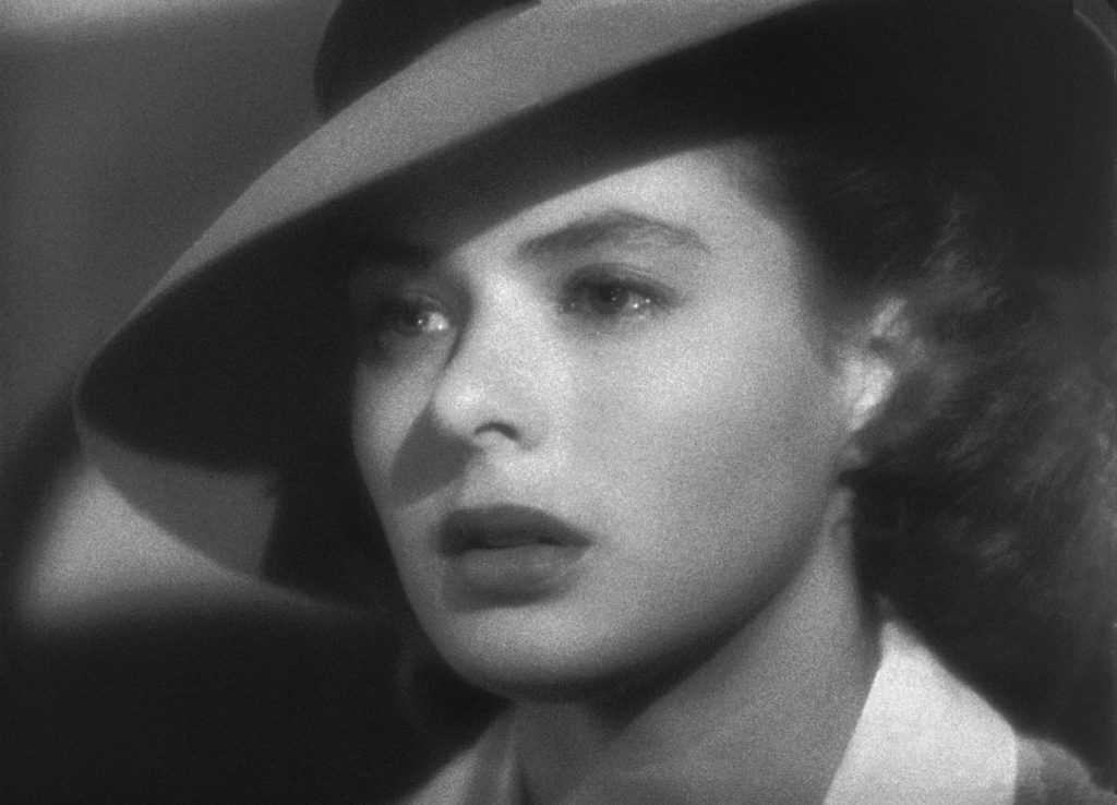
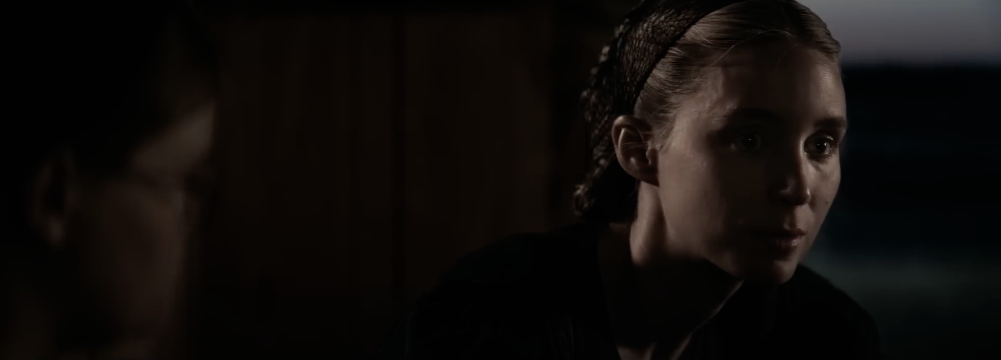
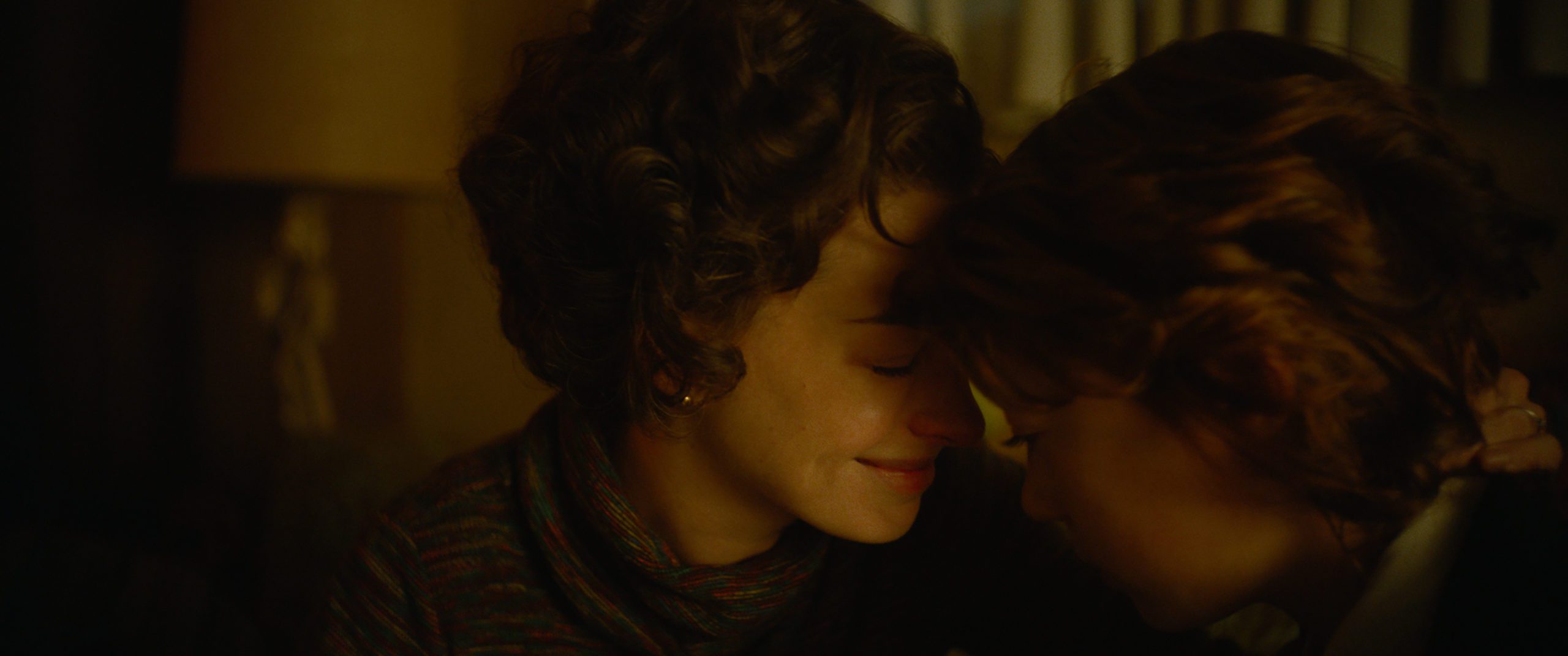
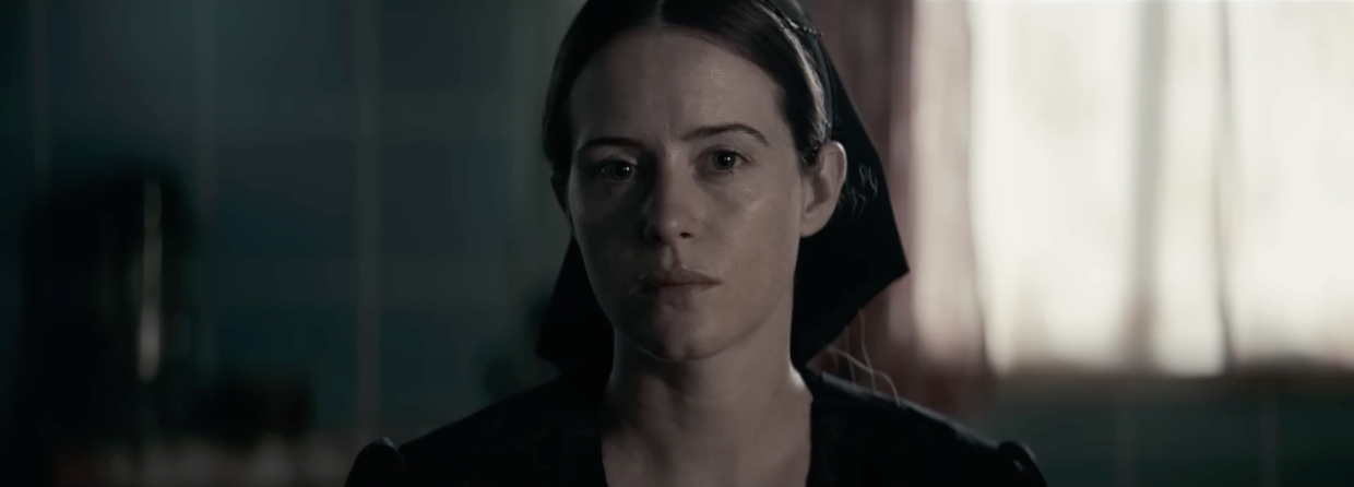 Claire Foy in Women Talking
 A perk of living in New York is the arrival each autumn of the New York Film Festival, which this year marked a milestone, its 60th edition — kudos to The Film Society of Lincoln Center. I’ve long thought of NYFF as a sampler of what’s happening in world cinema, a box of fine chocolates à la Forrest Gump. New Yorkers attending NYFF are privileged to enjoy choice selections from Cannes, Venice, Berlin, even Sundance. Which is to say, if there are new winds blowing somewhere in Cinema, they will be felt at NYFF.
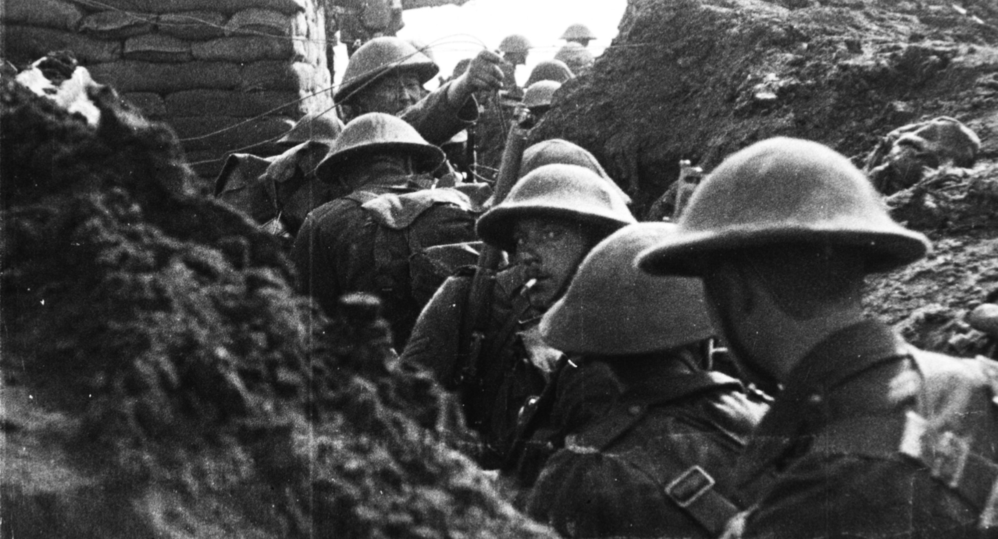
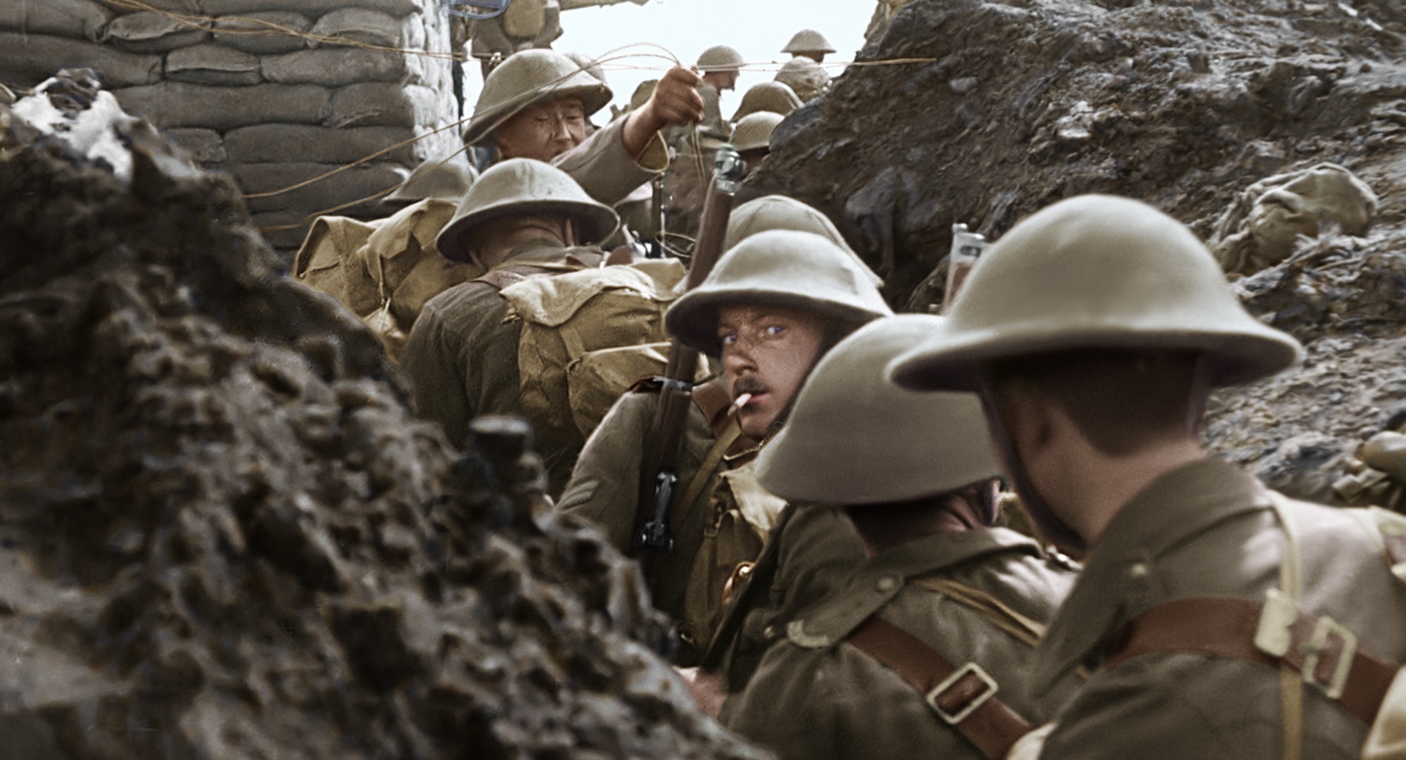
This year, the drained-color look of Sarah Polley’s Women Talking in NYFF’s Spotlight section caught my eye.
Over a long career in filmmaking I’ve been many things, including cinematographer and, quietly, also colorist, going back to the caveman days of color-correcting 16mm reversal original with Kodak CC filters. These days, like half the known universe, my colorist weapon of choice is DaVinci Resolve. Like a kid addicted to Fortnite, I spend embarrassingly long stretches of time in front of Resolve. So there was no way that I was not going to sharply react to the fact that throughout Women Talking, the level of color saturation is dialed way down — an aesthetic choice doubtlessly conceived as an analogue to the film’s wrenching themes of brutal patriarchy and mass rape.
An effective visual strategy? A budding trend perhaps? To corroborate my first impressions, I decided to see the film a second time, on a second big screen. Below I’ll dive deeply into some of the issues raised by this choice made by the filmmakers, share my take on image desaturation in general, and probe the connected topic of accurate tonal scale reproduction in theaters.
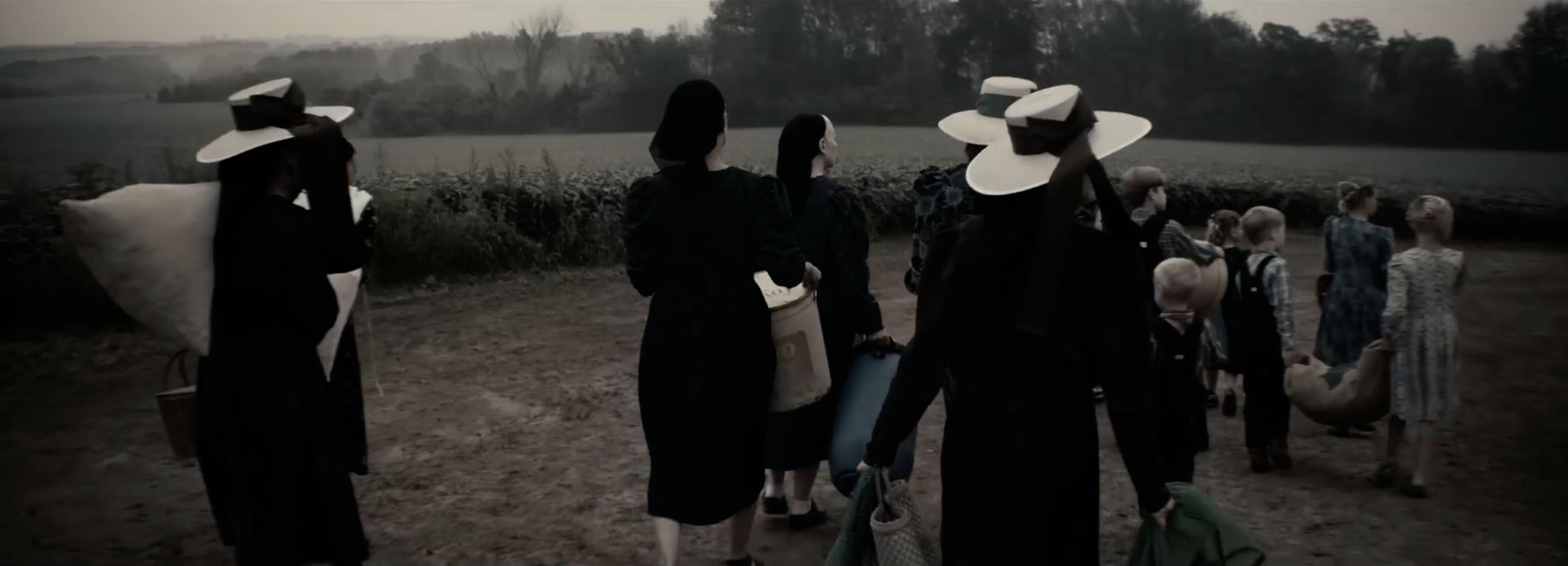
Women Talking, which premiered at Telluride a month prior to NYFF, tells the story of a small circle of women in a large rural religious colony who, in response to an ongoing wave of violent nocturnal assaults — the bloodied victims drugged senseless in their own beds, waking up not remembering anything — take it upon themselves to talk through and decide, in little over twenty-four hours, whether they and several hundred of their sister co-religionists will 1) do nothing, 2) stay and fight back, or 3) flee their colony en masse. Adult males in the colony? They’re all somehow implicated, it seems.
Shades of Margaret Atwood but, shockingly enough, rooted in a true story. In August 2011, eight men were convicted in a Bolivian court of serially raping, over a period of years, more than 130 women and girls in the religious colony to which they all belonged (an estimated 150 additional possible victims refused to come forward). A ninth man was charged but never apprehended. The rapists along with the girls and women they violated, from 8 to 60 years in age, were adherents to a pacifist Anabaptist Christian sect known as Old Colony Mennonites. Closely related to the Amish, they similarly drive buggies, forgo electricity, and force their women into antique dresses. 50,000 of them occupy the lowlands east of the Bolivian Andes, forming about 100 colonies.
The scene of these recurrent crimes was the 2,000-person “Manitoba” colony — yes, a Canadian connection via Ukraine of all places; fascinating stuff and beyond the ken of this article — where the women were illiterate and spoke no Spanish, only low German (Plautdietsch). Per news reports at the time, it was the colony’s male elders who captured the nine and turned them in to Bolivian authorities after an intended victim caught two of them climbing through a window into her pitch-black bedroom (remember, no electricity). Over the course of the trial it emerged that the men had deployed a cow anesthetic derived from the belladonna plant, which they sprayed through the windows at night to render entire families unconscious.
This is the clay from which esteemed Canadian novelist Miriam Toews, raised a Mennonite in Manitoba, Canada, molds her 2018 novel Women Talking, in which the colony’s women themselves, through their own agency, come to terms with what has happened to them and what they should do about it. The novel’s rights were promptly optioned by none other than Frances McDormand, who along with producer Dede Gardner offered the directing reins to Sarah Polley, who had expressed interest in the same property. Polley wrote the screenplay, McDormand and Gardner produced.
Polley’s approach to what was promptly dubbed a Mennonite #MeToo story is perhaps best described by the assertive title card at the film’s beginning, a line lifted from Miriam Toews’ book introduction: What follows is an act of female imagination — a gauntlet thrown down and a wry clapback to the fact that in real life the women were initially not believed. The film’s setting is not Bolivia but rather some unnamed place that resembles the Canadian Great Plains (shot in and around Toronto); nor is the language low German. The script’s somewhat antiquated English cadences suggest the believers’ isolation from the outside world, subtle traces of varying accents among the actors notwithstanding.
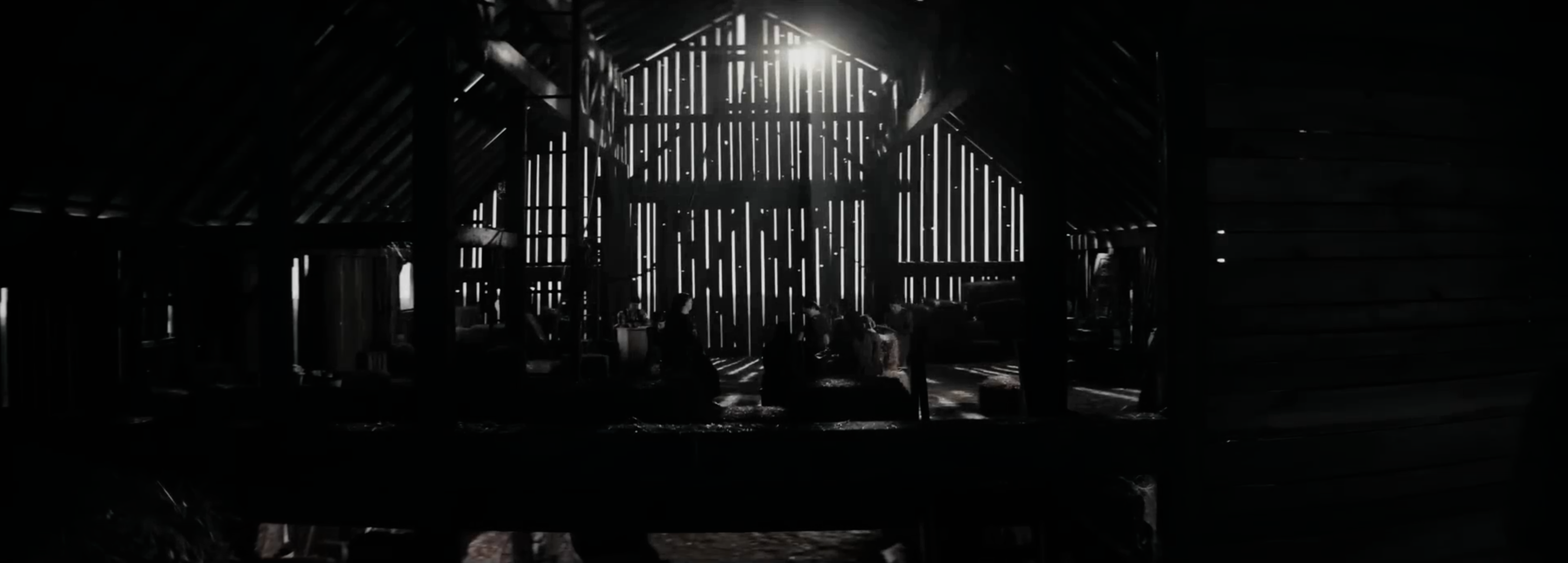
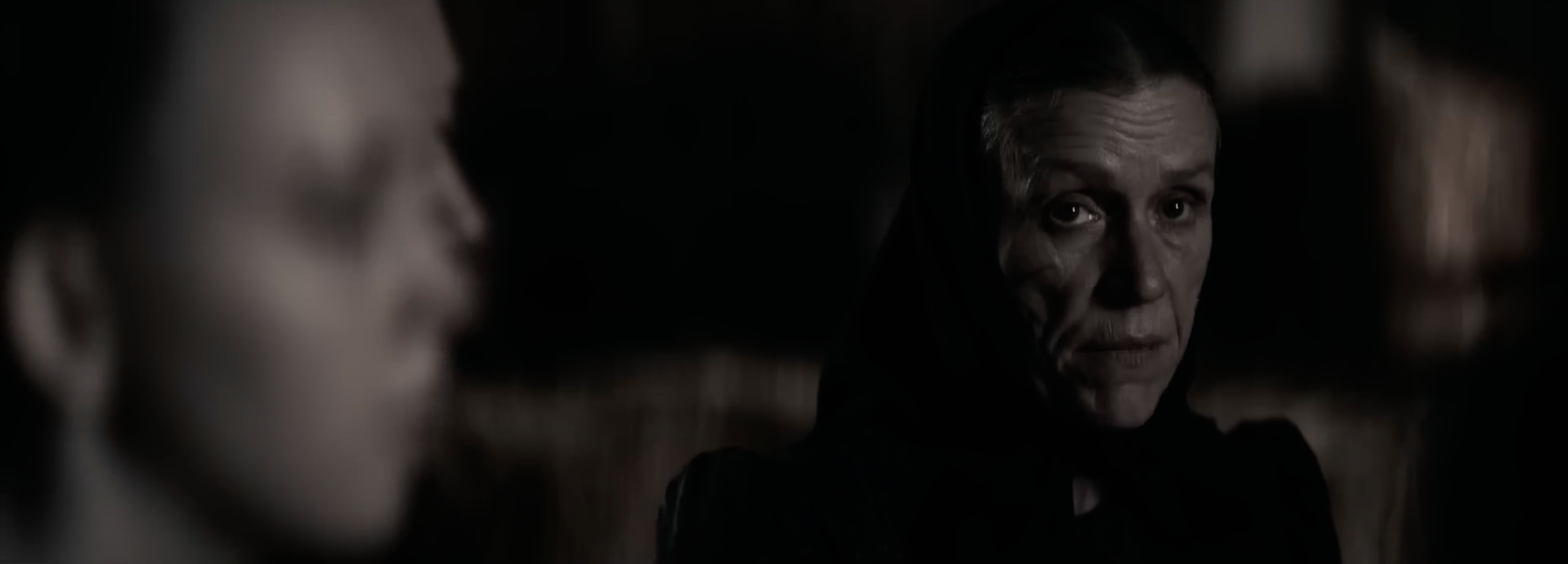
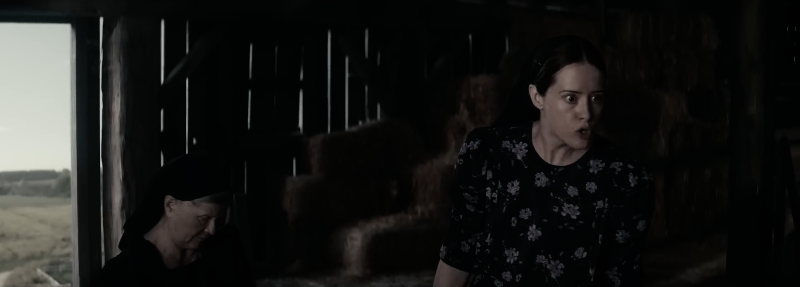
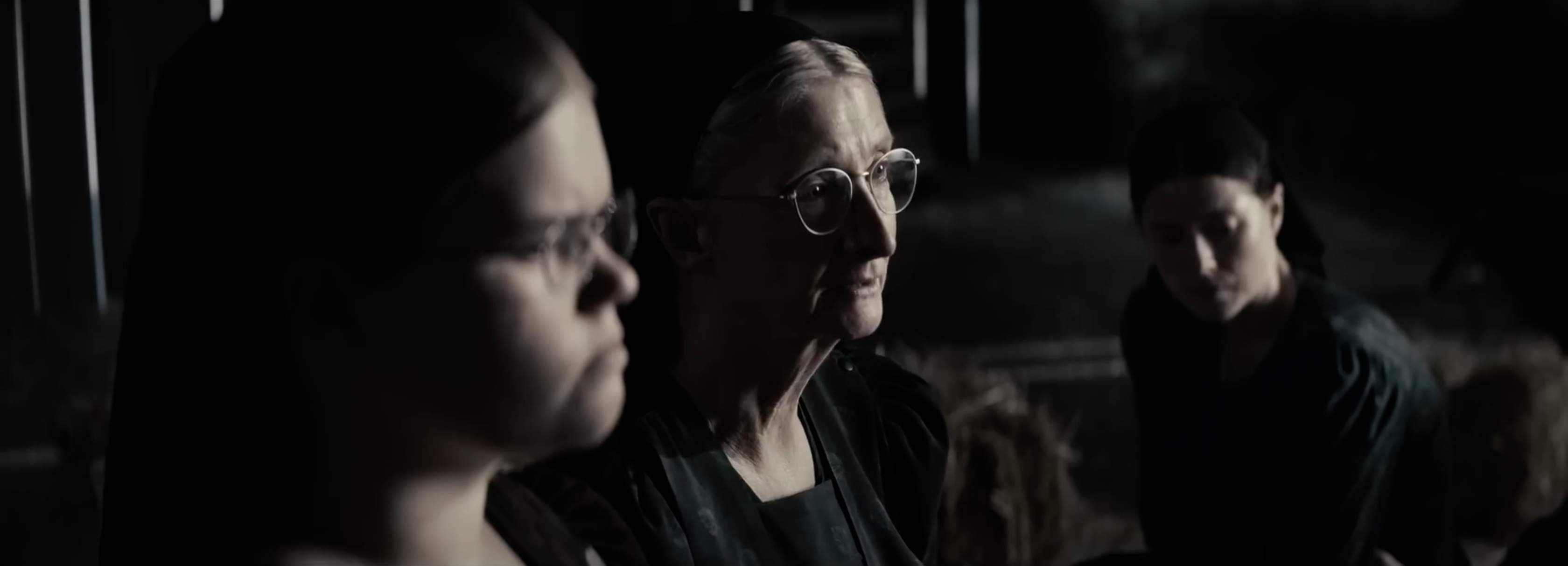
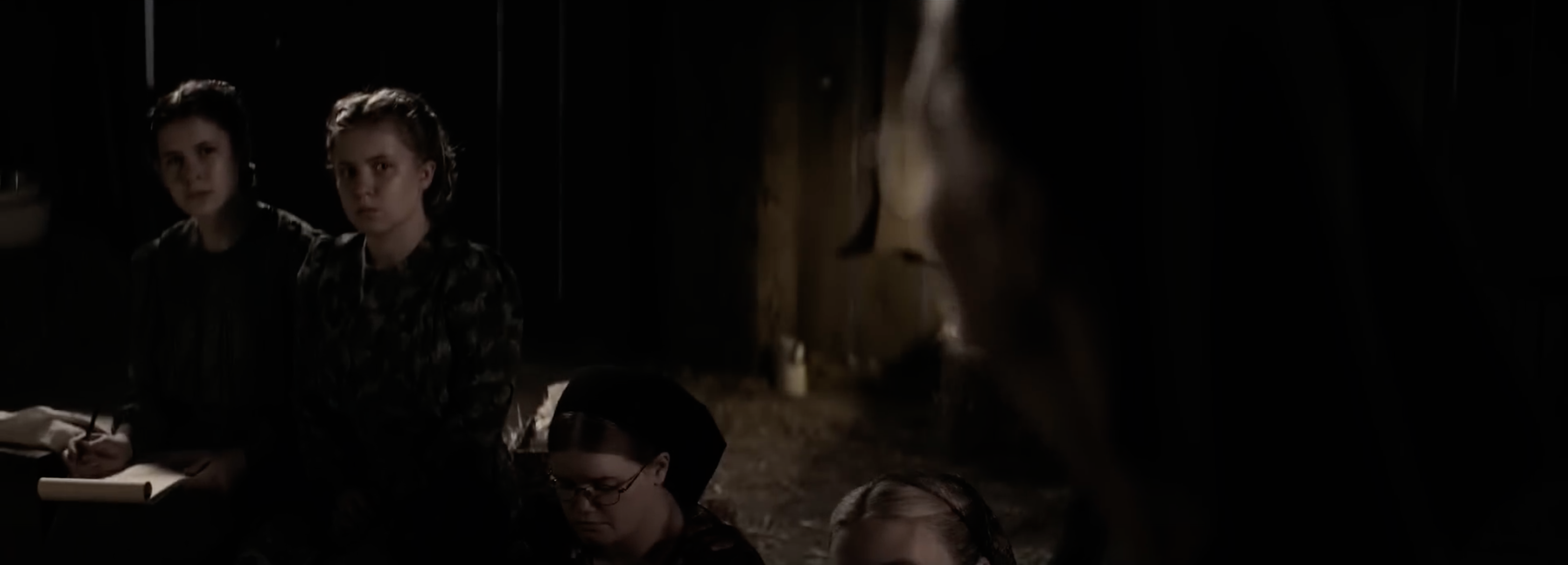
Most of the film’s screen time is set in a barn’s hayloft, where the principal characters, in the process of arriving at a group decision, sit and trade expressions of white-hot anger, apprehension, fear, humor, affection, and determination. The aspect ratio is anamorphic widescreen, with a preponderance of close-ups and medium two- and three-shots, often strikingly composed. Billy Wilder proved generations ago in The Apartment how effective could be the use of anamorphic widescreen in filming confined interiors, and Women Talking runs away with this notion. Every bit of fixed framing is composed just so, until a subtle dolly move perfectly timed to a dramatic beat underscores the precision with which this film has been visually executed.
The DP, Luc Montpellier CSC, who also shot Polley’s previous dramas, Away from Her and Take This Waltz, chose to use Panavision’s DXL2 camera with its RED MONSTRO 8K VV sensor and slightly oversized full frame format. (Shooting features and TV series in full frame is trendy.) For lenses he used Panavision’s Ultra Vista large-format anamorphic primes, the optical design of which derives from Ultra Panavision 70 lenses of the late 1950s used to shoot 65mm negative. As a result, instead of a conventional widescreen aspect ratio of 2.40:1, Women Talking adopts Ultra Panavision 70’s slightly longer-looking 2.76:1 ratio.
Multiple DXL2s were needed for coverage of multiple angles as actors traded lines, made impromptu adjustments, and listened to one another in character during the many takes Polley reportedly required. The shallower depth of field resulting from the decision to shoot in large format instead of Super 35 no doubt offered challenges to focus-pulling — multiplied by the number of cameras! — but with greater challenges come new opportunities, as evidenced by the many artful soft backgrounds behind group compositions in the hayloft. Bear in mind that anamorphic lenses produce less depth of field to begin with, compared to spherical lenses with the same horizontal angle of view.
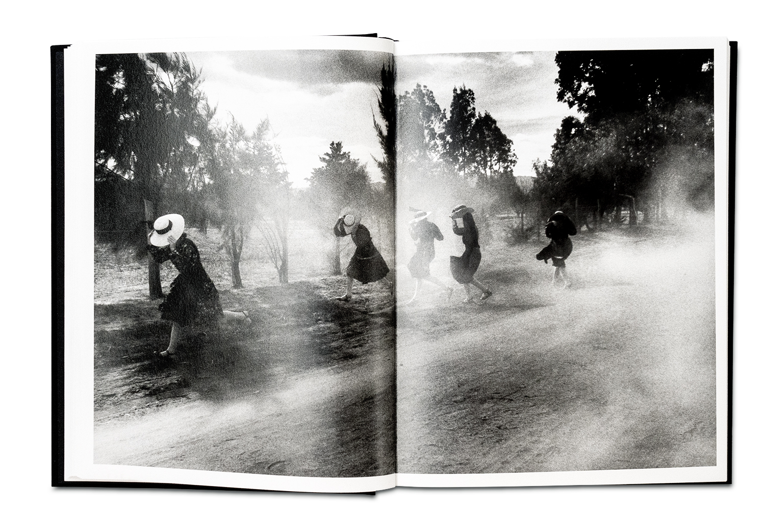
I especially appreciated the film’s commitment to naturalistic lighting. Both Polley and Montpellier have mentioned the influence of Magnum photographer and fellow Canadian Larry Towell, who in the 1990s photographed, in stark black & white, nearly two dozen Mexican Mennonite communities in Mexico and also in Ontario, where some of the Mexican Mennonites seasonally migrated to pick up agricultural work. Towell’s photography book, The Mennonites (2000), has been compared to the 1930’s dust bowl work of Dorothea Lange.
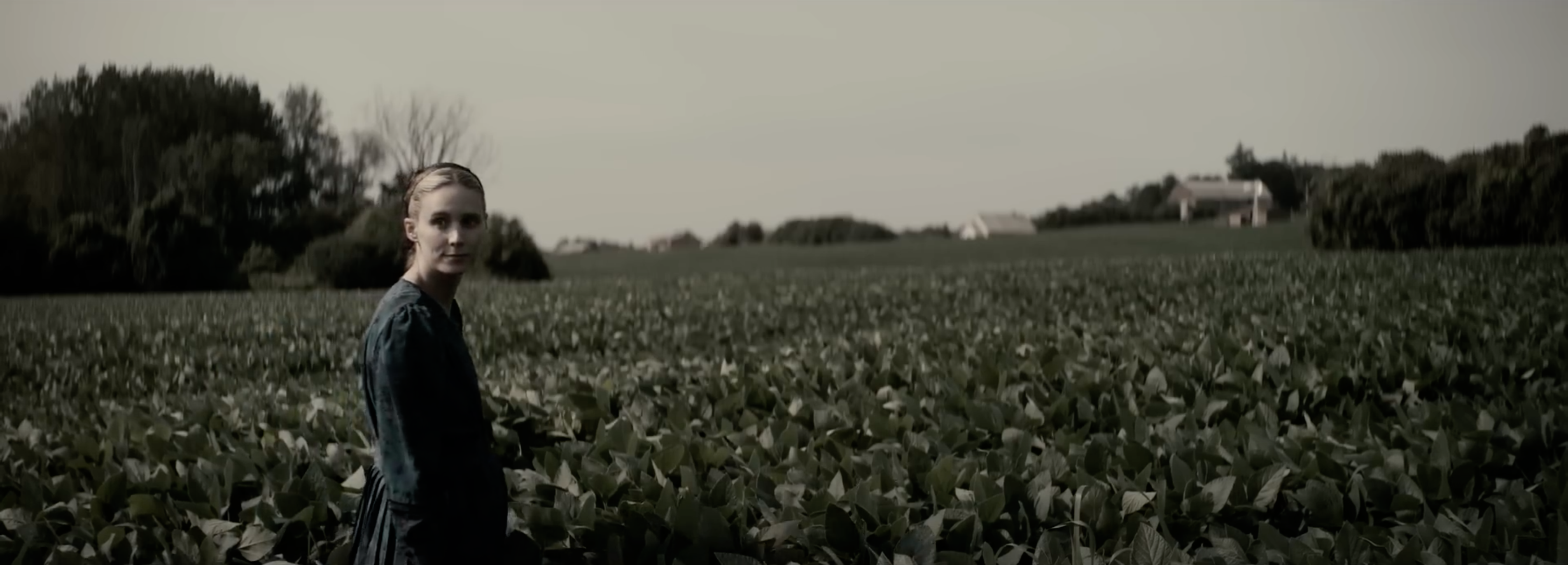
Scenes in the hayloft were shot on a set, with a blue screen behind what would be the large opening under the barn’s gable, called a hay door. The hay door, open in every scene, served as a window to the world outside the barn, framing distant crop fields, a flat horizon, and the position of the sun in the sky. The hayloft’s loose build, constructed of rough wooden slats, creates large vertical cracks through which shards of daylight enter from all sides. This forms a pervasive interior gloom, regardless of time of day. Montpellier wisely adds little to no edge or back lighting, unless motivated by an apparent existing source. For instance, in a hayloft night sequence about fifty minutes in, after the sun has dropped behind a remnant of ruddy sky, a collection of portable Coleman gas lanterns replaces the indirect daylight. Here Montpellier is able to justify edge lighting, since the lamps’ bright mantles act as point sources distributed across the hayloft.
I mentioned at the outset that I had attended a second screening, in a second theater. I did this partly to gauge my reaction a second time to the decision taken by the filmmakers to drain away most of the color, a choice that didn’t sit well with me upon first viewing, and also to ascertain whether projection quality might have been a factor in my response to the film’s signature look. (More on this below.)
The color palette in Women Talking is, by turns, muted, muddy, pallid, bleached. In a word, desaturated.
What exactly is saturation?
Color, a sensation we experience, is described by three physical attributes:
1) Hue… is something red or blue or yellow?
2) Saturation… is it a deep, pure red like a laser or mixed with other colors, like a red brick?
3) Brightness… how much light intensity does it exude, which end of a gray scale does it fall on?
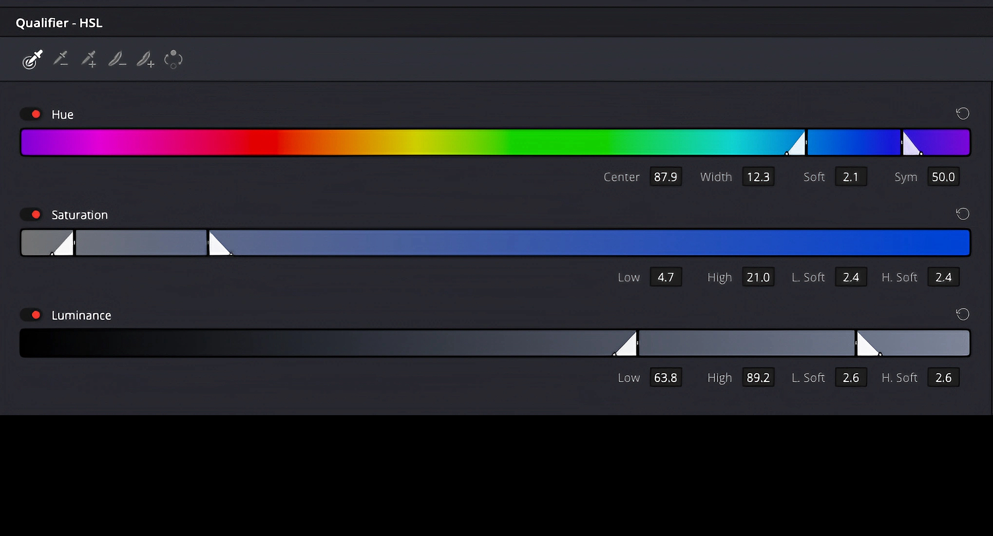
Basically what colorists do is juggle these three attributes, in masterful ways of course. And these attributes are interrelated. Drop the brightness of orange and it becomes brown. But drop color saturation to zero and all that remains is black & white. This makes sense: absence of color defines black & white. It’s no secret that if you wish to shoot a digital black & white motion picture, all you have to do is zero-out the saturation level in the camera using a LUT (look-up table), or in post, where it’s simply a matter of turning down the saturation knob in Resolve or any editing app with color controls.
In the real world, we also experience varying levels of saturation, at least situationally. Colors that pop outdoors on a bright sunny day can later seem dull and lifeless on an overcast day. In the gloom of night or a dark room, when rods in our retinas take over from color-sensitive cones, visible objects grow even more indistinct in color. (Look up mesopic vision.) But in real life we never experience a bright, sunny day with a degraded level of color saturation. This would appear discordant. It would feel weird and unnatural. Even when cloudy skies are at their darkest, the diminished saturation we experience is gently toned down, not dramatically stripped away.
If natural color is key to naturalism, then why doesn’t black & white photography like Larry Towell’s portraits of Mennonite life, which directly inspired the look of Women Talking, appear to us as equally weird and unnatural?
In Wim Wenders’ 1982 black & white film, The State of Things, the aging cinematographer Joe Corby, played by director Samuel Fuller, has the following exchange with his driver, Mark:
Mark: You know, I take pictures, photographs, but I never really thought in black and white before I saw our rushes. Do you know what I mean? You can see the shape of things.
Joe: Life is in color, but black and white is more realistic.
When you first pick up a pencil as a child, you draw a shape, essentially a black & white outline. Cave drawings were crudely drawn shapes too. Our visual system doesn’t need color to make meaning of shapes and details. Black lines and smudgy grays will do.
Consider the fact that photography, cinematography, and television were all conceived in black & white (although attempts at color were present in each from the outset); the same holds for reproduction, photogravure for example. In painting, representation limited to shades of gray is called grisaille, practiced in Western art since the 14th century, both as its own thing and as an underpainting technique for oil painting. Picasso’s Guernica is a famous example.
So although photographic black & white sidesteps a key component of human vision, it conveys detail, shape, texture, and tone. It succeeds as representational as long as images are recognizably in focus. Think Ansel Adams, Robert Mapplethorpe, the aforementioned Dorothea Lange.
Indeed, an initial task for any colorist is to first give shape to an image’s gray scale, or “tonal” component, by adjusting luminance values or tinkering with its gamma curve. This establishes realistic-looking contrast, more essential to the verisimilitude of an image than the presence or degree of color.
Only next do we adjust color hue and saturation to taste, to achieve the full look we’re after. Remember that mercifully brief fad, a decade ago, of embracing the look of uncorrected log gammas straight out of the camera, with their ultra low contrast and saturation? Nothing is prescriptive or sacrosanct in grading — you are free to come up with any look you want — although audiences may not sanction extreme choices like log-gamma contrast.
This being the case — freedom of choice — what’s the problem with sharply lowering color saturation in order to bring a color image closer to a gray scale?
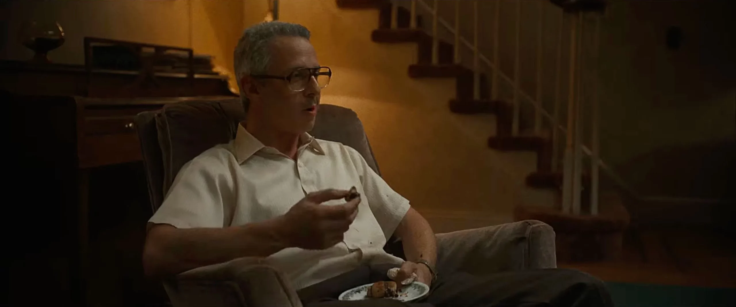
In 1930s Hollywood it was common to create a gauzy closeup of a glamorous star in her moment of passion. All it took was covering a lens with a silk stocking or Vaseline. This contrivance signaled emotionality and allure, as if seen through a veil of sentiment or her lover’s misting eyes. Josef von Sternberg’s infatuation with Marlene Dietrich provides well-known screen examples of this, but it was a common technique associated with the era. And then it went away. Why? It was a weak signifier to start with, too literal, too on-the-nose. A camera gag shouldn’t be necessary to gin up a scene’s emotional level or cue an audience what to feel; that’s what acting is for. (Although a swelling score from Max Steiner, Erich Korngold, or David Raksin might provide the same cue.) Besides being ineffective (ask Kari Lake), soft-focus stuck out like a sore thumb, drawing attention to its artifice. It didn’t pass the test of time.
In Women Talking, the protagonists’ situation is dire. Further abuse is imminent if something isn’t done. The women lack education, experience in the outside world, control over their lives. They know only how to cook, clean, and make babies. Disobedience means excommunication and shunning by the only world they’ve lived in. Unless something changes, their life will continue as grim and colorless.
Note that in such a description the word colorless is a figure of speech. In real life, their sky is just as blue as anywhere else in the world, their trees just as green, their strawberries just as red. Colorlessness used in this capacity aligns with bleak themes of oppression, despair, hopelessness. But it remains metaphorical.
To take colorlessness literally and actually drain the color from the images seems to me to be, well, too literal, too on-the-nose. It is meant to cue us about how to feel about the place, time, and circumstances in which this story takes place, as if the story-telling itself needed an extra helping hand. Montpellier has called the look “gothic,” although I fail to get the art-historical connection.
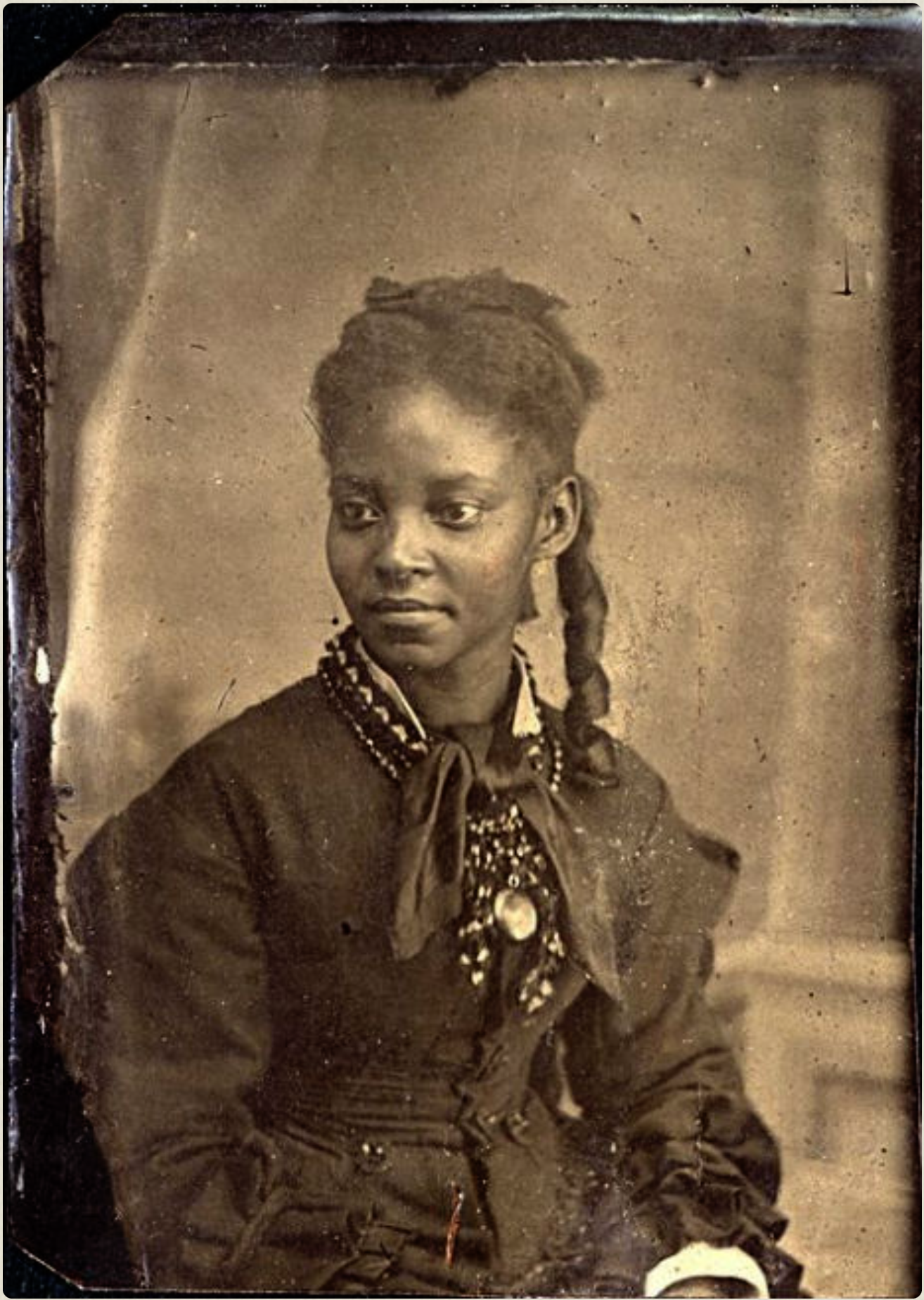
Could minimizing saturation be seen as akin to sepia toning? The look of sepia toning has long been shorthand for old-timey. The technique itself is a throwback to the late 1800s when silver in photographs was unstable. Sepia toning was a chemical process that enhanced the life of a silver image on paper and conferred a warm brown tone as a byproduct. The image remained monochromatic however. By the 1930s sepia toning was obsolete, so it really does connote a bygone era, and we interpret it as such.
In like fashion, the desaturated look of Women Talking seems to imply some sort of bygone era. Nothing on screen contradicts this impression, since there are no modern appliances or modes of dress — that is, until a late-model white pickup with a loudspeaker rumbles by on a nearby dirt road blasting… the Monkee’s 1967 smash hit, Daytime Believer!
For someone like me, who remembers exactly when this 45 was the world’s number one pop song, it’s jarring. And fun! What an audacious bit of surrealism. Be warned, it’s an ear worm. Couldn’t get it out of my head after that first NYFF screening. (In the novel, the song heard by the women is instead California Dreaming, released by the Mamas and the Papas in 1965.) That vehicle rumbling down a dusty country road turns out to be a census taker passing through. He shares information that a male colony member is on his way back from town to seek more bail money to free the rapists. Time is running short.
So, the whole point of desaturating the color in Women Talking is… not to imply the historical past? Those real-life rape convictions in Bolivia, after all, occurred only a dozen years ago.
I scrutinized color grading throughout Women Talking and only noticed a bump up in saturation in one scene, the hayloft at night. After a long afternoon of debate and discussion, the women have reconvened to make a fateful decision. Out the hay door a darkening horizon is scarcely visible and those Coleman lanterns are burning brightly. One character remarks that if God is omnipotent, why hasn’t he protected the woman and children? I will become a murderer if I stay, says another. Leaving is how we demonstrate our faith, says a third. In this scene, in which the women are approaching a fateful decision, it appeared to me that color saturation is restored to an almost normal level. Shadows (black levels) are lifted too, to give this interior night scene a softer contrast. This worked well.
[As an aside, you could fill a book with the history of pre-digital attempts to reduce saturation or otherwise alter the relatively fixed tonal and color characteristics of Kodak negative. To fashion the murky, veiled look of a past era in Robert Altman’s McCabe & Mrs. Miller (1971), DP Vilmos Zsigmond used heavy double fog filters on slow 5254 color negative (100 E.I. tungsten) which he underlit, underexposed, post-flashed (latensified) and push-processed at Technicolor. Whew! In Three Kings (1999), David O. Russell tried to abandon color negative altogether, rounding up all the 35mm reversal Ektachome he could get, then cross-processing it as negative with a bleach bypass for harsh grain and weird color contrasts befitting its bizarre Desert Storm heist plot. These days, to accomplish much the same results, all it takes is juggling some nodes and OFX filters in Resolve.]
I have already mentioned the second reason I watched Women Talking again, in a different screening room: projection quality.
To evaluate screen images that occupy the lower end of the tonal scale — “low key,” having significant detail in shadow areas — the technical quality of image reproduction is critical. Can a projector in a given room, on a given screen, accurately reproduce detail in the deepest shadows or not?
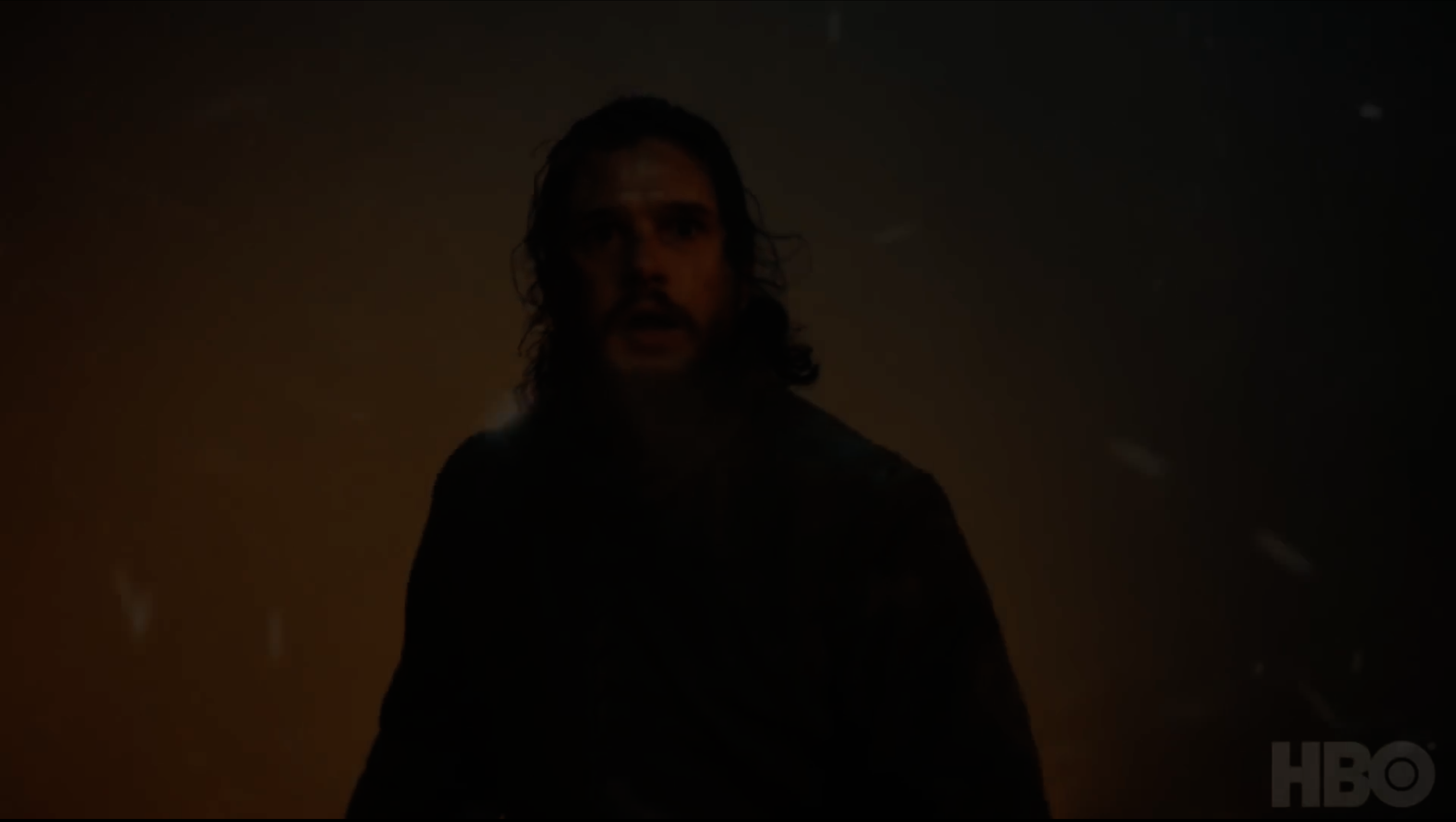
I’m not talking Gordon Willis in The Godfather, whose crushed shadows on motion picture print film Rembrandt might envy, but rather shadows from digital media that contain considerable dark detail that might or might not make the cut, depending upon the projector and lens and room in which it’s seen. If you watched HBO’s Game of Thrones in April 2019, the episode in which the Battle of Winterfell infamously raged mostly in darkness, then you’ll remember the uproar that followed. Most viewers at the time had a TV like mine, a 46-inch HD number that usually looks great, despite that fact it’s an older LED with a bit depth of only 8 bits per color, like all HD sets. That night, I, like many others, watched full-tilt battle scenes disappear into an undifferentiated murk, filled with ugly banding instead of stirring swordplay and derring-do.
In 2019, 31% of viewers had 4K TVs capable of 10-bit color. Regardless, HBO aired season 8 of Game of Thrones as an 8-bit, highly compressed HD signal only. Note that Game of Thrones was shot in 10-bit 4K. (OK, shot on Alexa, but close enough.) I’m certain that the state-of-the-art 10-bit OLED reference monitors with perfect blacks that HBO used for critical grading made the dark detail in those battle scenes look terrifically cool and positively edgy. As Bill Maher might say, I don’t know this for a fact, I just know it’s true.
What a difference a few years can make. In August, Game of Thrones was rereleased on HBO Max as 4K Utra HD. This means 10-bit images (1 billion colors) displayed on a 10-bit screen in HDR (High Dynamic Range), which you already possess if you own a 4K TV. Which promises, HBO says, “a clearer image.” I haven’t seen GoT in 4K yet, but I have no reason to doubt that this is the case in spades.
4K HDR images reproduce a visibly higher contrast range than HD due to the fact that the 10-bit panels used in 4K TVs produce brighter whites, blacker blacks, and finer gradations in between, compared to the 8-bit panels used in HD sets. Those 10-bit panels that use LED technology typically deliver a contrast range from 3000:1 to 4000:1. Panels that are OLED or QD-OLED (for quantum dot) are even more impressive, capable of 100% true black. Because of this they are sometimes described as approaching infinite contrast.
How do challenges in accurately reproducing dark detail on TV correspond to challenges in projecting similar images on the big screen? Detail that occupies the same low end of the tonal scale?
Both screenings of Women Talking used DCI-compliant digital cinema projectors driven by DCP servers. This is the industry’s standard setup for theatrical projection, designed to insure identical results on any screen. The performance standard for the projector’s output is called SMPTE RP 431-2:2011. The RP stands for Recommended Practice; SMPTE is the Society of Motion Picture and Television Engineers; and this standard was adopted in 2011. Note that this is a “recommended” practice only, not mandatory. There are no projection police poised to inspect, issue citations, or shut down a theater if it doesn’t meet the following specs:
1) At 100% white output, the center of the screen should reflect 14 foot-Lamberts of brightness, plus-or-minus 3 fL, something easily measured with a spot meter like those used by DPs.
2) The contrast between the brightest white on the screen and the blackest black, taking into account ambient stray light in the screening room, should be a minimum of 1200:1. A contrast ratio of 2000:1 is preferred.
Are such specifications routinely met?
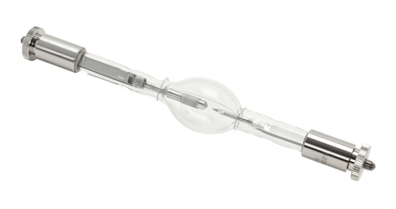
Most 2K and 4K projectors in current use contain xenon lamps with relatively short lives. They drop 50% in brightness toward the end of their 800-1200 hour lifetimes and tend to flicker with age. Best practice is to check lamp output at least once a week, recalibrate to 14 fL if needed, and adjust lamp position to ensure a flicker-free image. If the lamp remains dim or continues to flicker, it’s supposed to be replaced. Xenon lamps cost $1000 a pop.
Are best practices always followed?
With regard to contrast, even if a projector meets specs when installed, over time port windows accumulate dirt. So do lenses and internal optics. Spurious flaring that results can subtly wash out dark detail on the screen. Matte screens age too, dulling somewhat. Another factor in variability between theaters are older Texas Instruments DLP imagers, micro-mirror devices inside digital projectors that actually create the projected images. Older DLP imagers are less adept at creating acceptable blacks compared to DLP imagers in newer projector models. The black output from older models can be dark gray. For the record, no digital projector is capable of true black, so this shortcoming is a matter of degree.
Don’t believe me? Next time you’re in a theater or digital projection room, put your hand near the screen when the projected frame is totally black. You will see a sharp shadow, because the projected black is not nearly as black as the white screen behind your hand, with no projector output falling on it.
Why does any of this matter? If the projector’s output is bright, say, beyond 17 fL, which is the high end of the DCI/SMPTE digital cinema standard, then the brightest on-screen details will discourage your eyes from adjusting to the ambient darkness of the room itself. As a result, dark screen detail will appear darker; blacks, blacker; and everything more contrasty. But if the situation is reversed and a projector outputs at the low end of the DCI/SMPTE standard, 11 fL, or less due to an aging xenon bulb, then your eyes will adjust more to the room’s darkness (especially if the scene contains no bright elements), and black screen detail will appear gray, which it really is. Color saturation will likewise appear muted. Put another way, variations in screen brightness and contrast due to quality of projection disproportionately impact the low end of the tonal scale, where the subtlest gradations of shadow detail are found.
At NYFF I watched James Gray’s poignant fictionalized memoir, Armageddon Time, with a blistering performance by Jeremy Strong. Shot in large-format by Darius Khondji using ARRI 65s and ARRI DNA primes (vintage Mamiya and Hasselblad lenses rehoused by ARRI), Armageddon Time depicts a mid-1980s, middle-class Jewish household in Queens, a household that seems to think there’s an energy crisis underway, because its sparse interiors appear lit by only low-wattage incandescent bulbs.
I struggled to make out detail in dark interior scenes. Shadow detail wasn’t so much crushed as muddied by insufficient shadow contrast. I had a hard time believing that this is what Gray and Khondji intended. I wouldn’t be surprised to learn that they had OK’d the final grade on OLED monitors or iPad Pros with perfect contrast at the toe of the tonal scale. Or perhaps even on an RGB laser projector, nearly a match to OLED, with superior contrast and snappier color compared to xenon. In which case they would have signed off on readily visible shadow detail, subtle yet distinct, a specialty of large-format digital cameras. Unfortunately that same level of shadow detail may not have survived in the jungle of real-world theatrical projection, where variations in brightness and black levels can and do frequently creep in.
The minimum 1200:1 contrast ratio and the preferred 2000:1 ratio specified in the SMPTE RP 431-2:2011 standard for theatrical projection is based on what can be achieved with a xenon lamp projector. (This is true also of the DCI-P3 color space.) Notice there’s no maximum, just a minimum. One way for xenon projectors to improve image contrast is to lower their black levels, but this is rarely feasible without also lowering output, which defeats the goal.
The best answer, going forward, is RGB laser projection. Don’t worry — red, green, and blue lasers don’t shoot out of a projector’s lens. The lasers illuminate DLP imagers just as xenon projectors do, only with a luminous energy that is brighter, purer in color, larger in gamut, and directional in a way that enables greater contrast and deeper blacks. Flicker becomes a thing of the past; lamp changes too, since laser light sources continue to output 80% of their initial brightness at 30,000 hours — that’s three and half years of never being turned off. Oh, and it consumes half the energy. Not surprisingly, these projectors are costly and some theater owners are loathe to replace what already works, especially at a time of declining ticket sales. Thankfully, existing Barco, Christie, Sony, and NEC projectors can be retrofitted with laser light sources at considerably less cost.
Brighter RGB laser projection with better intrinsic contrast is a good way for theaters with raised levels of ambient light to meet DCI/SMPTE standards. Indeed, as more cinemas upgrade, perhaps the DCI/SMPTE standards for theatrical projection could themselves be revised upward. For one, the spec for contrast could be pushed higher, to better match that of OLED screens, premium grading monitors like Sony’s BVM 4K HDR Trimaster series, and future microLED displays that will offer OLED-like true blacks combined with longer gray scales, larger gamuts, and no burn-in. A standard that specified a higher contrast would protect films rich in dark detail like Armageddon Time and also films like Women Talking, which through desaturation and other such expressive manipulations operate at the outside margins of tonal scale and color. Such films rely even more on precise, faithful on-screen reproduction of what was accomplished in the grading suite.
Similarly, as market penetration of 4K TVs grows, bringing HDR and 10-bit wide color gamut to the masses, content with marginal lighting like Game of Thrones will be seen the way it was meant to be seen. Which happily ought to converge with how it will also be seen on the big screen, given the spread of RGB laser projection and upgraded projection standards.
So, how did the second screening of Women Talking compare to my first viewing? Indeed, color and contrast seemed to have a little more snap the second time around, which I thought better sold the desaturation effect. There could be many reasons for this on-screen variance, some of which I spelled out at length above. At times, lower apparent contrast can be simply a matter of a full audience. Yes, clothing worn by an audience can, in fact often does, reflect back onto the screen, which knocks down the black level. This is a well-known effect. The second screening I attended, in a room with darker walls, was virtually empty.
By the way, if you want to experience the clearly superior quality of laser projection, catch a 3D viewing of Avatar: The Way of Water, hands down the best 3D I have ever seen. Only a laser projector could provide an image bright enough for one eye and a separate image bright enough for the other eye — at the same time, from the same projector, at 48 frames/sec! Each eye, by the way, considerable brighter than the DCI/SMPTE standard. Dolby 3D relies on passive glasses, with each eye tuned to a slightly different set of RGB primaries. Do the math and you’ll realize that the Barco or Christie projector in the projection booth contains six lasers. Did I mention RGB laser projection’s massive color gamut, the only type of display, panel or projection, to approach a full Rec. 2020 color space?
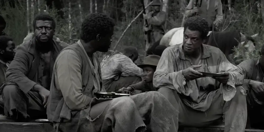
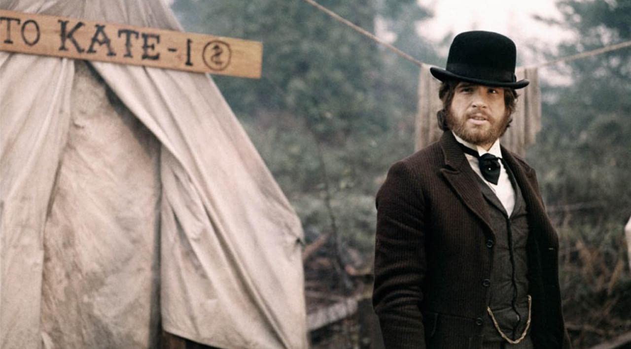
Lastly, does the distinctive low-saturation look of Women Talking portend a trend? If you’ve seen trailers for Emancipation, starring Will Smith as a man slipping the bonds of slavery during the Civil War, in theaters now, you may be inclined to agree with this. Smith, a newly minted pariah in real life, may feel at times like the color’s been drained from his world, but that’s an existential mood, not an external reality. In Emancipation, director Antoine Fuqua and DPs Bob Richardson and Rob Legato, shooting with large-format RED RANGER MONSTRO 8K cameras and prototype large-format Panavision primes, worked out a near-monochrome look in advance, employing LUTs (color look-up tables) and the grading of dailies on location. You can enjoy an engaging, in-depth discussion by Richardson and Legato of their thinking and technical approaches here.
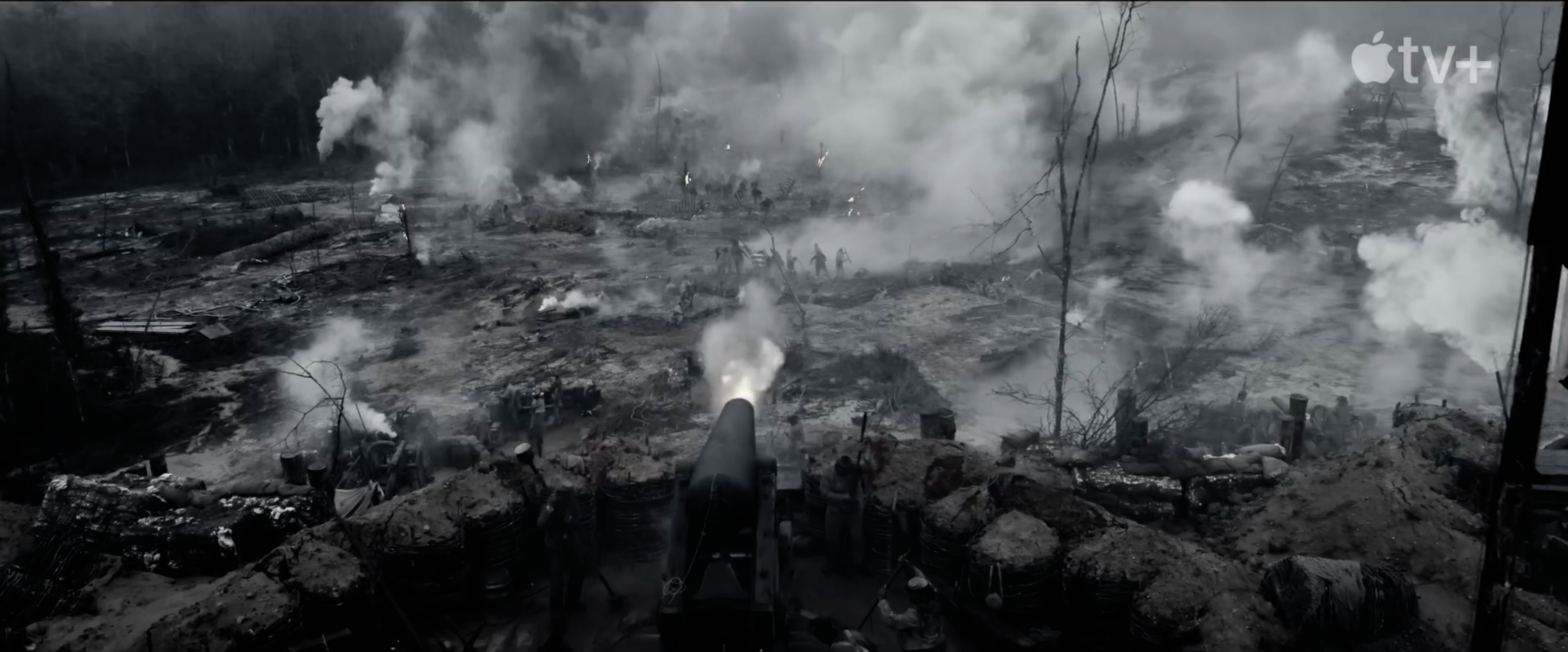
Emancipation would seem intended as a cinematic rebuke to D. W. Griffith’s racist primer, The Birth of a Nation. [I have always wondered, what nation is being birthed? It’s a deceptive title. The source book was entitled The Clansman.] This is especially apparent in the wide shots of battle scenes towards the end, almost a backhanded homage to Griffith and his innovative cinematographer, Billy Bitzer. In every way, clearly, Emancipation is the antithesis of The Birth of a Nation — except in its exploitation of the graphic power of black & white, which I find ironic. Griffith and Bitzer didn’t have a choice in the matter. Color cinematography was decades in the future. For them, choosing black & white was not a thing. No creative decision-making was involved. Doing without sound was not a choice either, for the same reason.
I’ve shot in a war zone, and I can say with conviction that no newsreel camera operator covering the chaos of World War I from the trenches of Verdun or the Somme would have opted to go without color or sound if there had been a choice. What they sent back in 1916 were mute shadow plays on celluloid of all they had experienced while cranking their cameras. I made this very point in a 2018 piece on this website, “The Documentary Masterpiece that is Peter Jackson’s They Shall Not Grow Old,” where I defended Jackson’s efforts to reconstruct the phantom color and sound that were never recorded a century ago due to the era’s technological limitations.
To me, a scant trace of color, the gambit throughout Emancipation, is a persistent reminder of what isn’t there. I find it distracting. As with tricking out a closeup using soft-focus, aestheticizing or over-stylizing can feel like a short cut, as if the power of the narrative isn’t solely to be relied upon. Let’s paint the past in faded shades that make us seem modern and progressive, our times vivid by comparison.
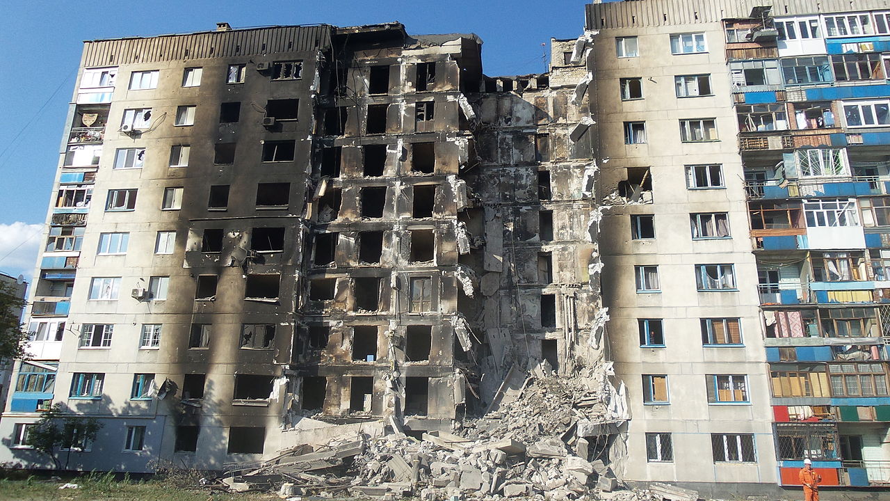
Perhaps I’m leery of such artifice having spent years of looking through the candid lens of a documentary camera, but here’s how I see the world: On sunny days, skies over blackened ruins in Ukraine are bright blue. As were skies over Auschwitz-Birkenau, where beyond electrified fences a lush green Polish countryside thrummed with crows cawing, cows mooing, tractors plowing. Overhead flew birds. Evil takes place in full color, often in full view, amidst the humdrum and the banal, wherever humans operate. This is achingly hard to dramatize, no less process emotionally, and we filmmakers resort to our bag of tricks.
The freedom to make such artistic choices, however, is fundamental. So to be clear, this is not a review or takedown of Women Talking, a strikingly original work that represents exactly the sort of edgy filmmaking that NYFF ought always to platform. Women Talking has already been named one of the top ten films of 2022 by the National Board of Review and the American Film Institute. It will hit theaters in a limited run December 23rd courtesy of United Artists Releasing, and AMC has already erected promotional vitrines in its lobbies showcasing dour puff-sleeve dresses on manikins surrounded by handfuls of hay and a bucket of farm eggs — I kid you not.
Lucky audiences over the holiday season will thrill to remarkable performances by a cast that includes Claire Foy, Jessie Buckley, Rooney Mara, Judith Ivey, Ben Whishaw, and Frances McDormand, plus a brilliant and moving score by Hildur Guðnadóttir (Chernobyl, The Joker, Tár).
Don’t miss it! But see if you miss a more natural palette, as I did.